All CTA blocks
CTA 6
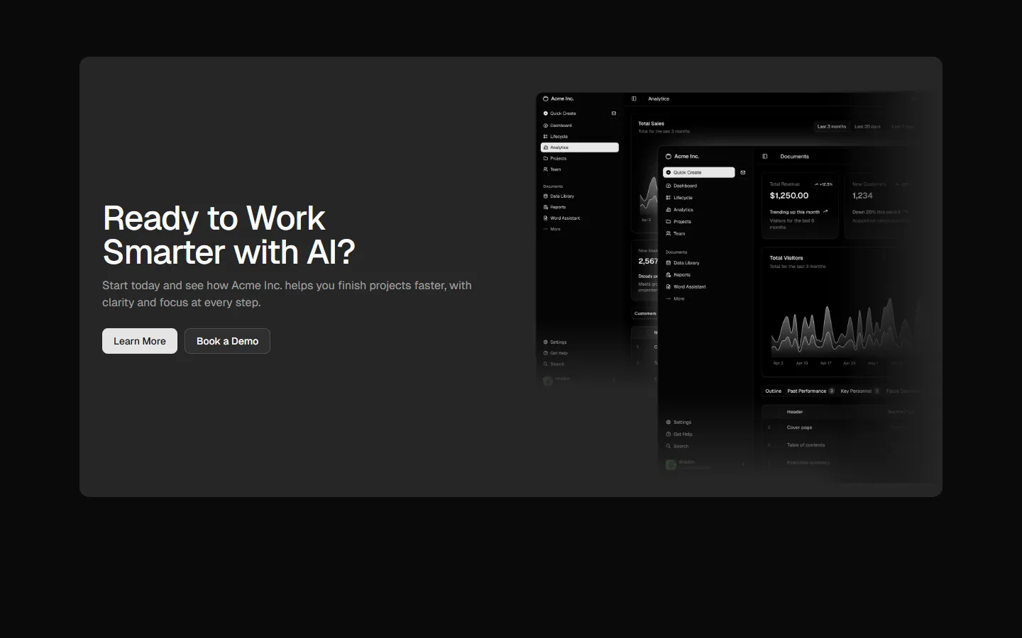
Feature-led split with primary visual
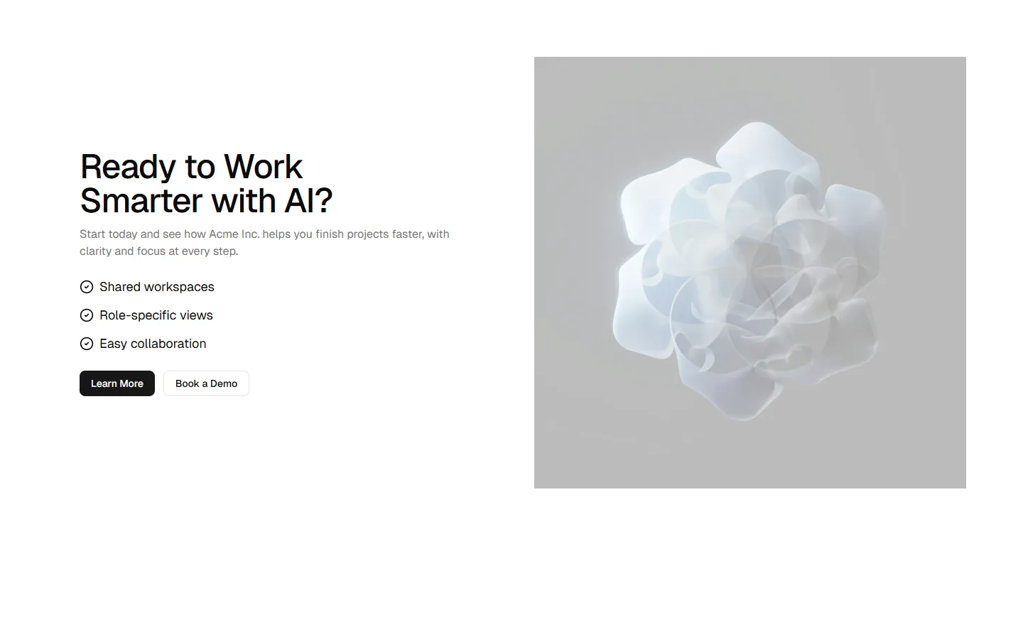
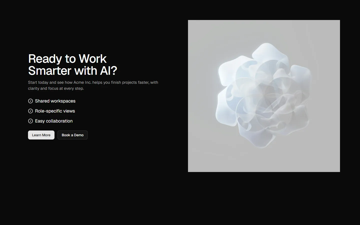
A split CTA layout anchored by a dominant visual panel, with supporting copy and a short feature list alongside. Emphasizes imagery first, then reinforces the action with structured text and clear primary and secondary buttons. Suitable when visual tone or brand feel needs to carry more weight than the copy.
Pro Marketing Figma React
All blocks
More CTA
Pro
CTA 1
Centered headline with stacked actions
Pro
CTA 2
Left-aligned headline with inline actions

Pro
CTA 3
High-contrast panel with stacked actions
Pro
CTA 4
High-contrast panel with left-aligned actions
Pro
CTA 5
Split content with feature list and media
Pro
CTA 7
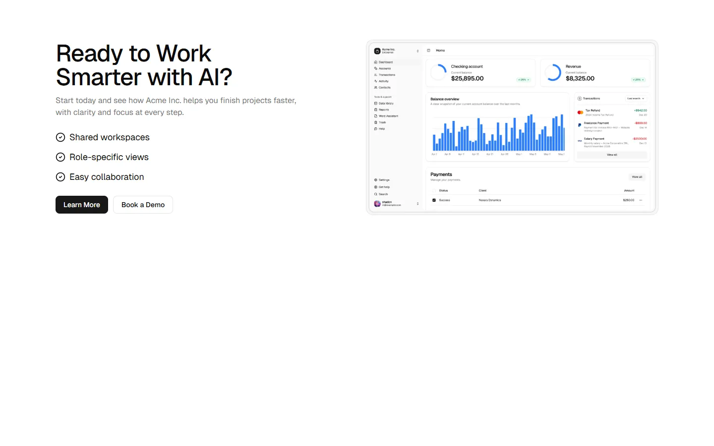
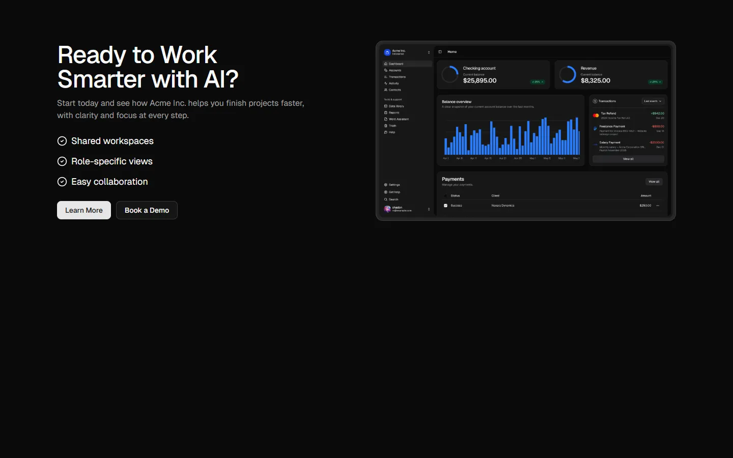
Product preview split with feature checklist
Pro
CTA 8
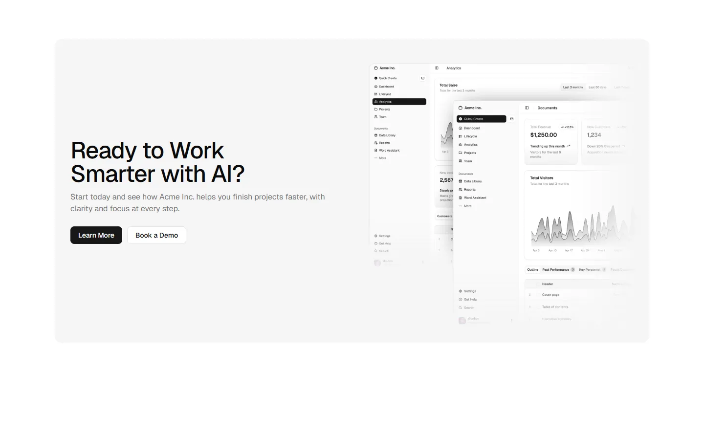
Wide product panel with offset preview
Benefits
Production-ready by default
Built with shadcn/ui conventions and designed for real projects.
Built with shadcn/ui
Clean React components using Tailwind and modern shadcn patterns.
Install instantly
Add the block directly using the shadcn CLI.
Works with your theme
Compatible with shadcn themes and token-based color systems.
MCP server support
Use shadcn MCP server right from your favorite AI tools.
