News, articles & updates
Insights, tips and product updates to help you design and ship faster with shadcn/ui.

Announcing shadcncraft Figma Plugin v2
We’ve released version 2 of the shadcncraft Figma plugin, introducing a much deeper connection between Figma, shadcn tooling, and production code.

Introducing shadcncraft
Today we’re launching a new name, a new brand, and a completely rebuilt website. Shadcraft is now shadcncraft.

Application components & blocks have landed
Application components and blocks are now included in both the Pro and Pro React Kits. If you already own either product, they’re available right now in your Polar customer portal.

Introducing the shadcncraft Figma Plugin
Today we’re releasing the shadcncraft Figma plugin.

The fastest way to theme shadcn/ui with tweakcn
Theming is one of the quickest ways to make shadcn/ui feel like your brand. The default system has a clean black and white foundation, but every real project eventually needs colour, tone and personality. For many teams, this is where things slow down. Updating variables, aligning Figma with code and trying to manage light and dark mode can turn into days of manual work.
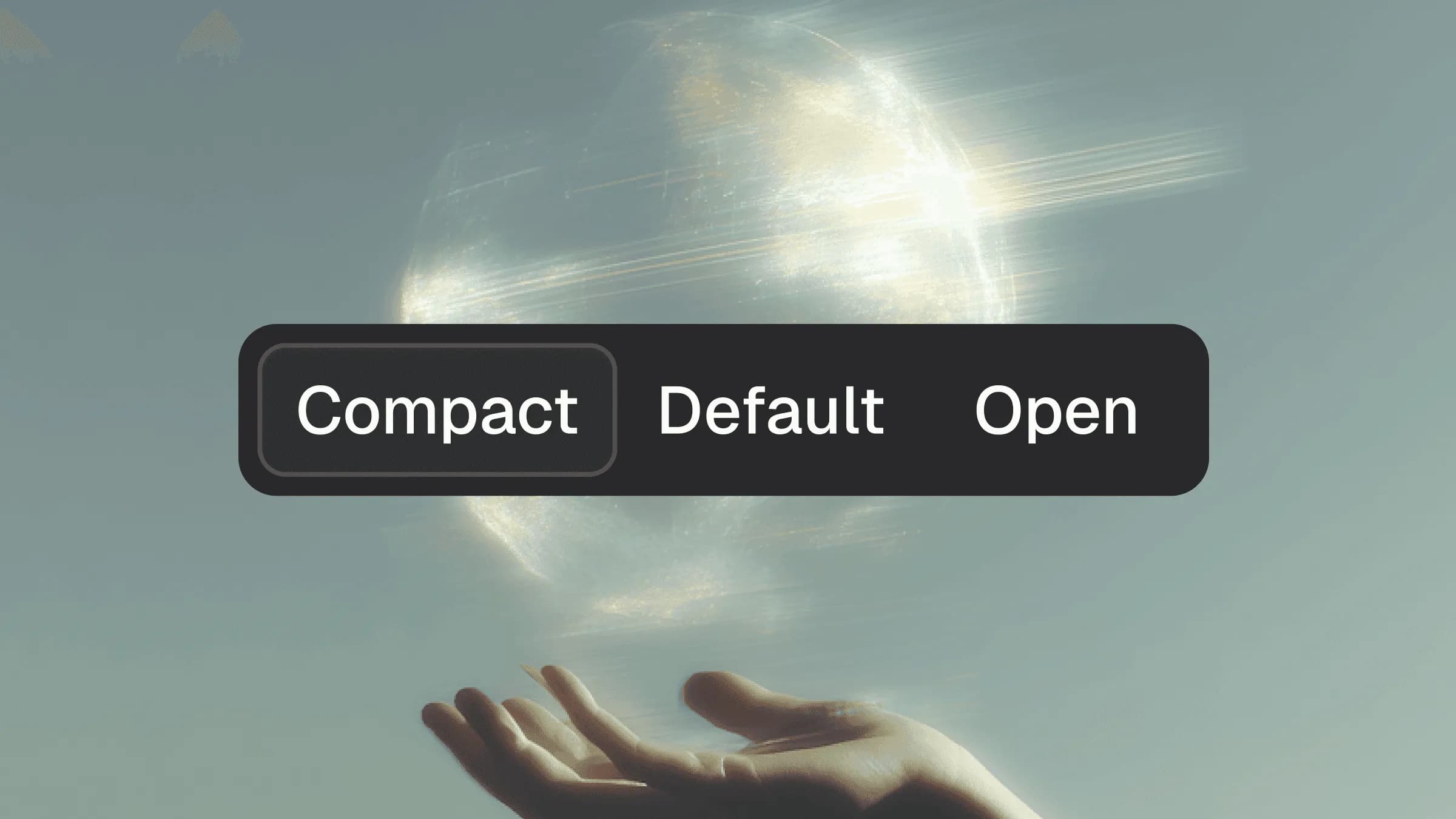
Best practice patterns for tabbed interfaces in shadcn/ui
Tabbed interfaces are one of the most common navigation patterns in modern product design. They let users switch between related sections without losing context. In shadcn/ui, tabs are built on top of Radix primitives, which means you get strong accessibility foundations and predictable behaviour by default.
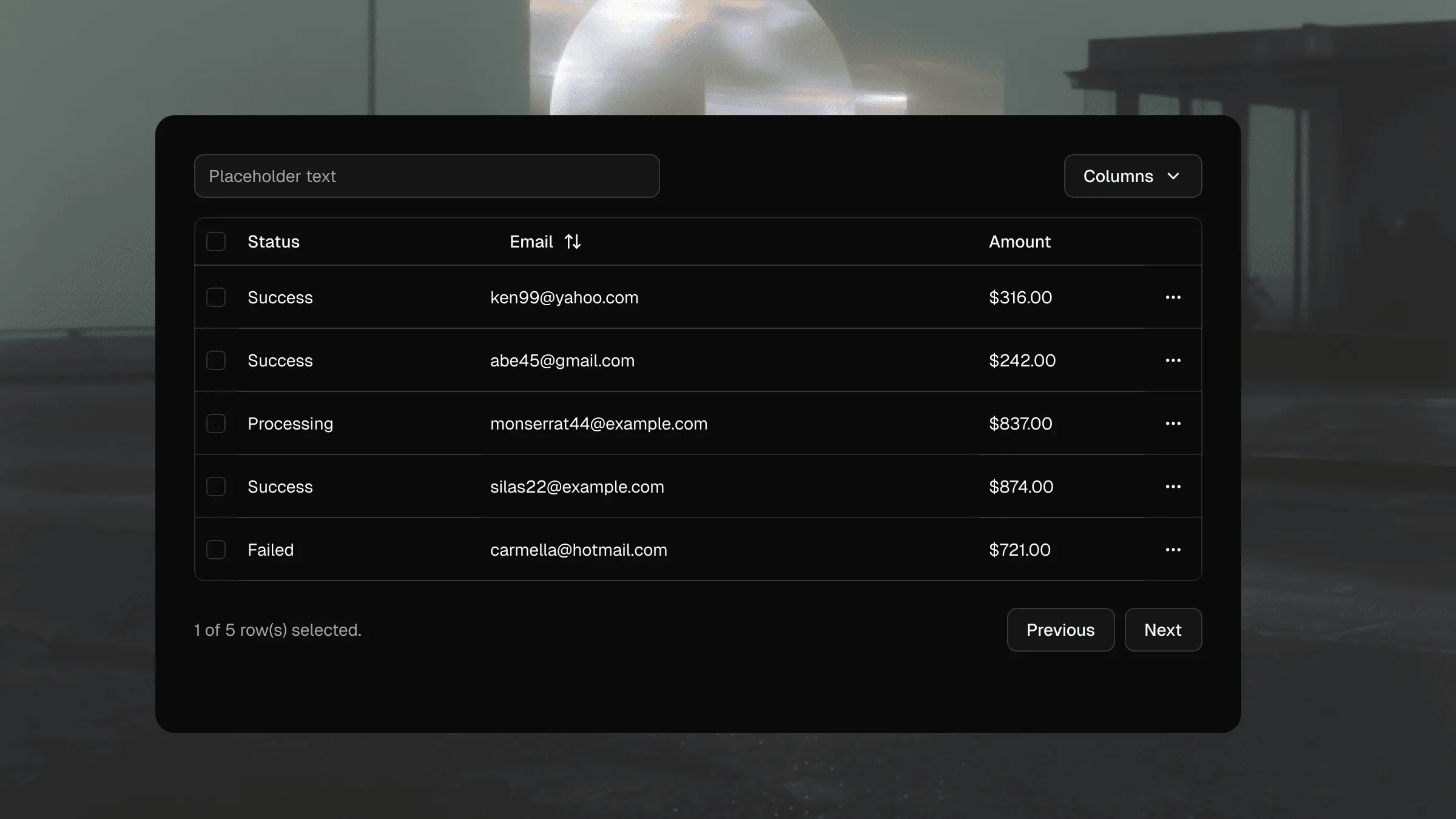
Building production ready data tables with shadcn/ui
Data tables often look simple, but anyone who has worked on a real product knows they are one of the most complex interface patterns in the entire UI stack. Sorting, filtering, column alignment, dense layouts, responsiveness and accessibility all compound quickly. shadcn/ui gives you a clean starting point built on Radix primitives and Tailwind, but delivering a robust production table requires more than dropping in the default markup.

The complete beginner’s guide to shadcn/ui
If you spend any time building modern React apps, you’ve probably come across shadcn/ui. It has become one of the most widely used component stacks in the frontend world, powering everything from solo side projects to large production apps. This guide is designed to give you a clear understanding of what shadcn/ui is, why it matters, and how teams put it to work. If you’re new to it, this is the perfect starting point.
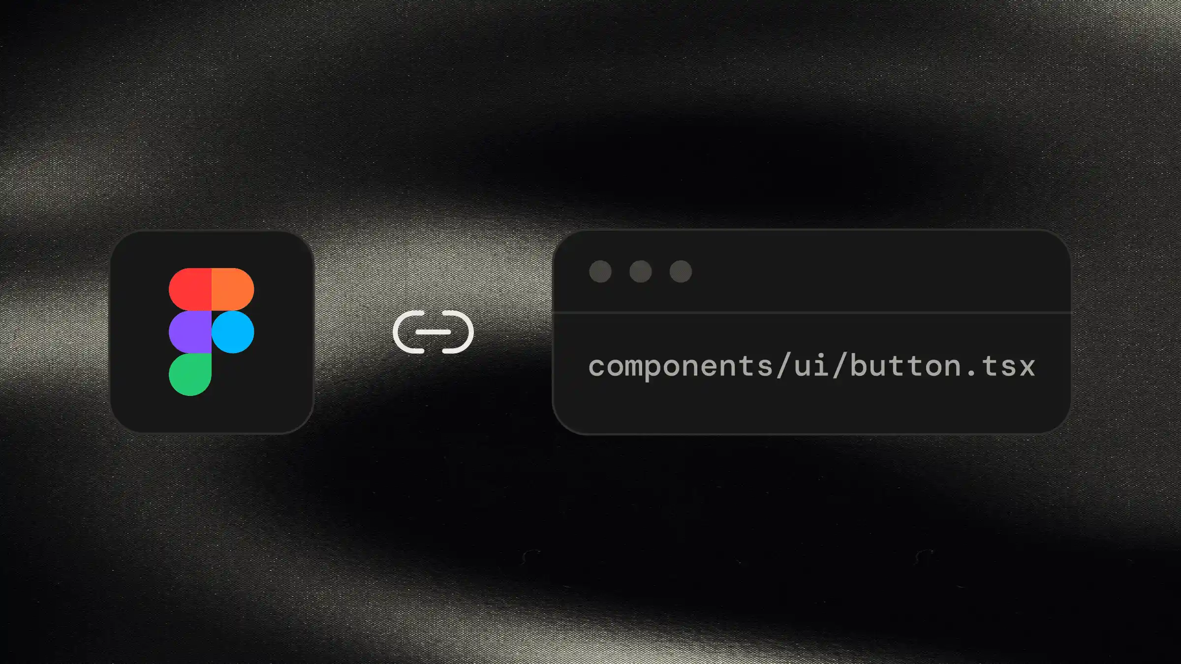
Using Figma Code Connect with our shadcn/ui kit
Anyone who has worked through a design handover knows the pain: the Figma file looks immaculate, yet the coded version drifts. Spacing shifts a little. States don’t behave the way they were designed. Variants aren’t interpreted consistently. Even with a strong design system, these gaps still appear.
Build pages fast with shadcn MCP Server
Most web builders still assemble marketing pages the long way: drop in components, tweak spacing, adjust layout, refactor imports. With the shadcncraft Pro React Kit and shadcn MCP Server, the workflow becomes prompt-driven. You describe what you want in natural language, and the agent assembles a complete, production-ready page, and even takes care of installing all the necessary components from the shadcncraft registry.

Our Black Friday Sale is now on! 30% off everything.
The biggest discount we have ever offered

Five essential Figma Plugins for design systems
When we started building shadcncraft, our premium Figma UI kit for the shadcn/ui ecosystem, we knew the level of detail needed to be high. The aim was to mirror the structure, behaviour, and developer mindset behind shadcn/ui. That meant clean variables, pixel precision, consistent rounding, correct node types, and instant theming.
