All Benefits blocks
Benefits 12
Two-column icon list
A two-column layout that displays a list of items, each paired with an icon, title, and short description. Items flow vertically within each column and adapt to a single column on smaller screens. Use when you need a dense but scannable list with clear visual anchors.
Pro Marketing Figma React
All blocks
More Benefits
Pro
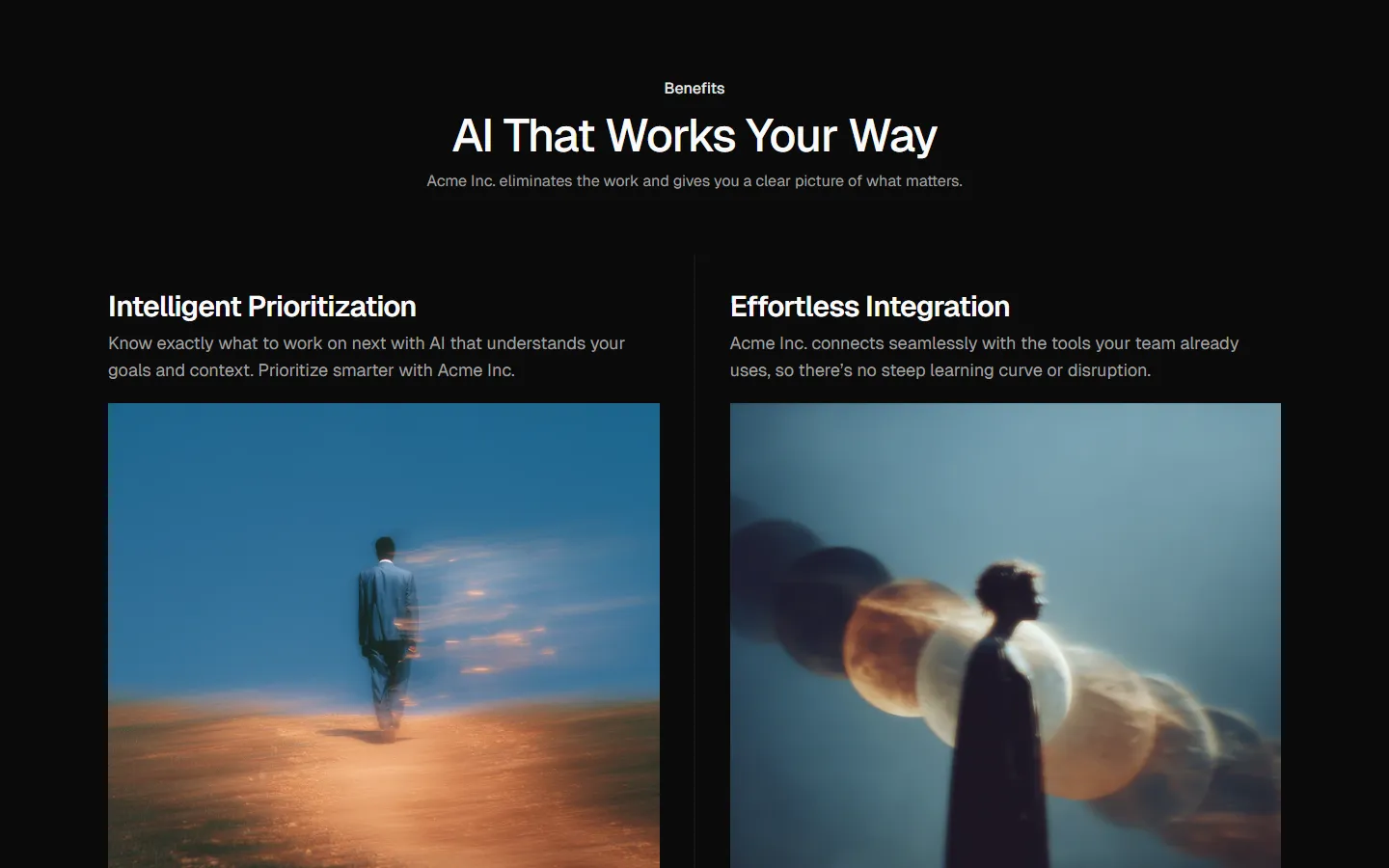
Benefits 1
Alternating rows with text and image
Pro
Benefits 2
Alternating rows with actions and image
Pro
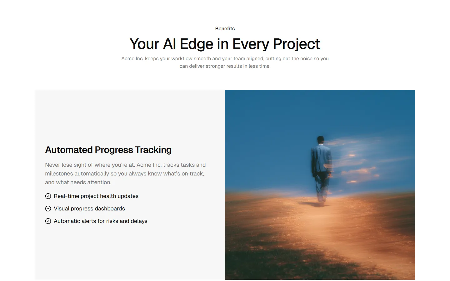
Benefits 3
Stacked sections with full-bleed media

Pro
Benefits 4
Compact icon list
Pro
Benefits 5
Icon grid
Pro
Benefits 6
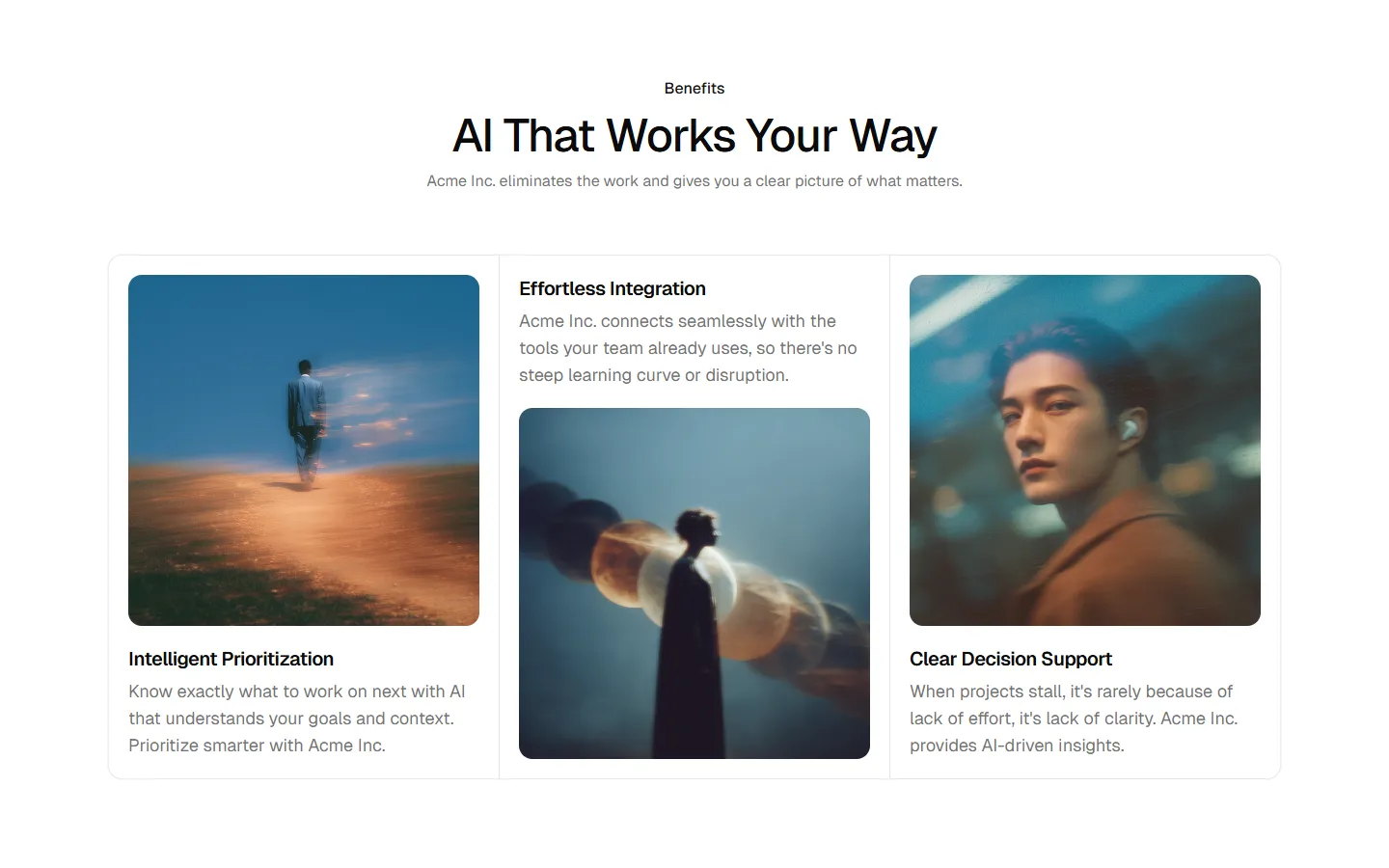
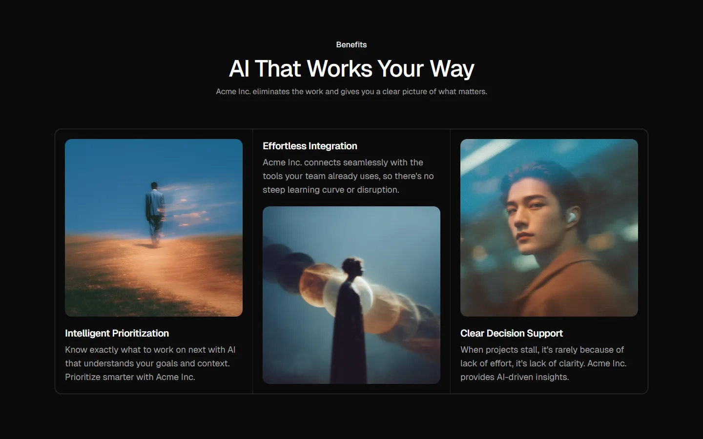
Image-led cards
Pro
Benefits 7
Split highlights with supporting list
Pro
Benefits 8
Hero media with supporting list


Pro
Benefits 9
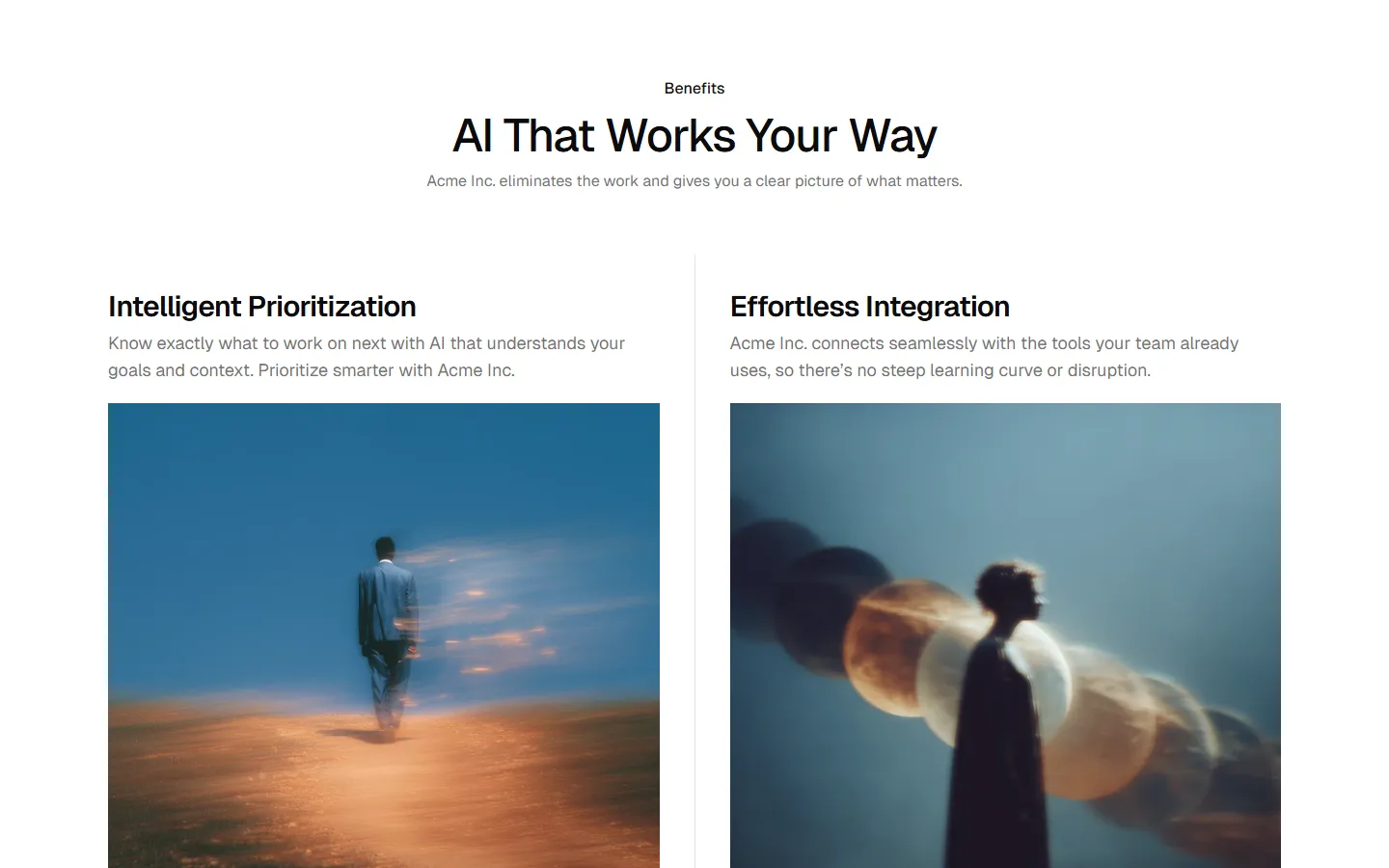
Two-column text layout

Pro
Benefits 10
Full-width media with overlay text


Pro
Benefits 11
Emphasized lead with supporting column


Pro
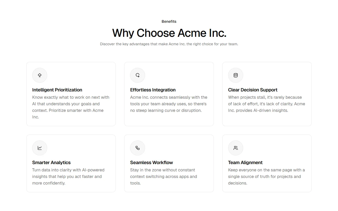
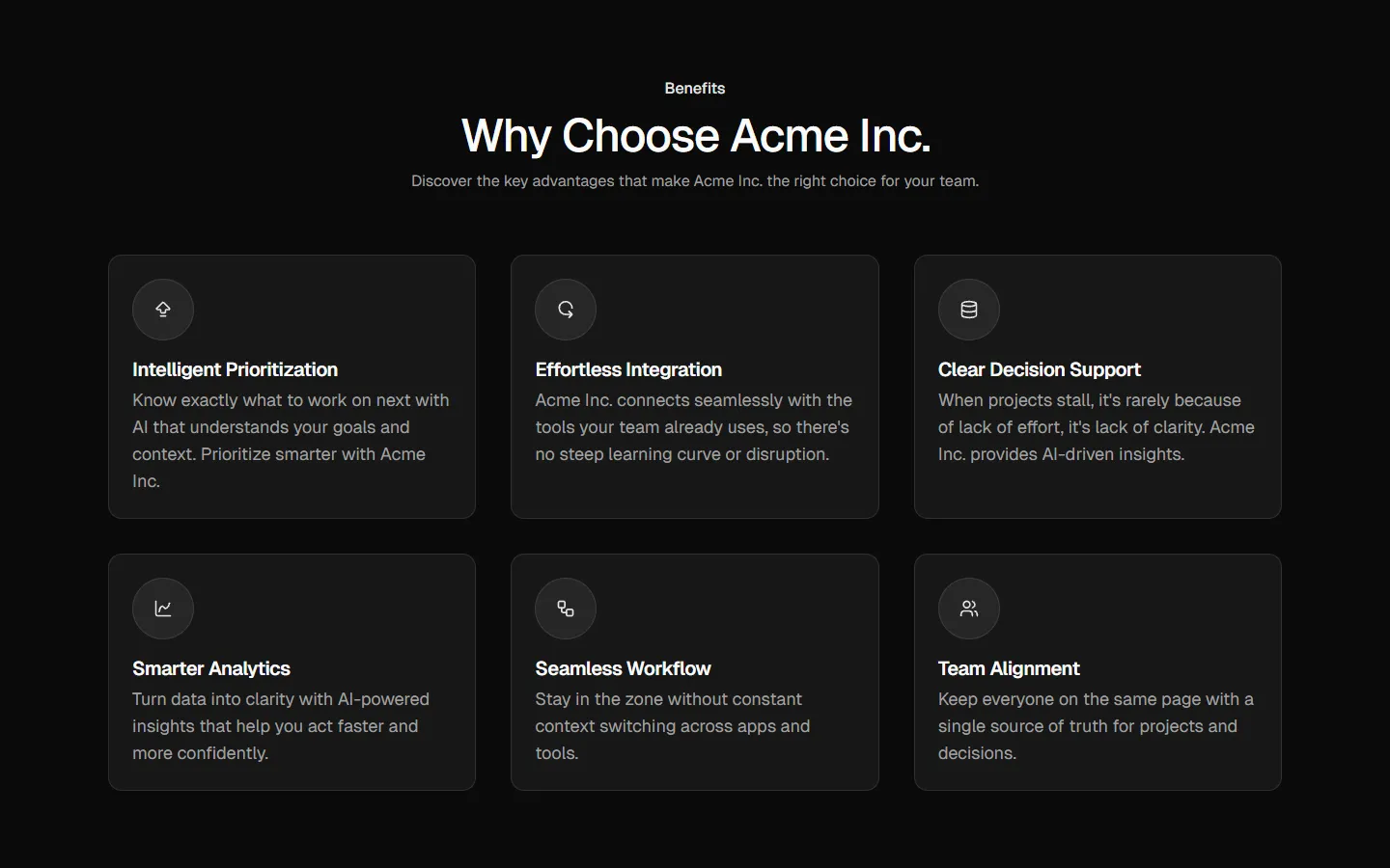
Benefits 13
Card grid with section header
Benefits
Production-ready by default
Built with shadcn/ui conventions and designed for real projects.
Built with shadcn/ui
Clean React components using Tailwind and modern shadcn patterns.
Install instantly
Add the block directly using the shadcn CLI.
Works with your theme
Compatible with shadcn themes and token-based color systems.
MCP server support
Use shadcn MCP server right from your favorite AI tools.
