All Benefits blocks
Benefits 2
Alternating rows with actions and image
A benefits section with a headline and intro, followed by multiple feature cards arranged in a staggered grid. Each card includes an icon, feature title, short description, supporting UI image, and primary actions. Use to present key product capabilities when you want each feature to stand alone and drive clicks to demos or deeper pages.
Pro Marketing Figma React
All blocks
More Benefits
Pro
Benefits 1
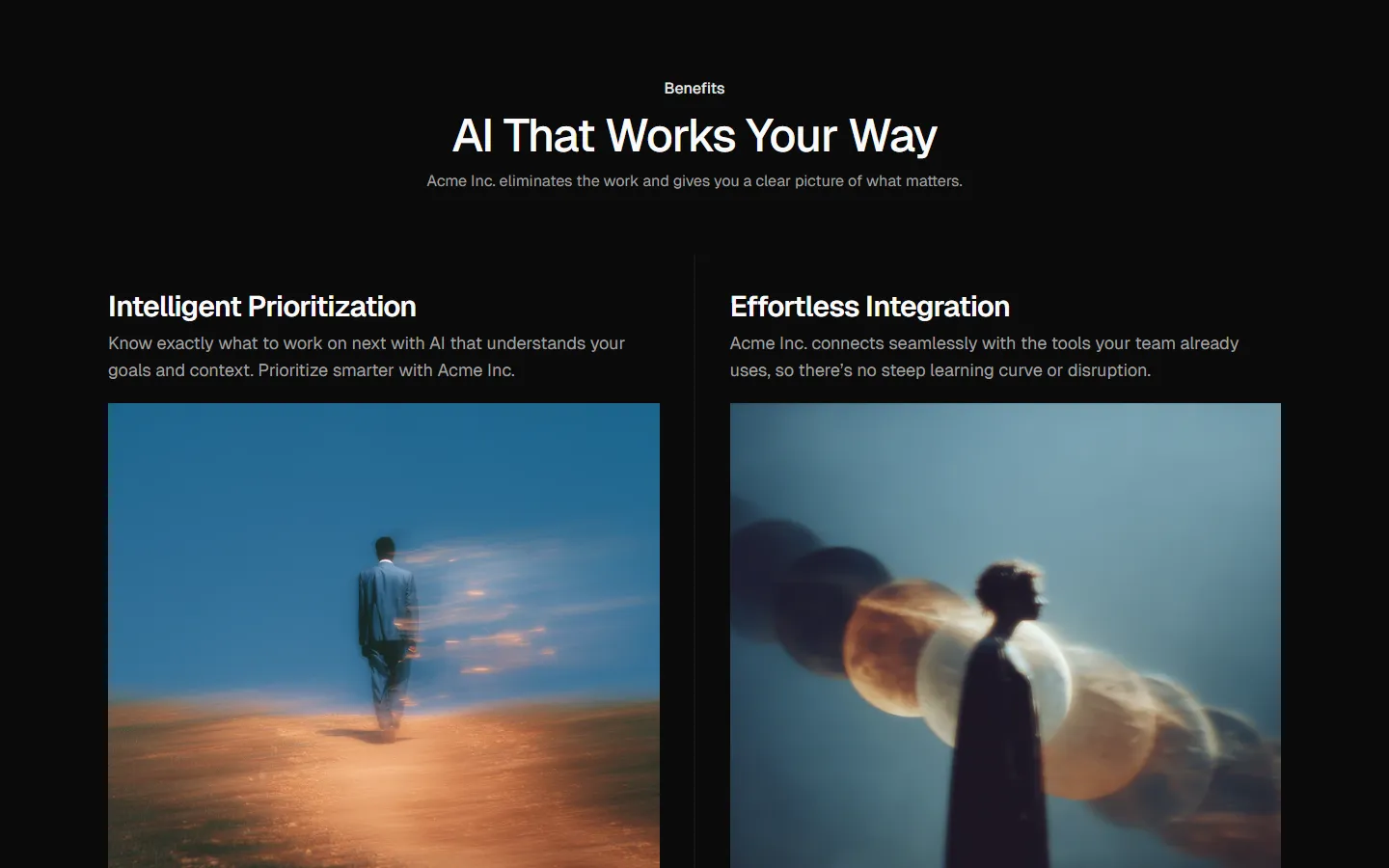
Alternating rows with text and image

Pro
Benefits 3
Stacked sections with full-bleed media

Pro
Benefits 4
Compact icon list

Pro
Benefits 5
Icon grid


Pro
Benefits 6
Image-led cards


Pro
Benefits 7
Split highlights with supporting list
Pro
Benefits 8
Hero media with supporting list


Pro
Benefits 9
Two-column text layout

Pro
Benefits 10
Full-width media with overlay text


Pro
Benefits 11
Emphasized lead with supporting column


Pro
Benefits 12
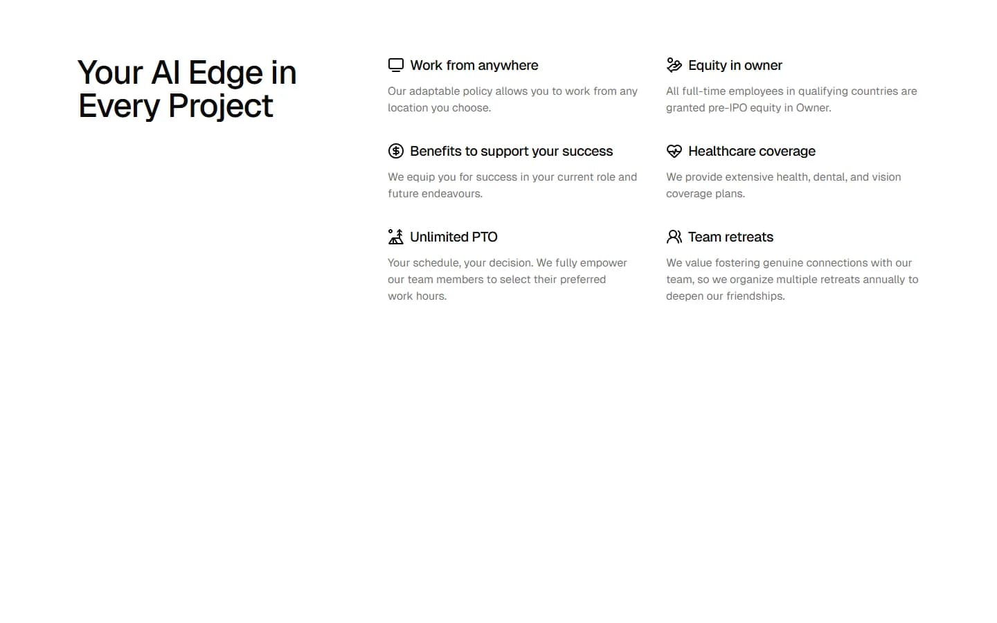
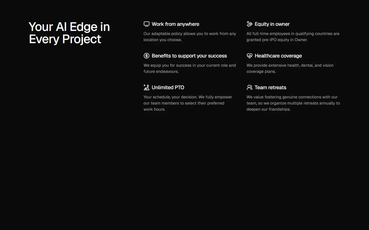
Two-column icon list
Pro
Benefits 13
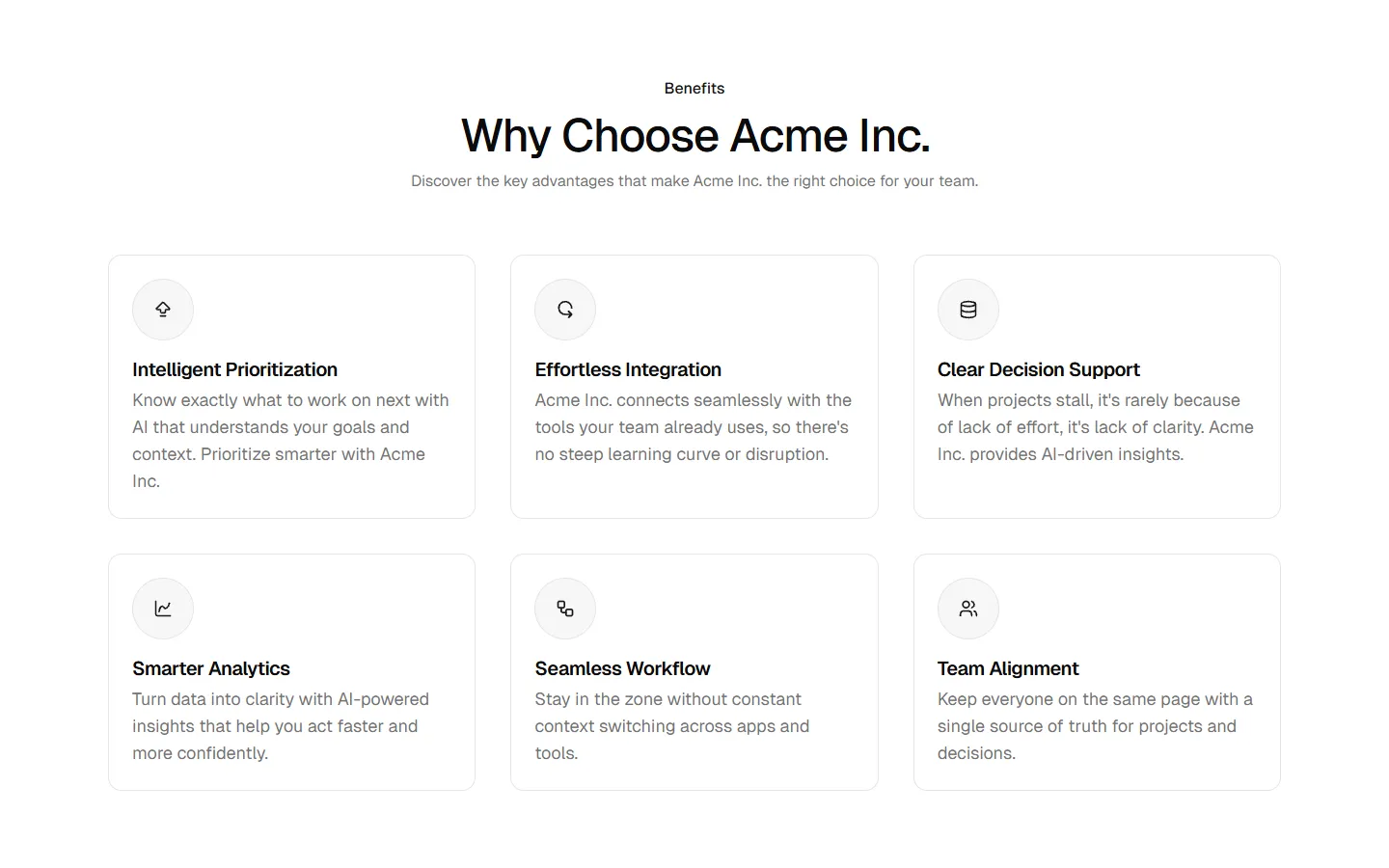
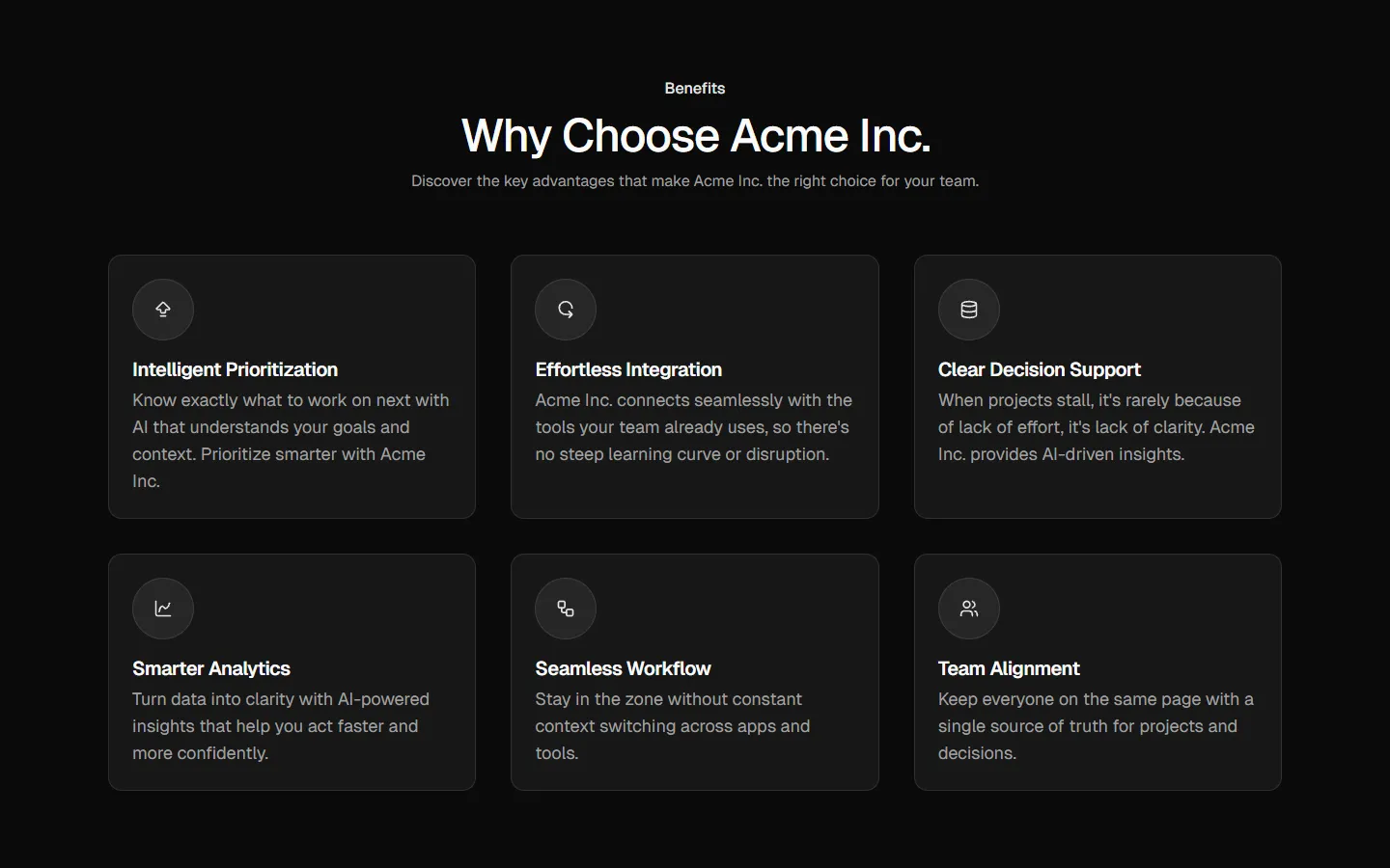
Card grid with section header
Benefits
Production-ready by default
Built with shadcn/ui conventions and designed for real projects.
Built with shadcn/ui
Clean React components using Tailwind and modern shadcn patterns.
Install instantly
Add the block directly using the shadcn CLI.
Works with your theme
Compatible with shadcn themes and token-based color systems.
MCP server support
Use shadcn MCP server right from your favorite AI tools.
