All Contact blocks
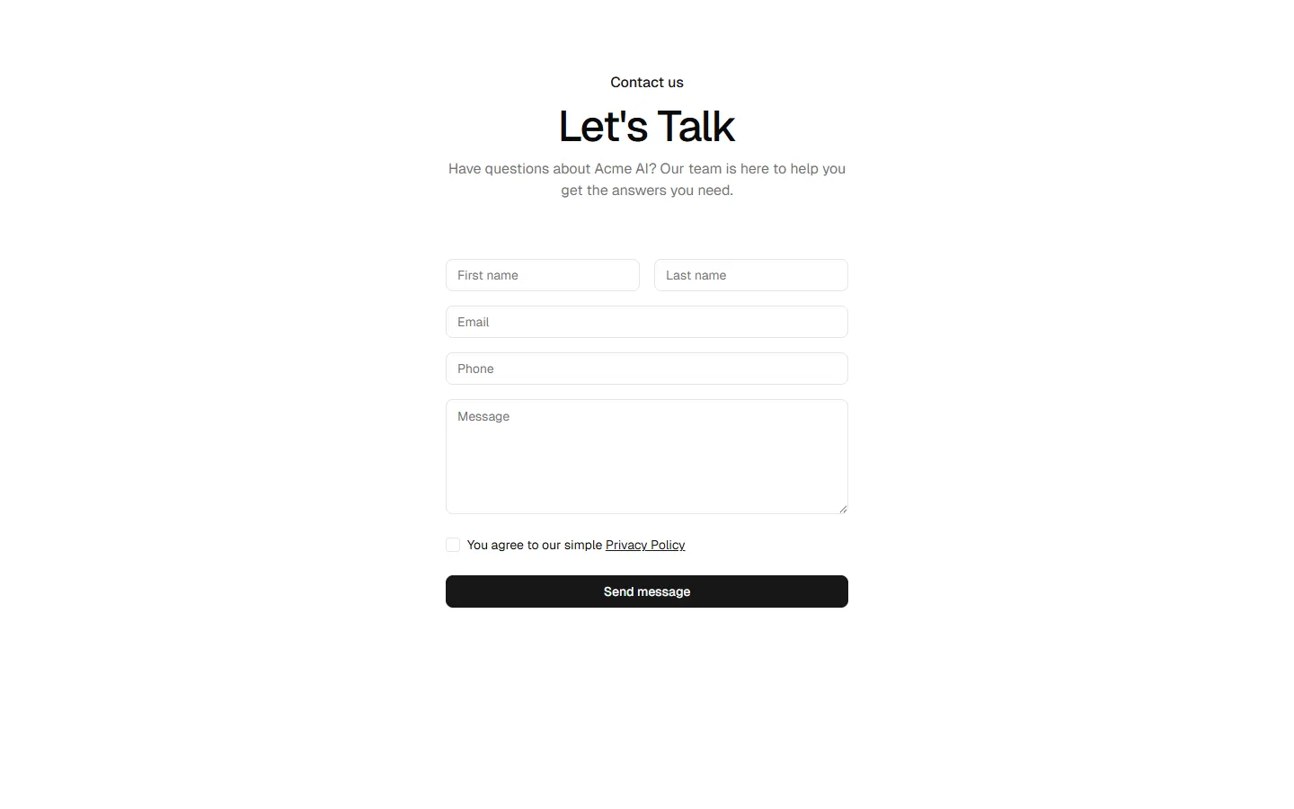
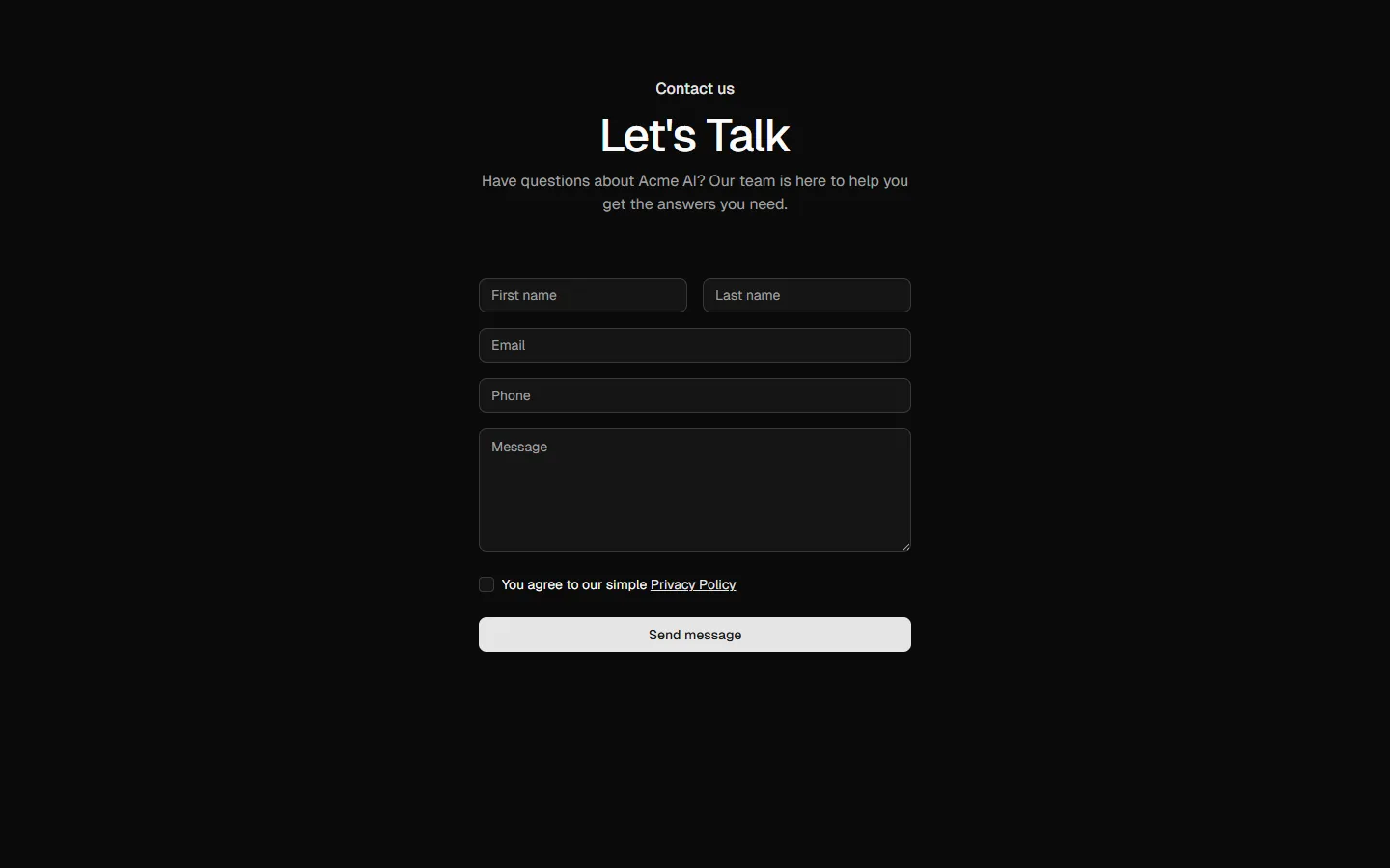
Contact 3
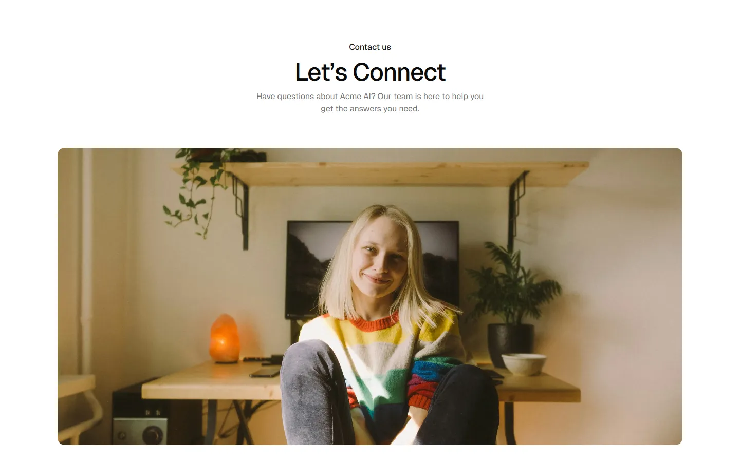
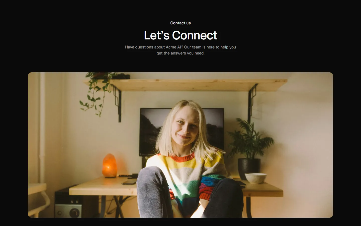
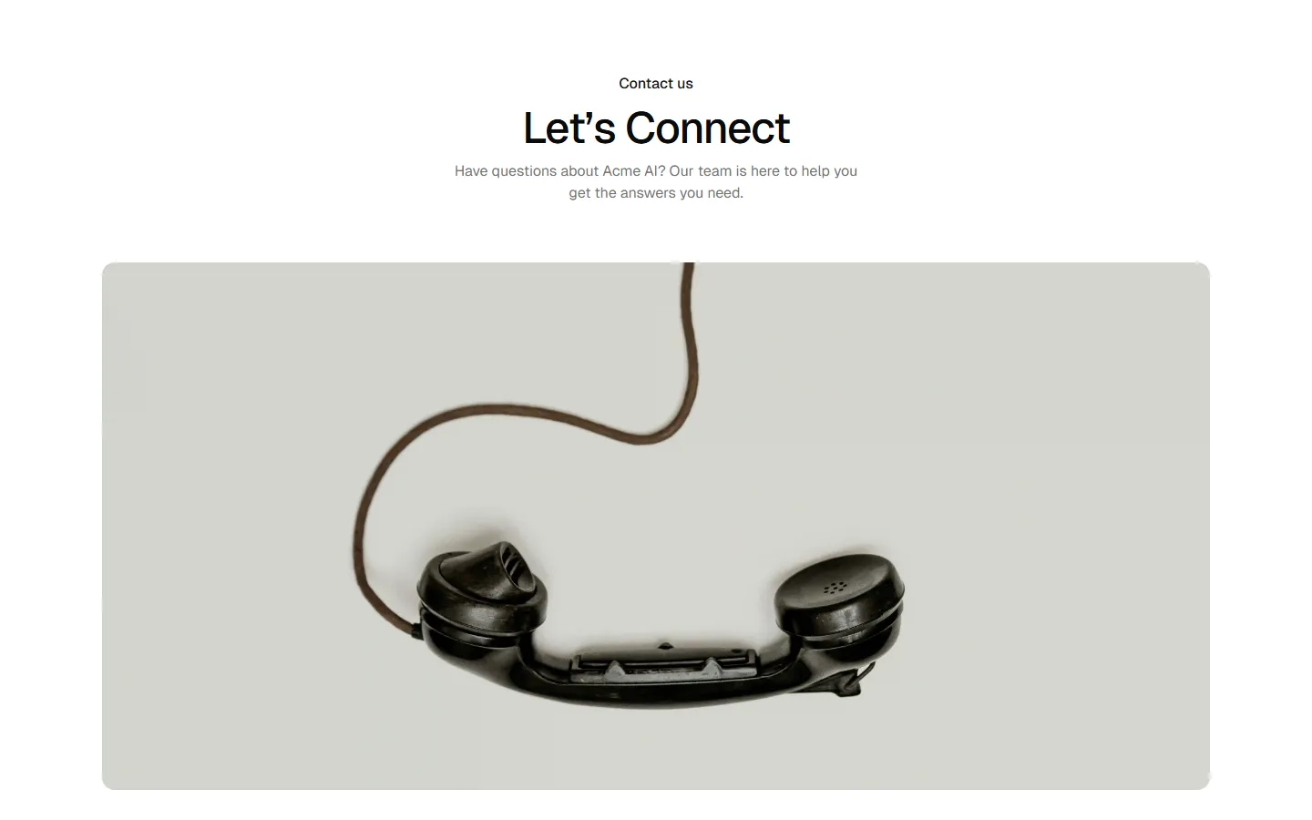
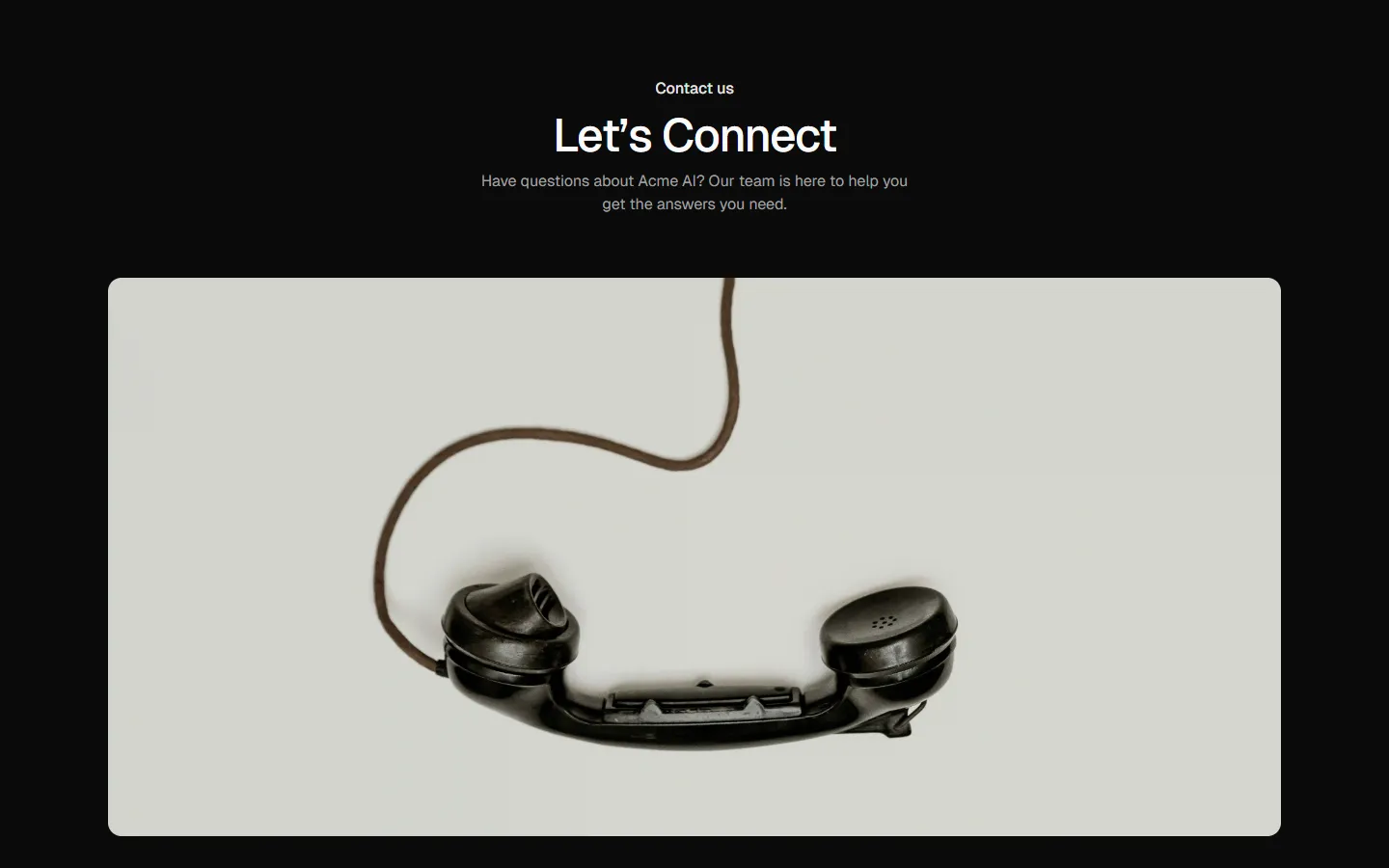
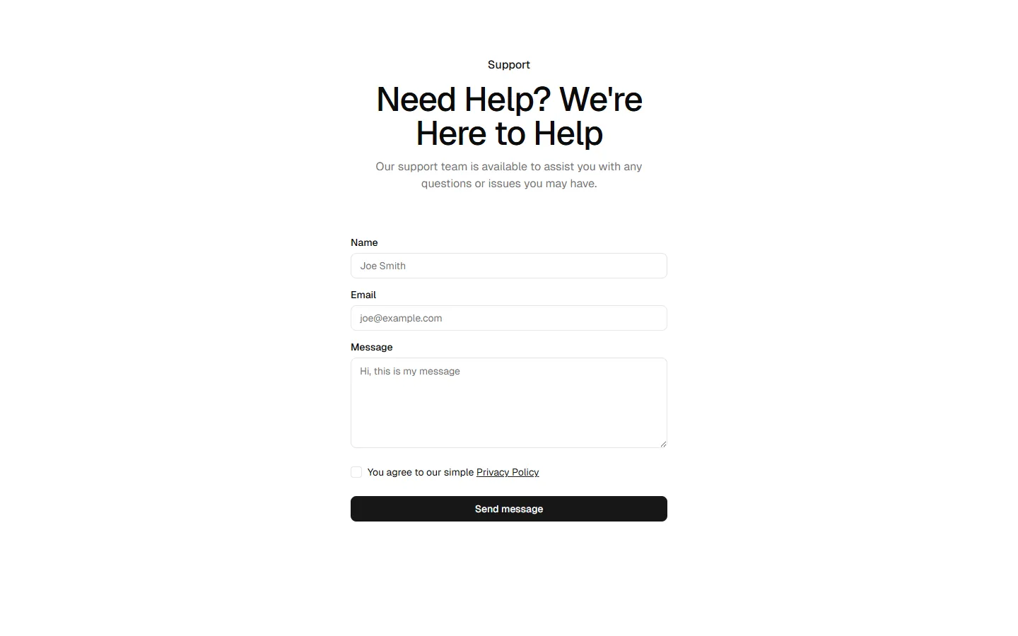
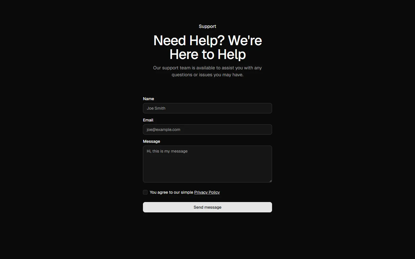
Split form with image
A two-column layout pairing a contact form with a large supporting image. The image adds personality and visual balance while the form stays clear and readable. Works well when you want the contact section to feel more human and less transactional.
Pro Marketing Figma React
All blocks
More Contact
Pro
Contact 1
Centered form, single-column
Pro
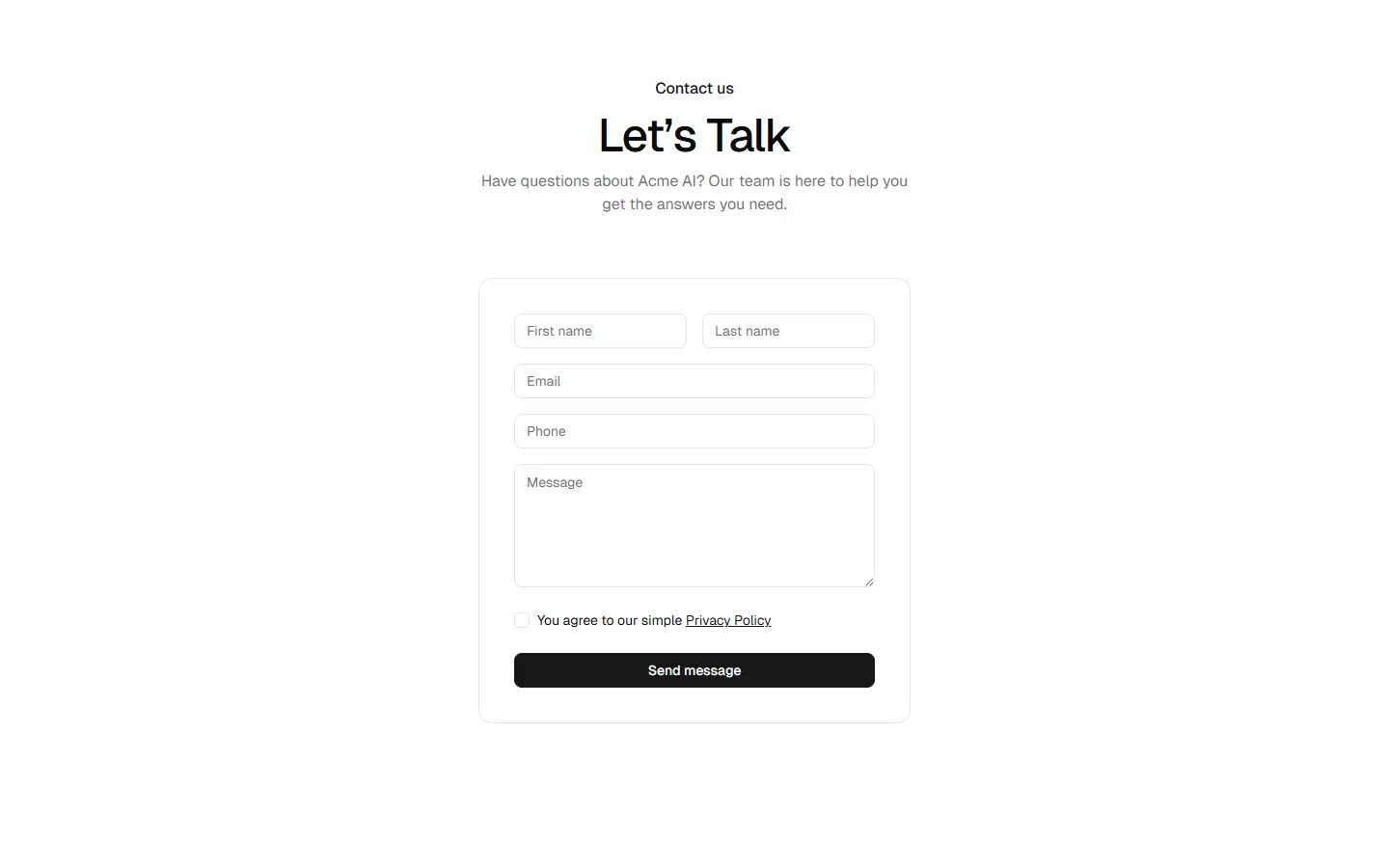
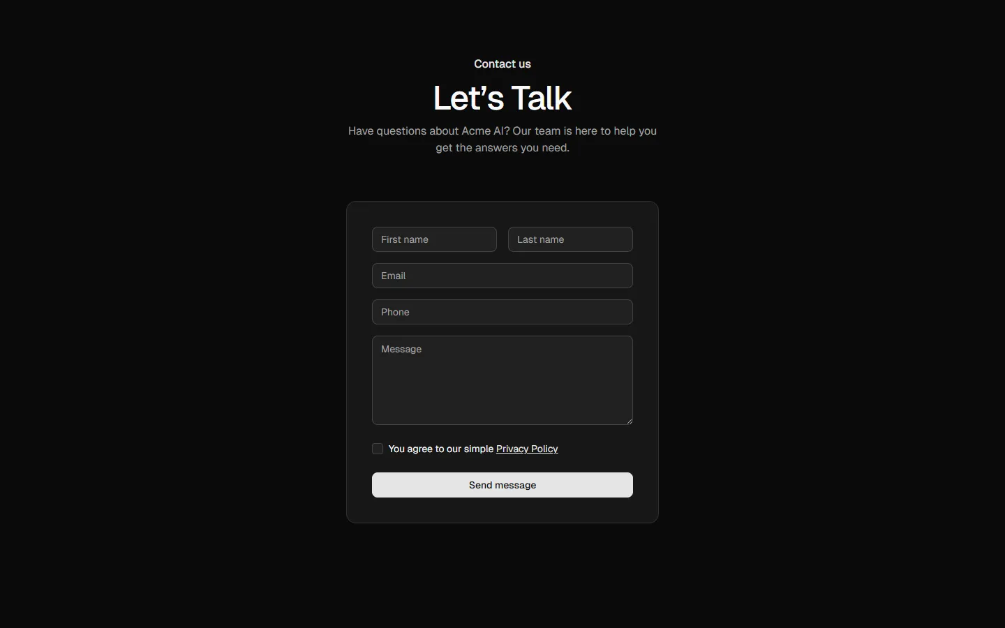
Contact 2
Centered form in card
Pro
Contact 4
Multi-channel contact options
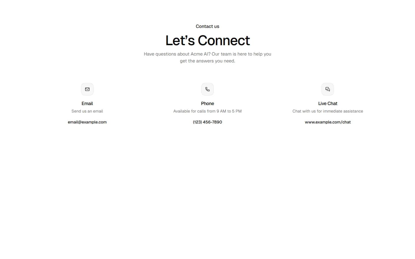
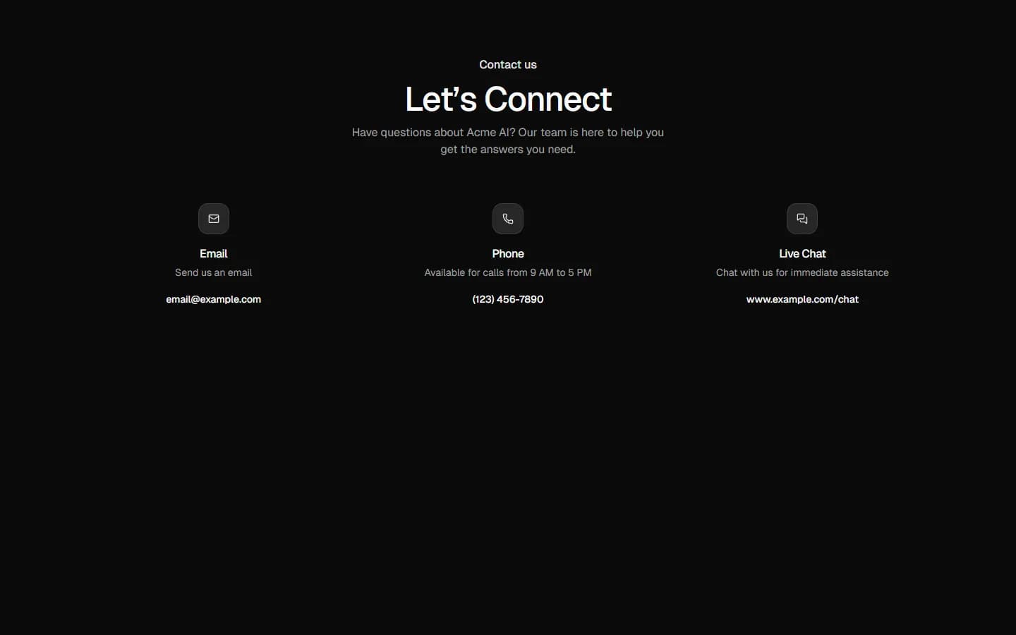
Pro
Contact 5
Global presence with contact methods
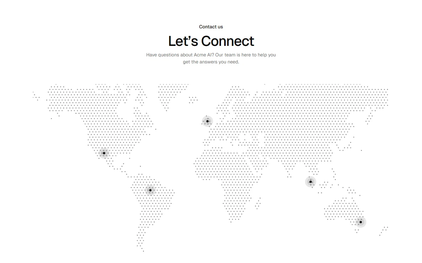
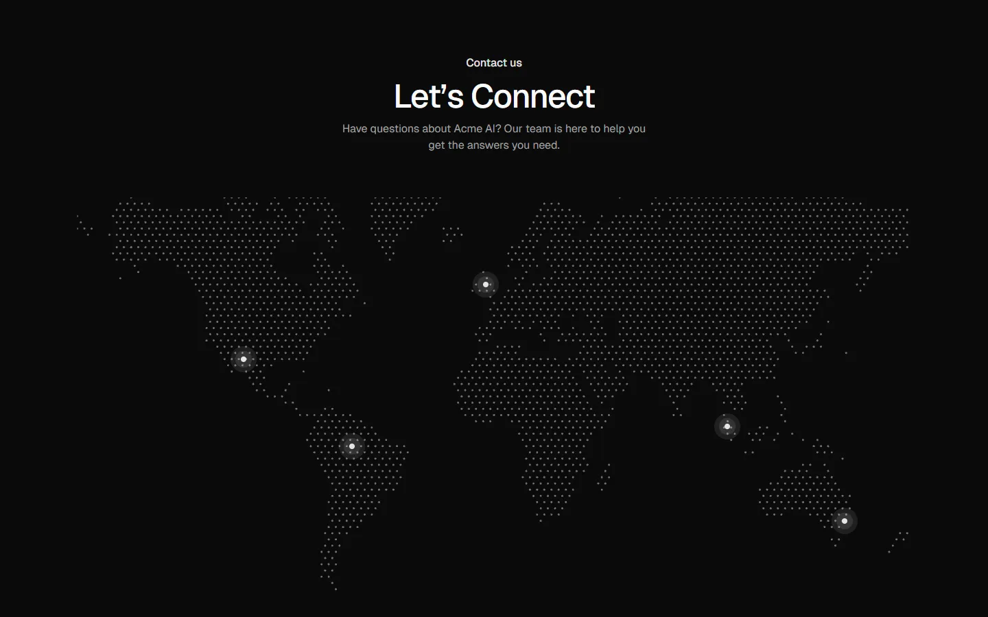
Pro
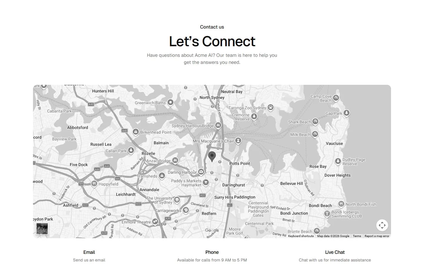
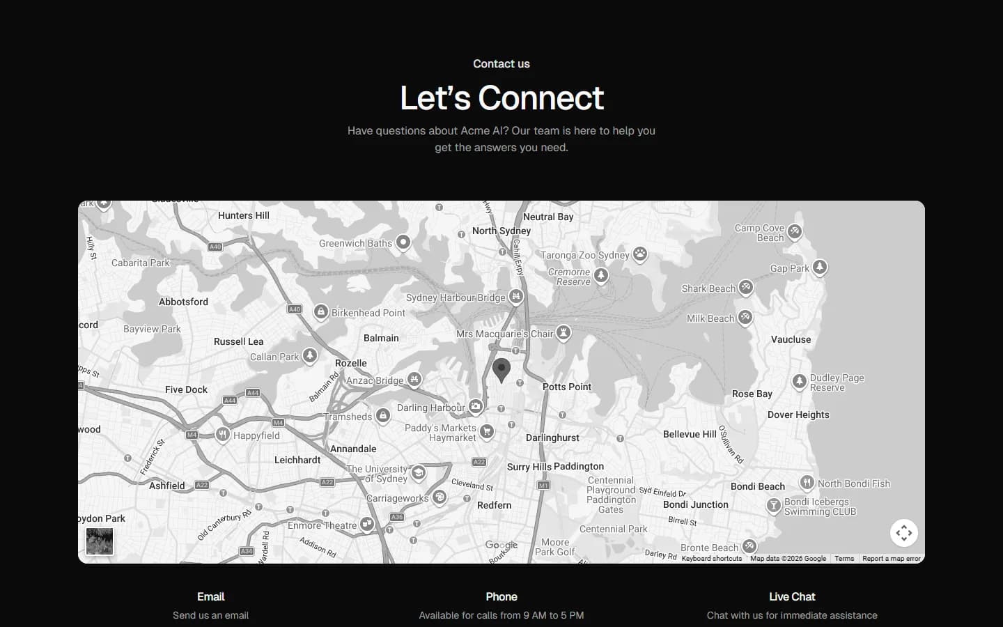
Contact 6
Map-first contact
Pro
Contact 7
Image-led contact
Pro
Contact 8
Hero image with channel cards
Pro
Contact 9
Centered CTA panel
Pro
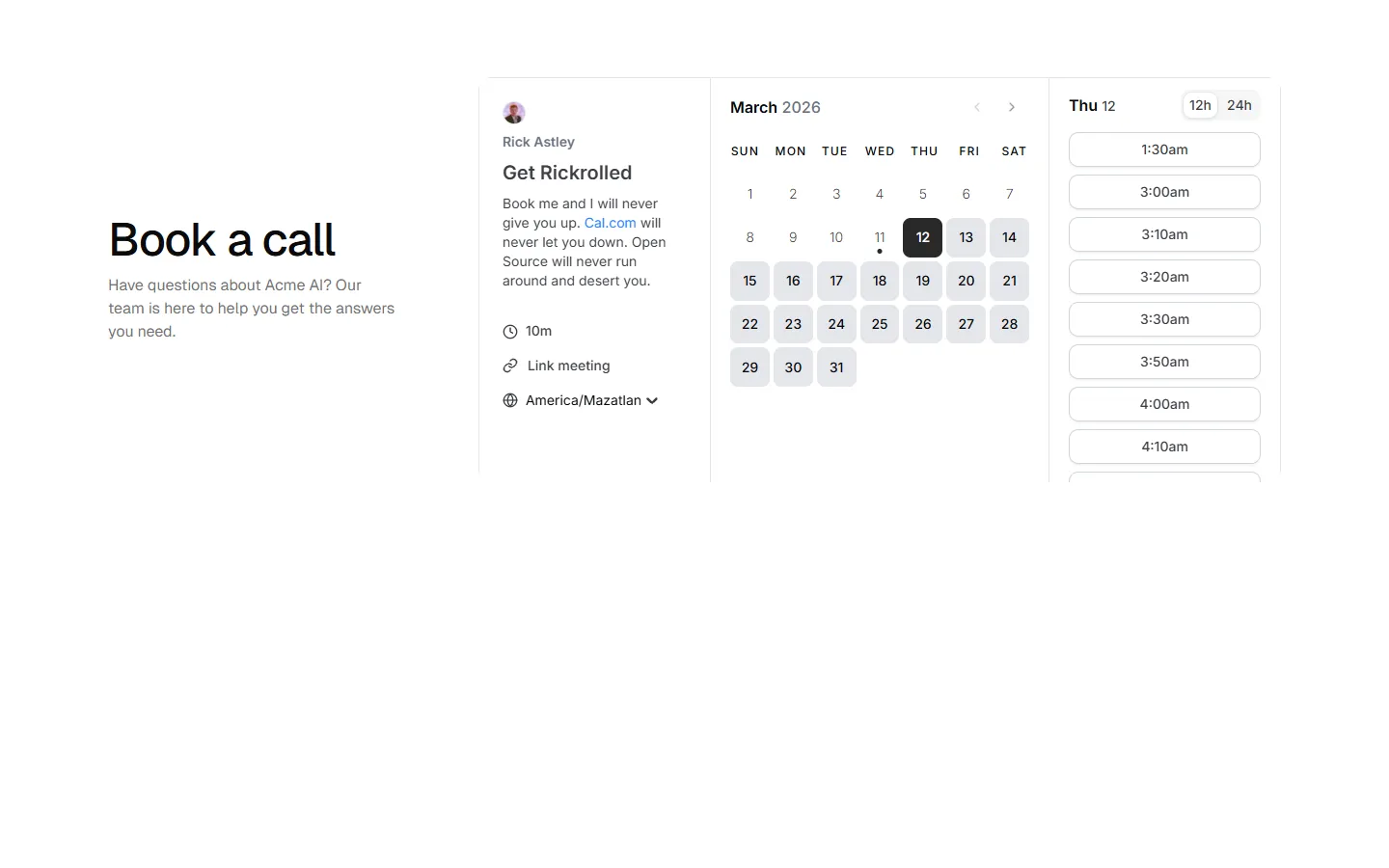
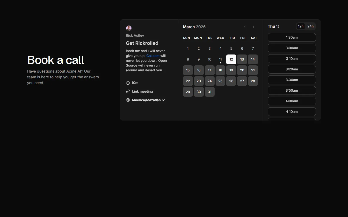
Contact 10
Split layout with embedded scheduler
Pro
Contact 11
Centered form with supporting sidebar
Benefits
Production-ready by default
Built with shadcn/ui conventions and designed for real projects.
Built with shadcn/ui
Clean React components using Tailwind and modern shadcn patterns.
Install instantly
Add the block directly using the shadcn CLI.
Works with your theme
Compatible with shadcn themes and token-based color systems.
MCP server support
Use shadcn MCP server right from your favorite AI tools.
