All Contact blocks
Contact 7
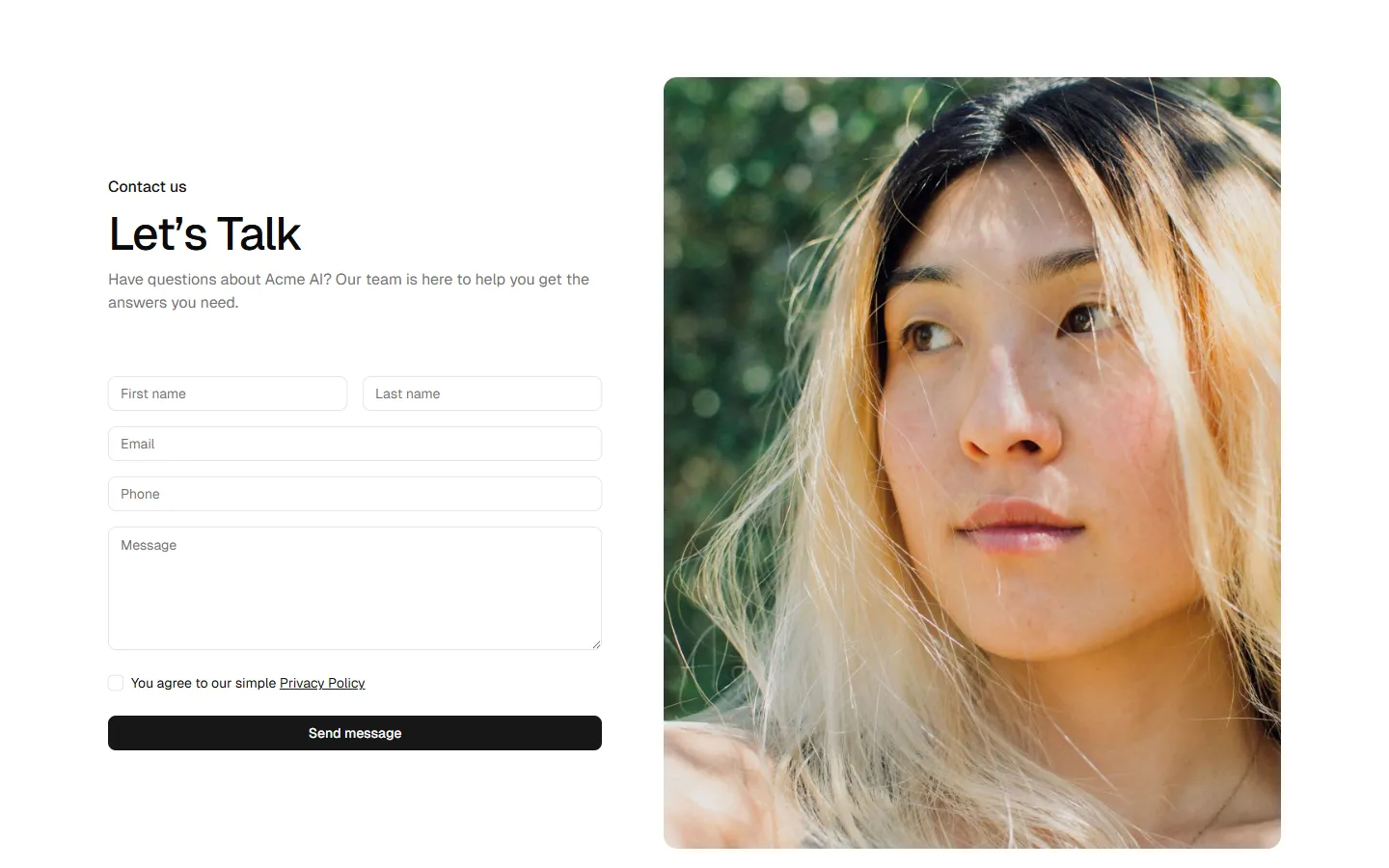
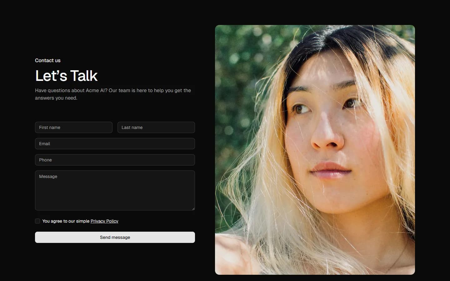
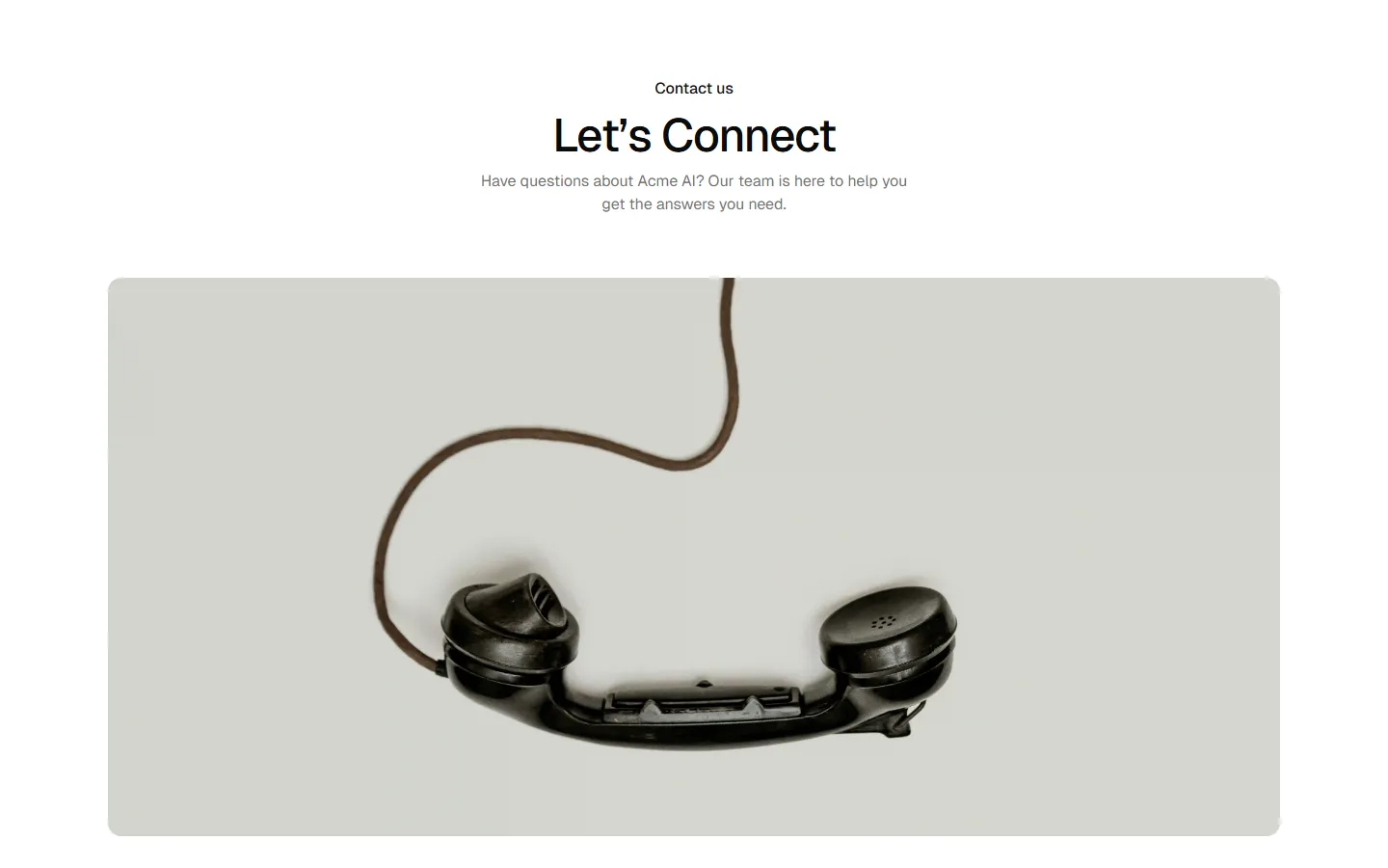
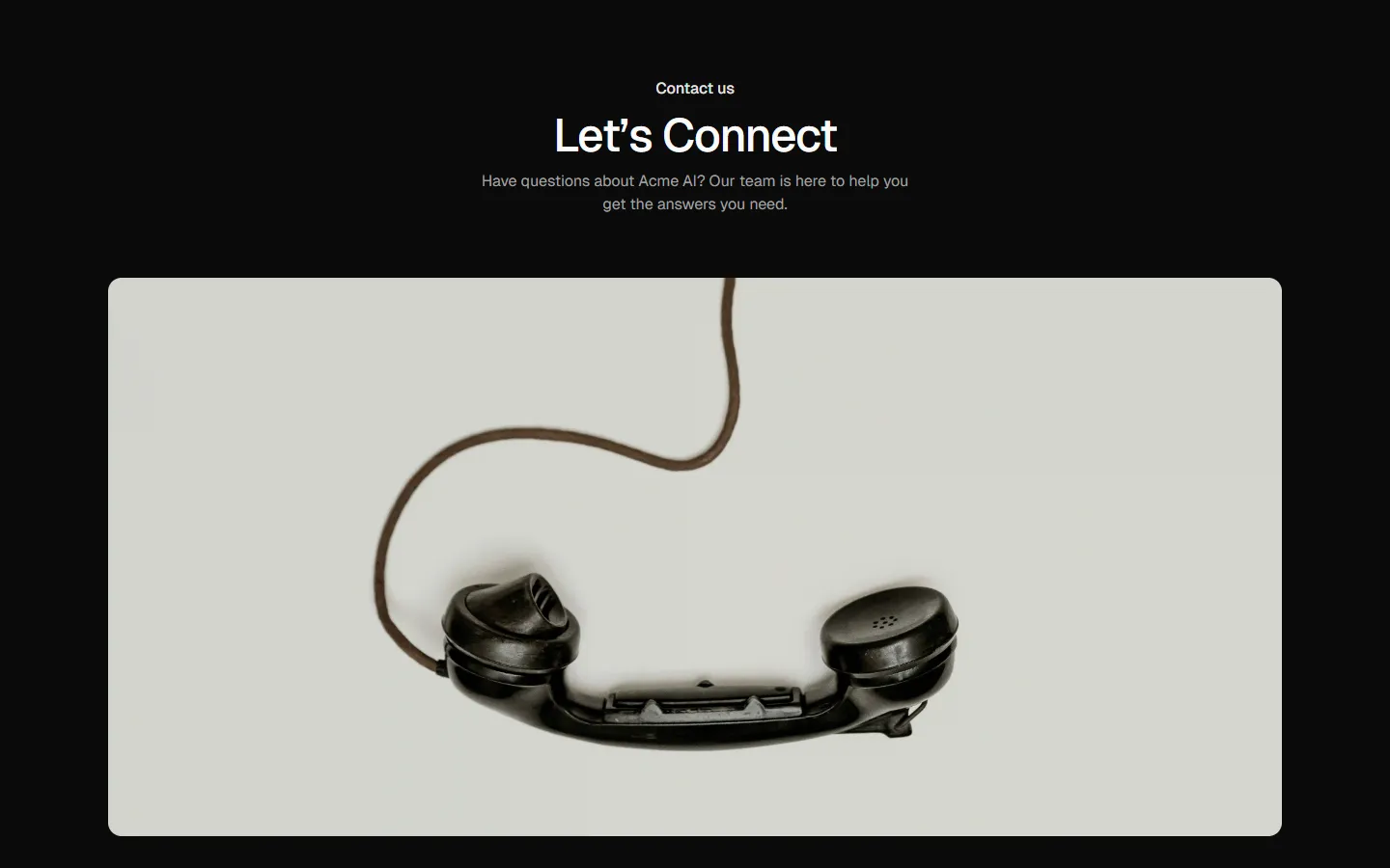
Image-led contact
A contact layout anchored by a large, friendly image, with key contact options displayed clearly below and in a side panel. Good for brands that want to feel personal and approachable without using a full form upfront.
Pro Marketing Figma React
All blocks
More Contact
Pro
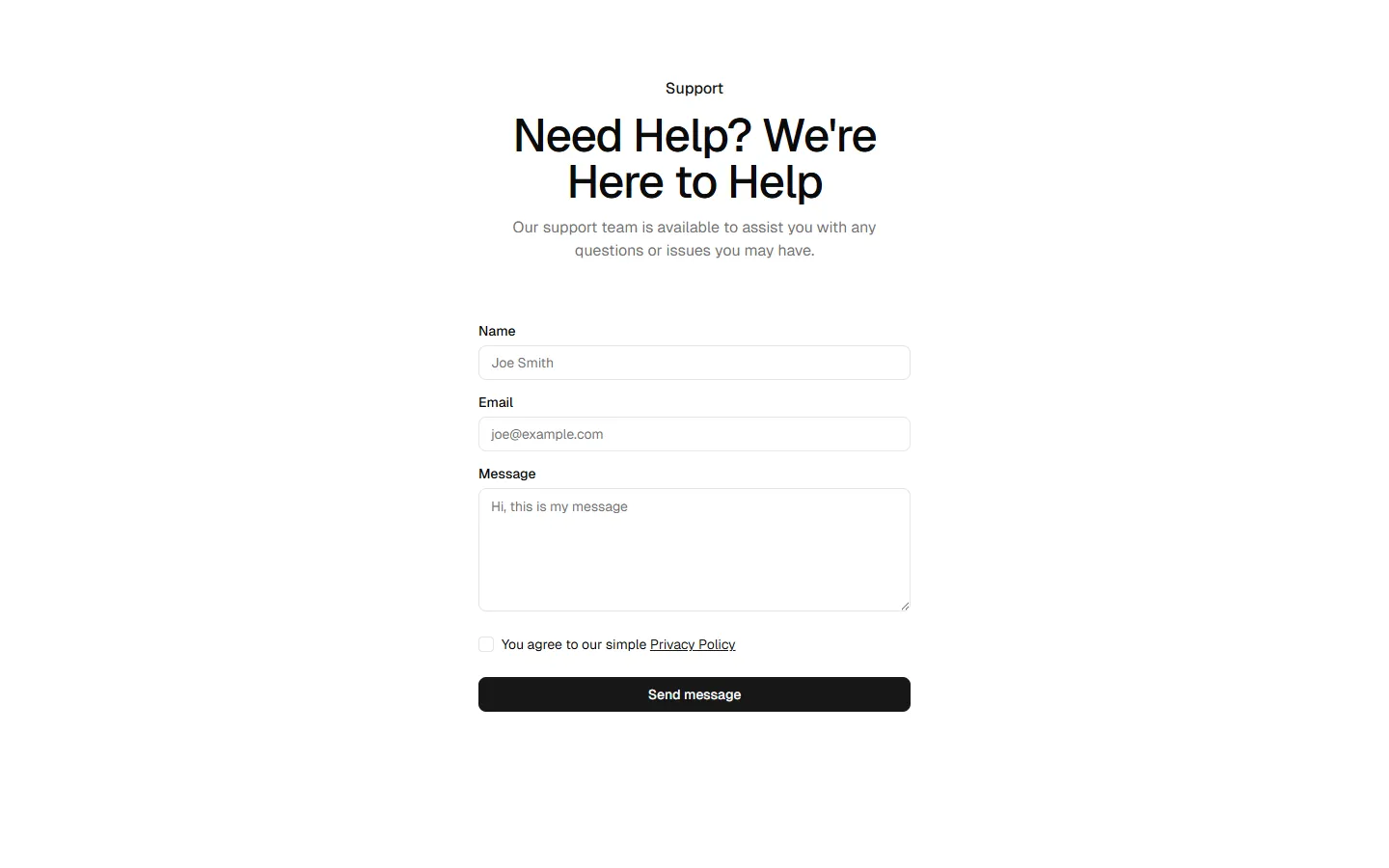
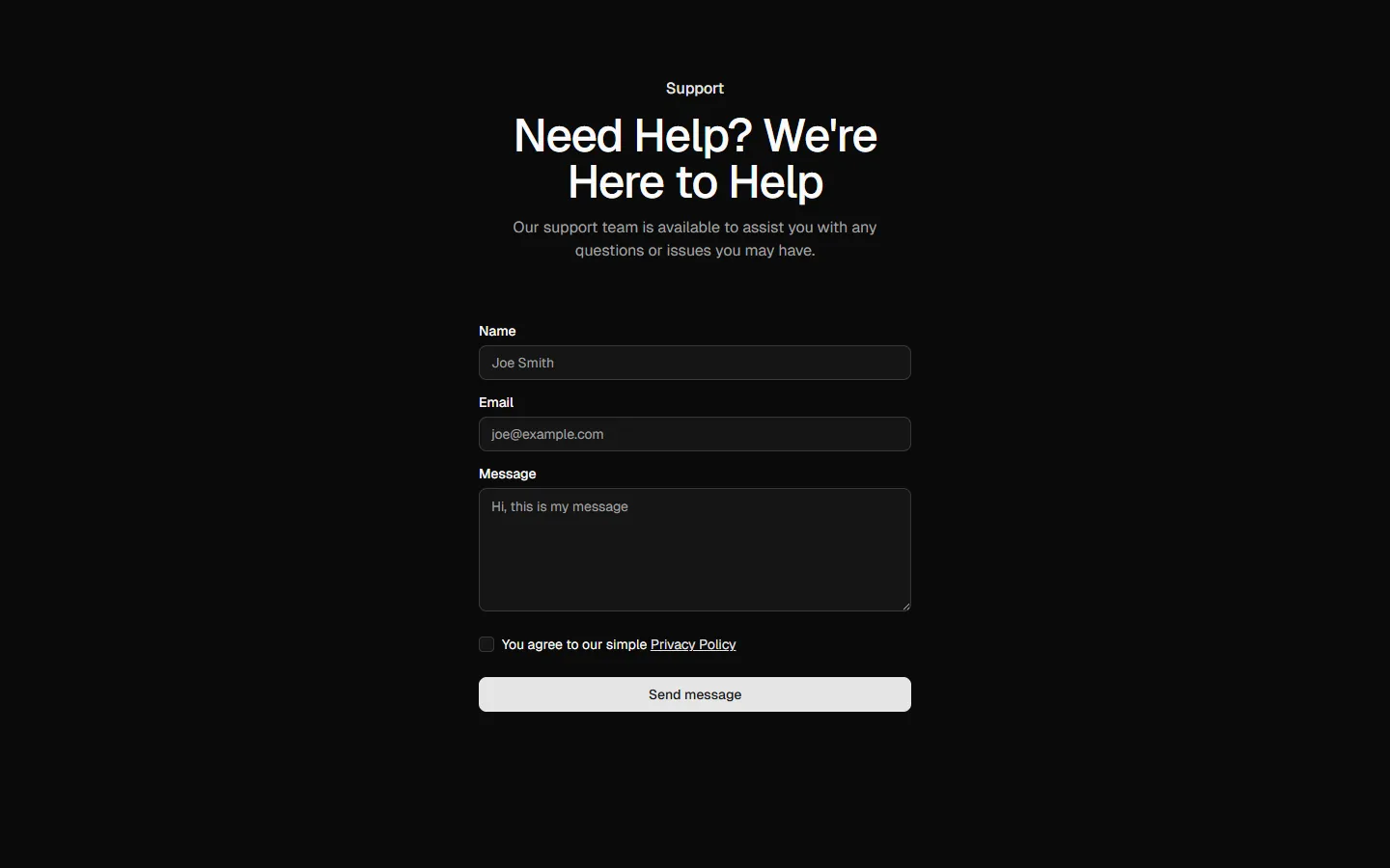
Contact 1
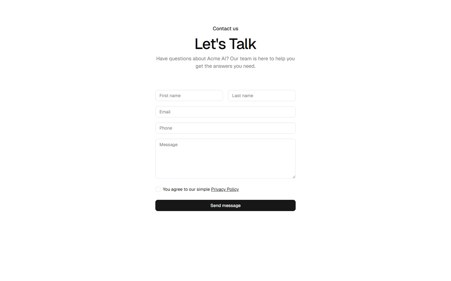
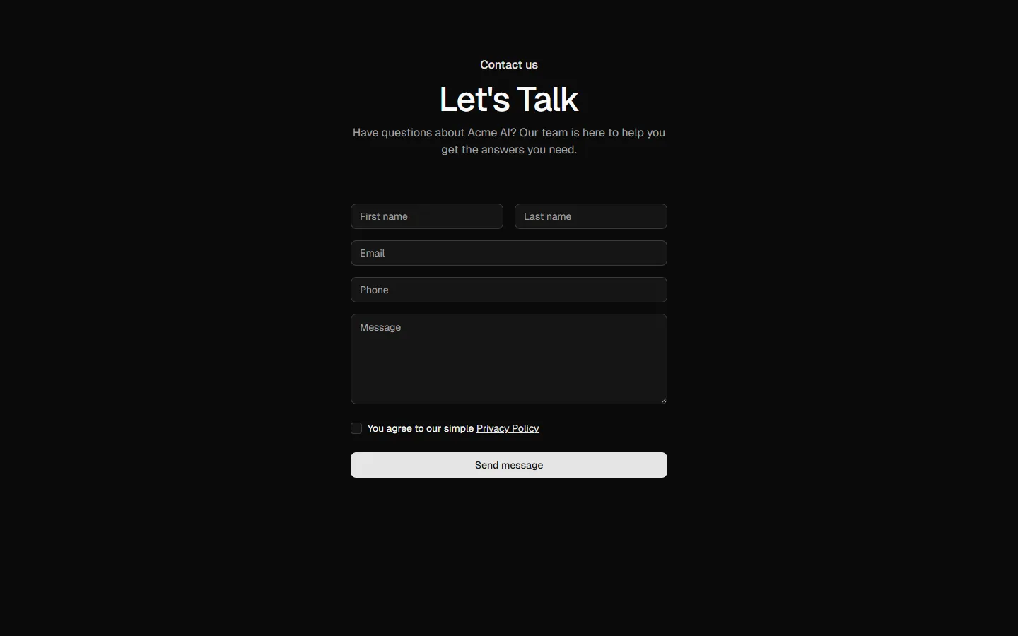
Centered form, single-column
Pro
Contact 2
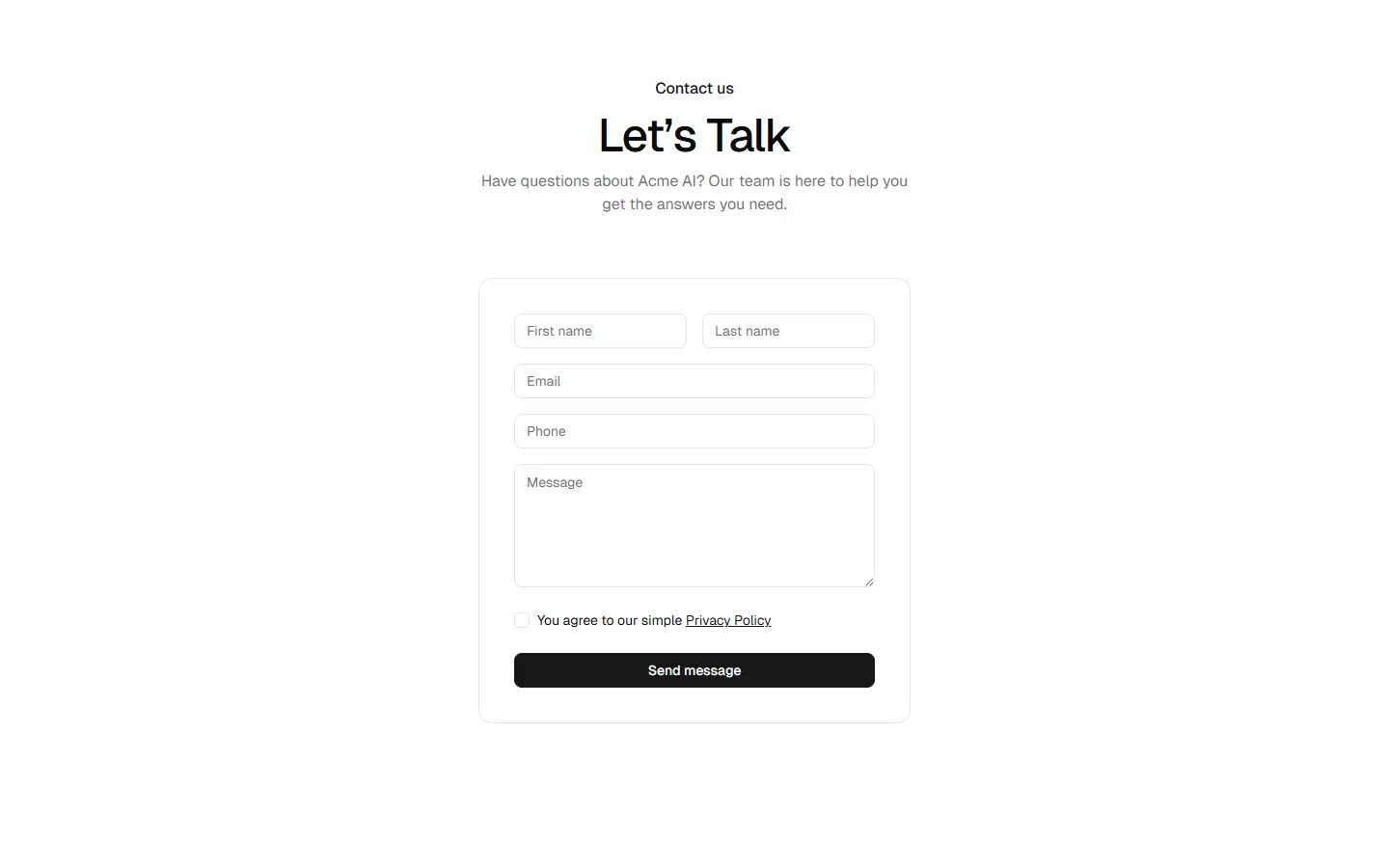
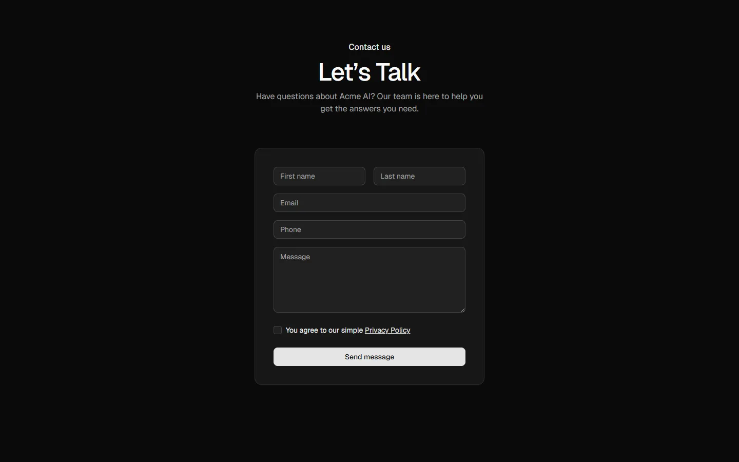
Centered form in card
Pro
Contact 3
Split form with image
Pro
Contact 4
Multi-channel contact options
Pro
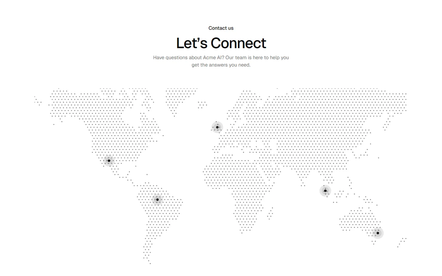
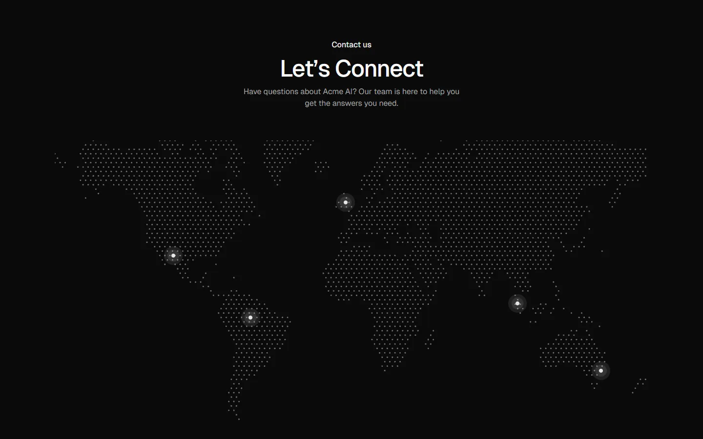
Contact 5
Global presence with contact methods
Pro
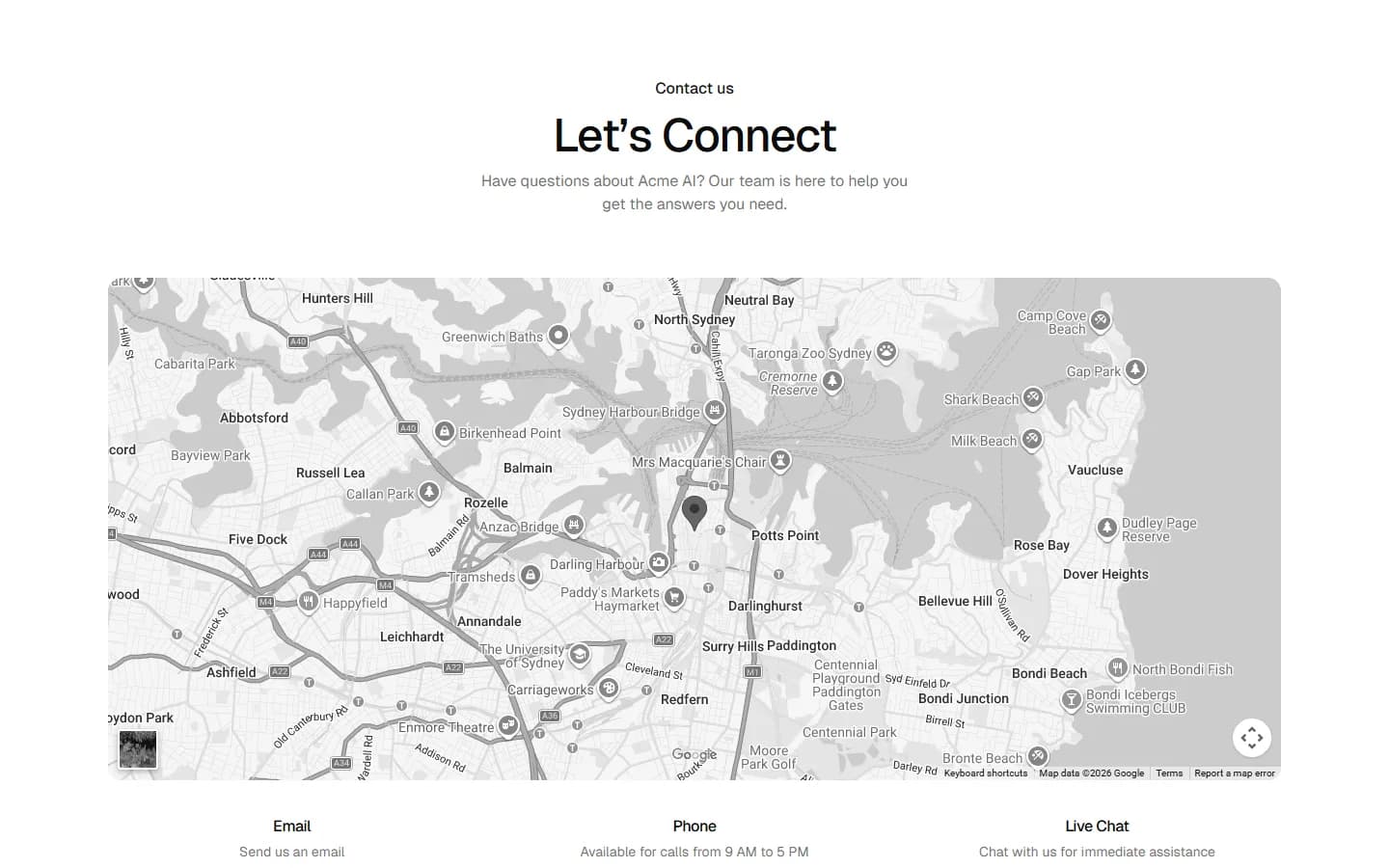
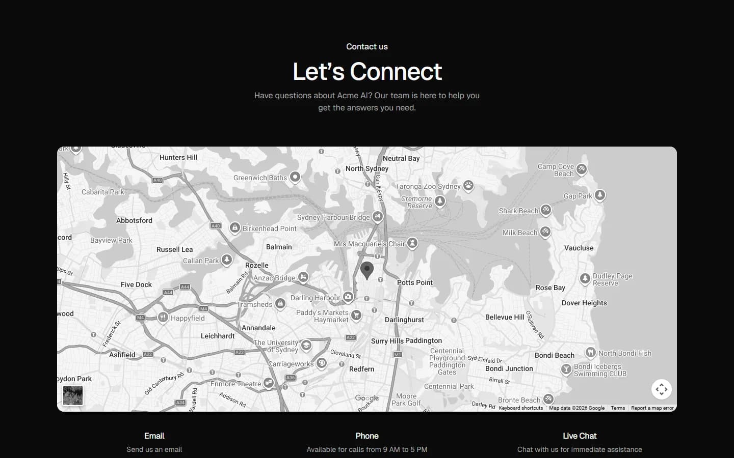
Contact 6
Map-first contact
Pro
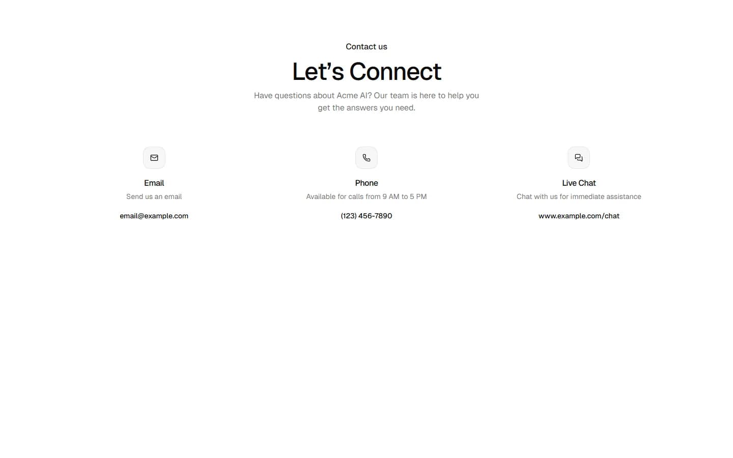
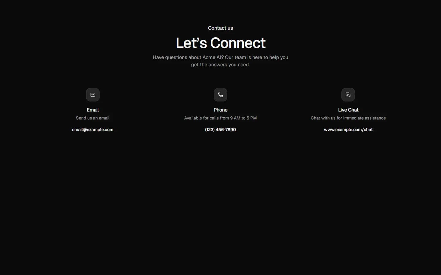
Contact 8
Hero image with channel cards
Pro
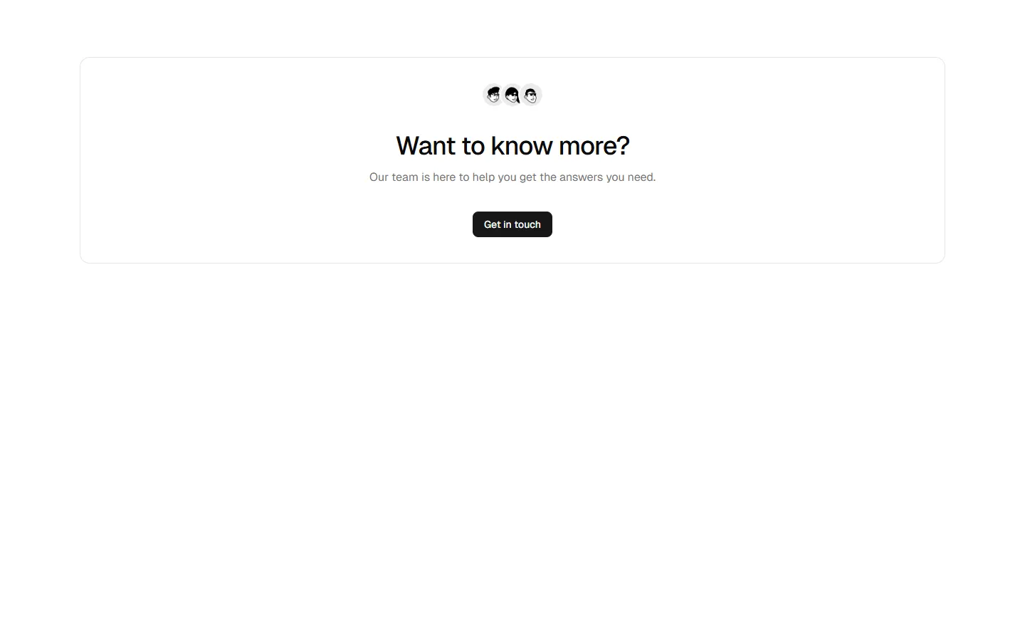
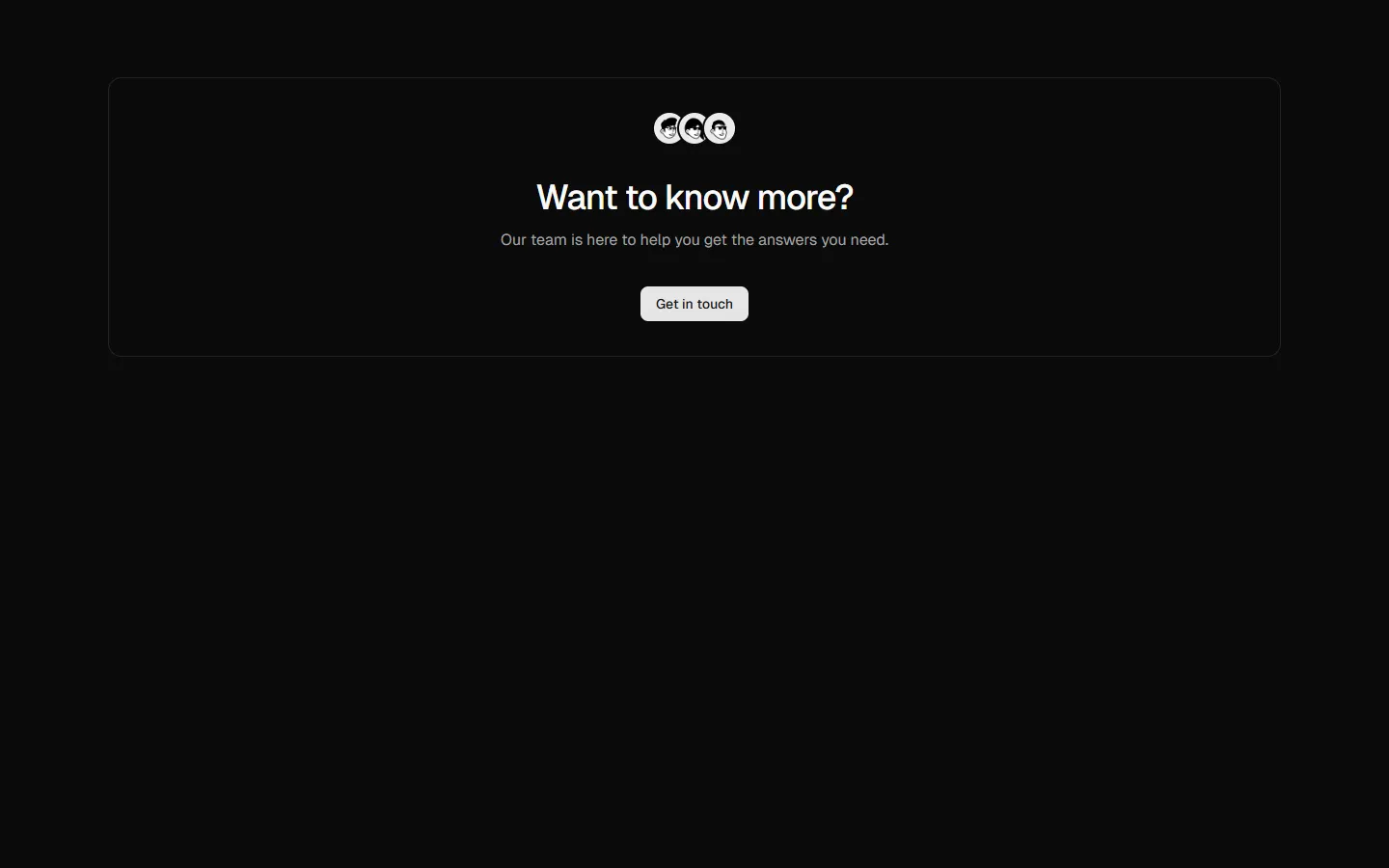
Contact 9
Centered CTA panel
Pro
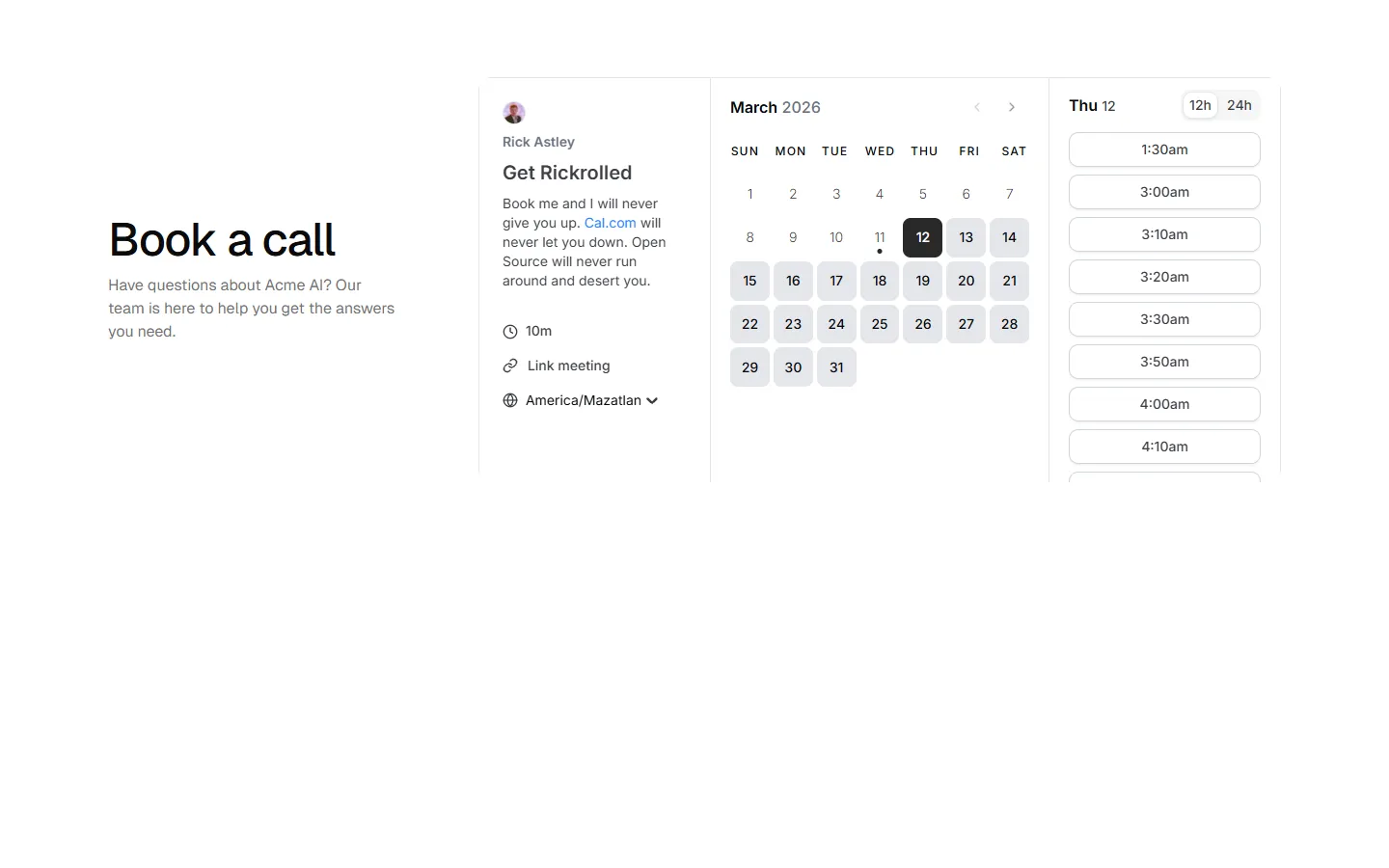
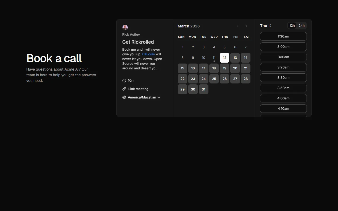
Contact 10
Split layout with embedded scheduler
Pro
Contact 11
Centered form with supporting sidebar
Benefits
Production-ready by default
Built with shadcn/ui conventions and designed for real projects.
Built with shadcn/ui
Clean React components using Tailwind and modern shadcn patterns.
Install instantly
Add the block directly using the shadcn CLI.
Works with your theme
Compatible with shadcn themes and token-based color systems.
MCP server support
Use shadcn MCP server right from your favorite AI tools.
