All Top Navigation blocks
Top Navigation 3
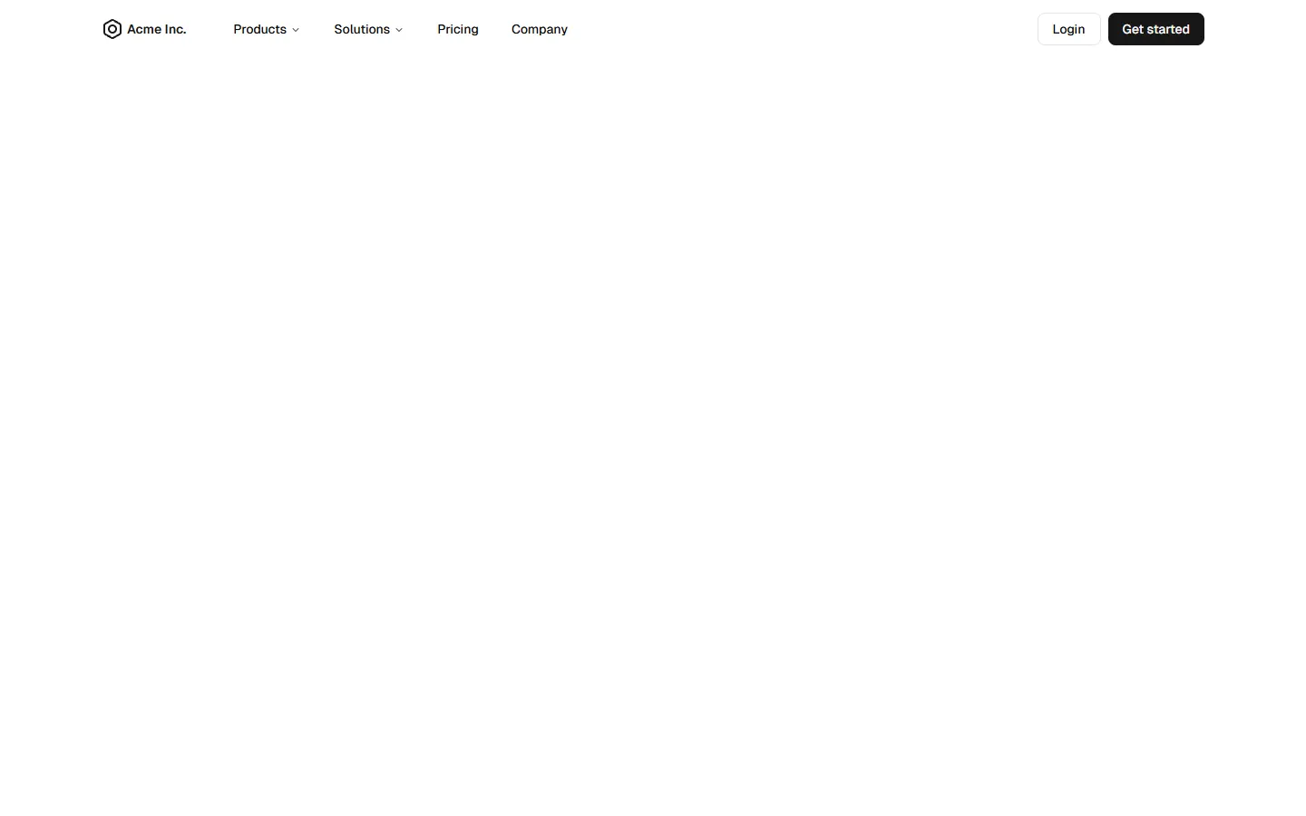
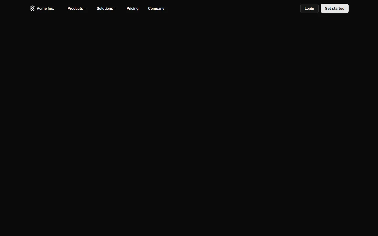
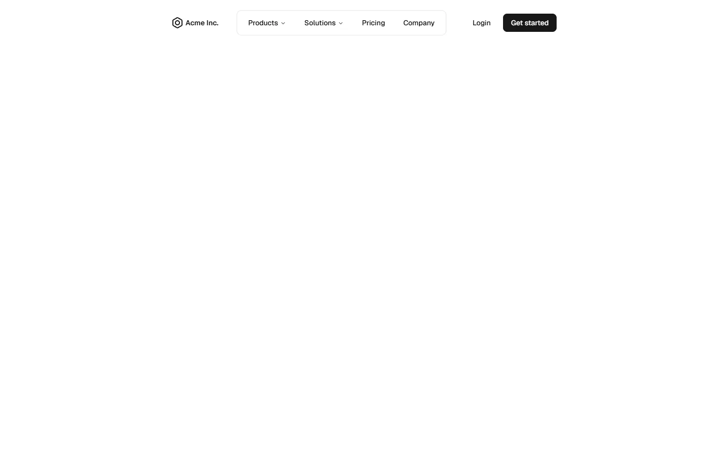
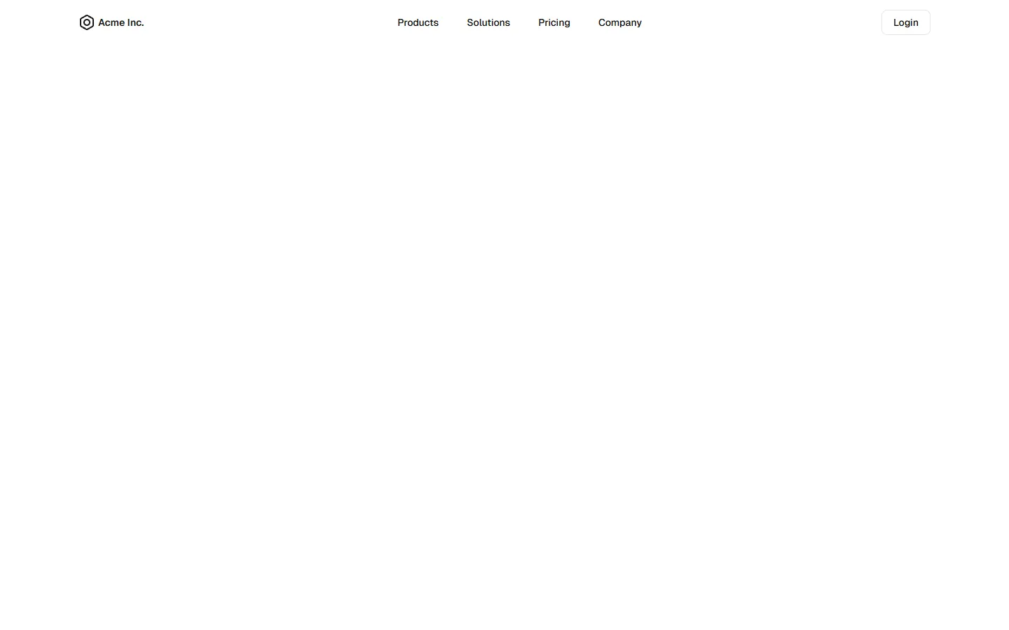
Compact bar with progressive disclosure
A compact top navigation that keeps the large-screen layout minimal and low-profile, with primary links arranged in a single horizontal bar. Dropdowns reveal richer, icon-led menus only when needed, keeping visual noise down by default. On smaller screens, the same structure expands into a stacked, panel-style menu with nested sections, preserving hierarchy while shifting emphasis to vertical scanning and tap targets.
Pro Marketing Figma React

Benefits
Production-ready by default
Built with shadcn/ui conventions and designed for real projects.
Built with shadcn/ui
Clean React components using Tailwind and modern shadcn patterns.
Install instantly
Add the block directly using the shadcn CLI.
Works with your theme
Compatible with shadcn themes and token-based color systems.
MCP server support
Use shadcn MCP server right from your favorite AI tools.
