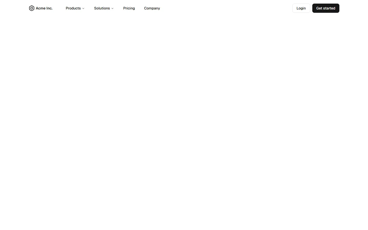
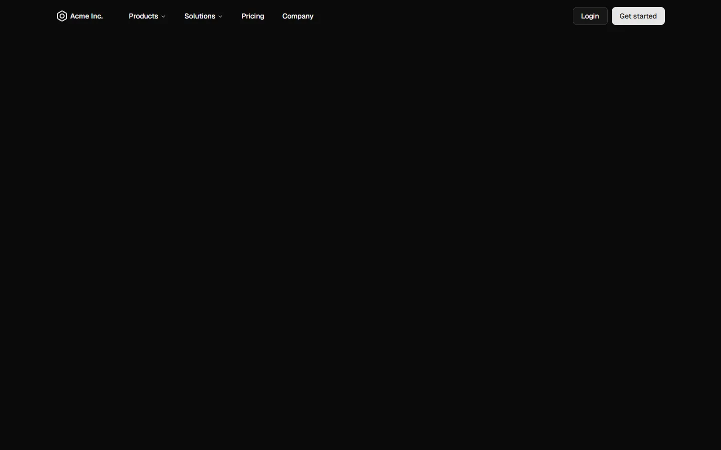
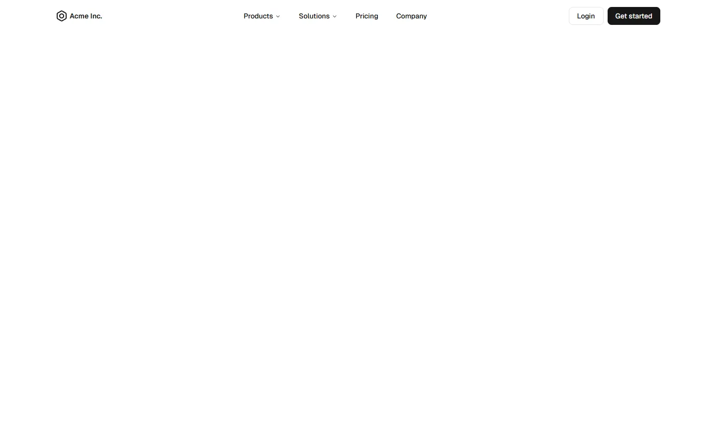
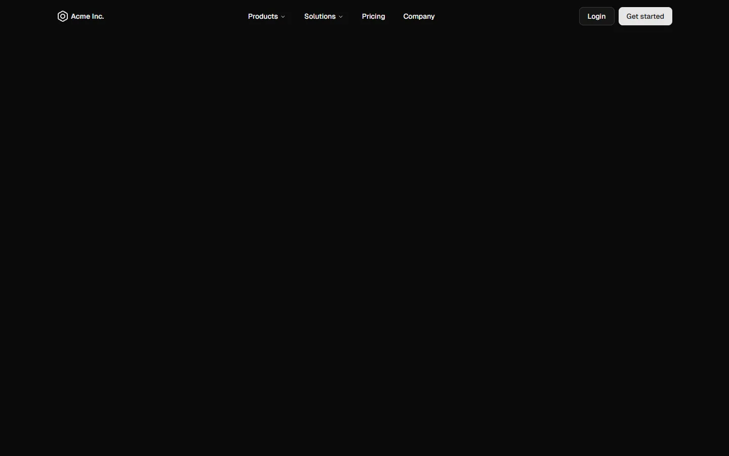
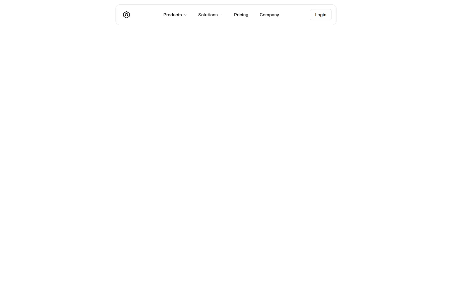
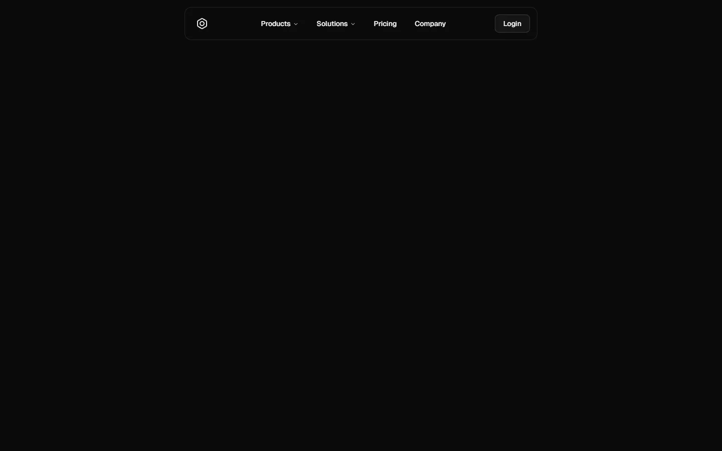
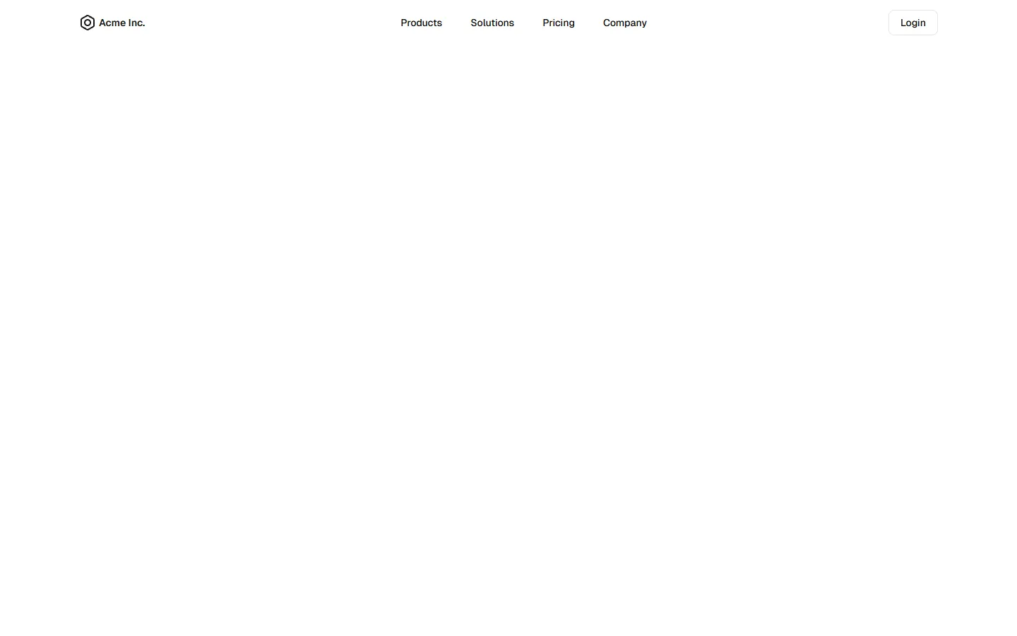
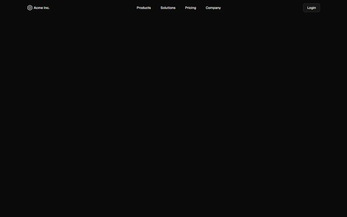
Top Navigation 4
Centered pill navigation with dropdown menu
A centered top navigation where primary links sit inside a pill-style container, creating a strong visual anchor across large screens. Dropdown menus open from the center group to reveal secondary links in a compact panel. On small screens, the layout collapses into a full-height drawer with stacked links and clear primary actions, maintaining the same information structure while prioritizing tap comfort and readability.
Production-ready by default
Built with shadcn/ui conventions and designed for real projects.
Clean React components using Tailwind and modern shadcn patterns.
Add the block directly using the shadcn CLI.
Compatible with shadcn themes and token-based color systems.
Use shadcn MCP server right from your favorite AI tools.
