Product Details 1
Product overview with configuration
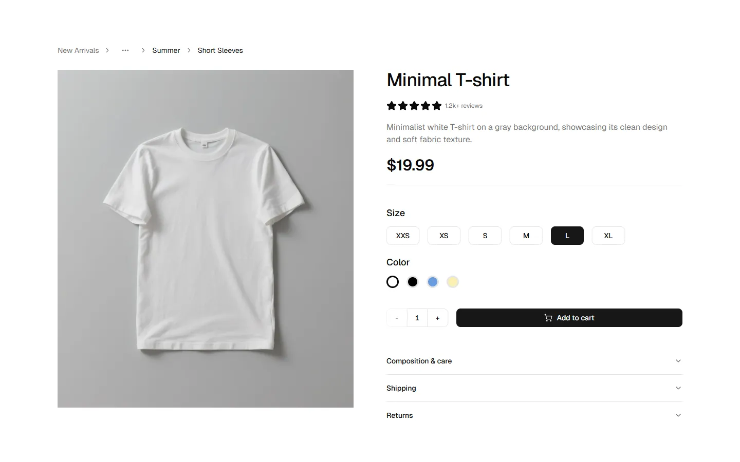
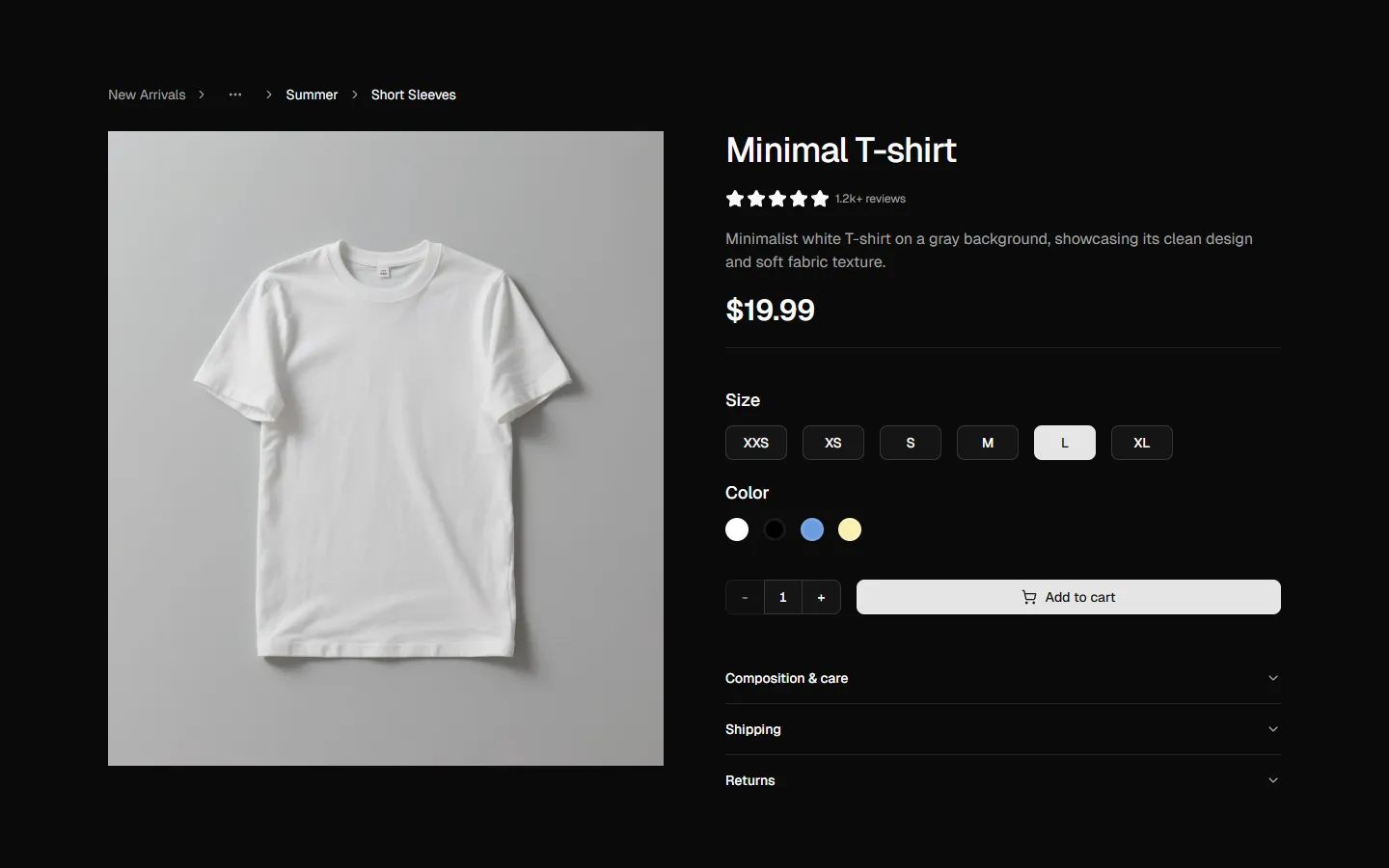
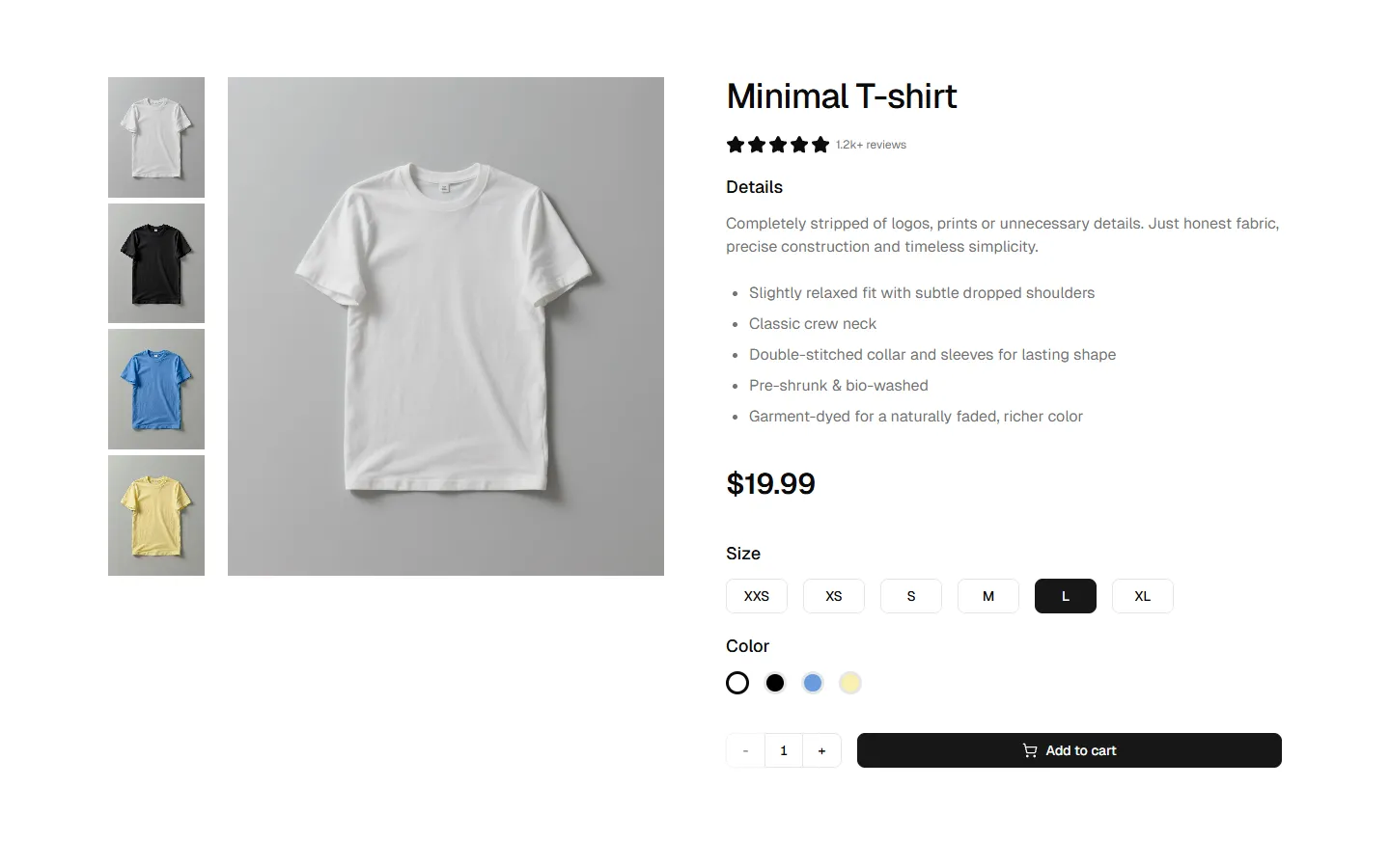
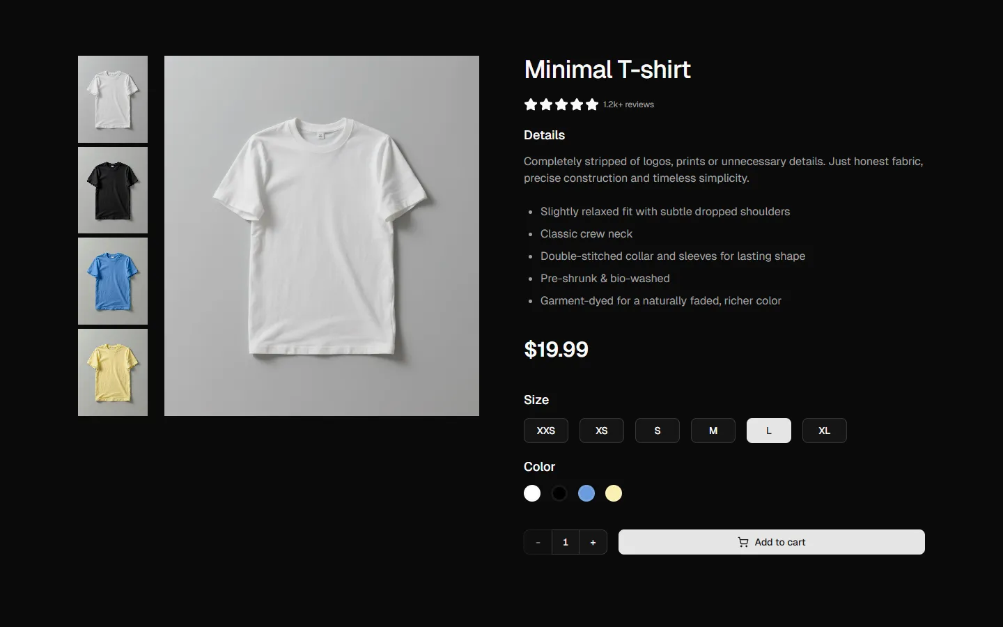
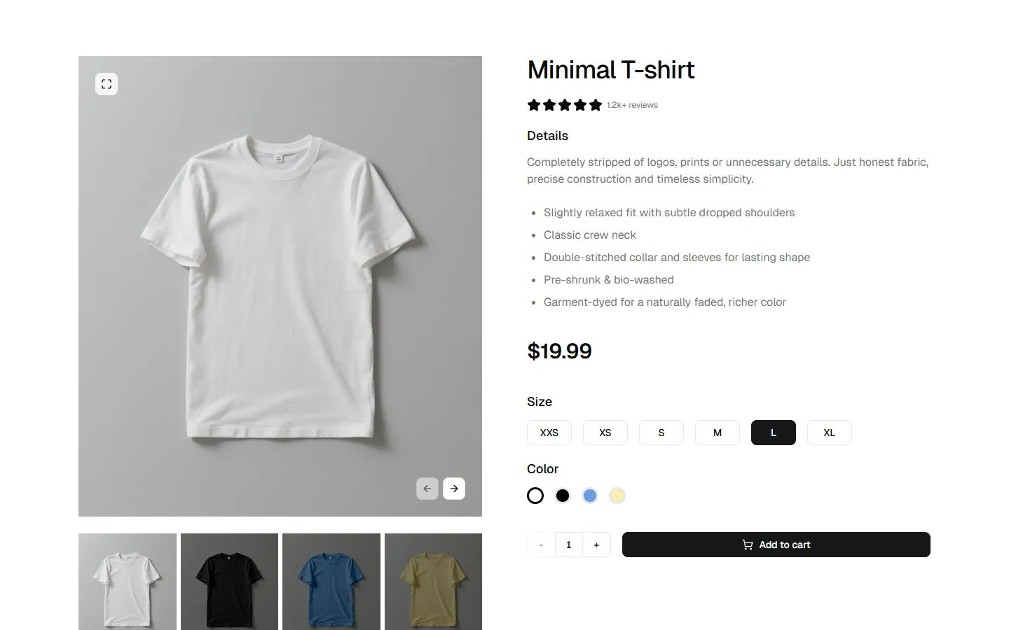
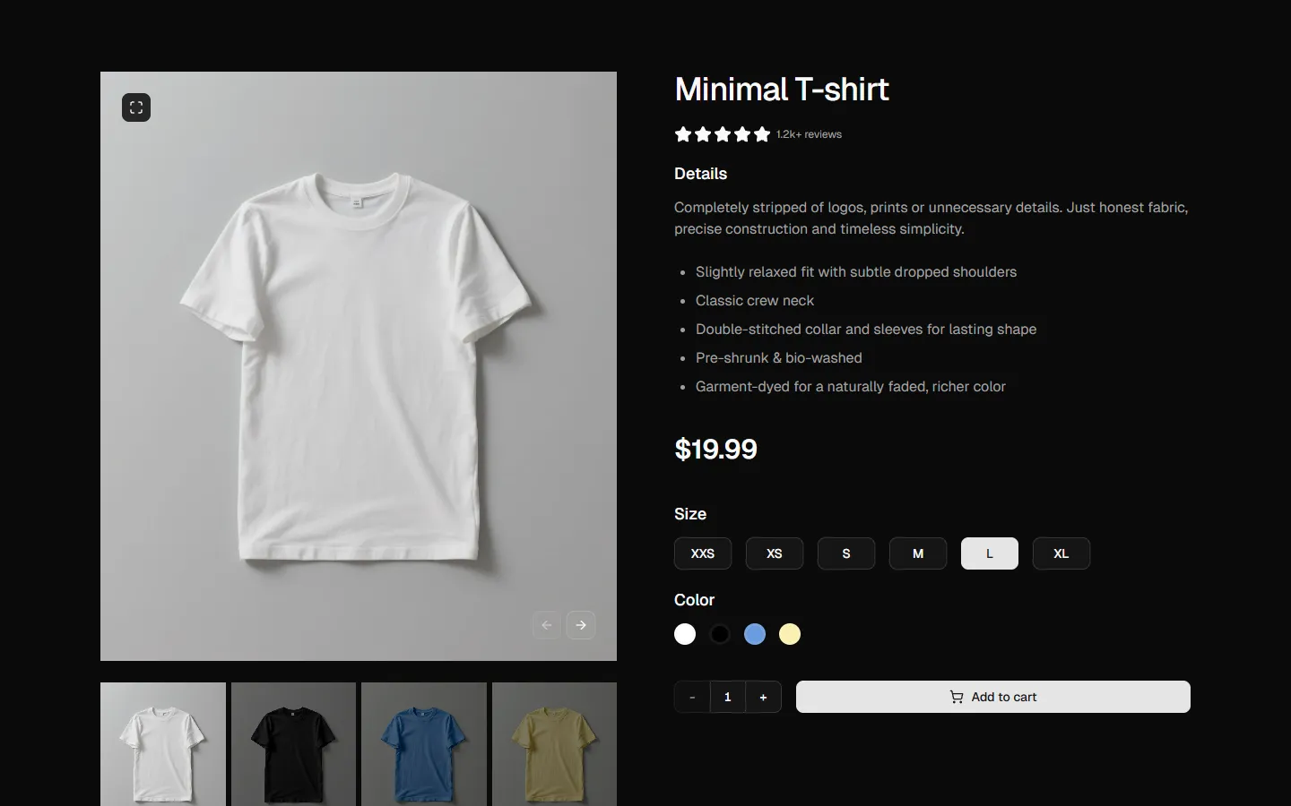
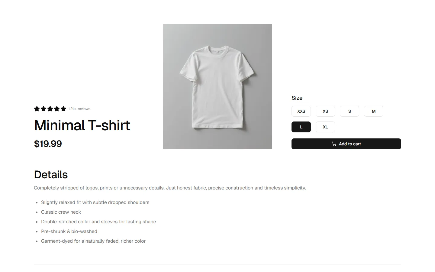
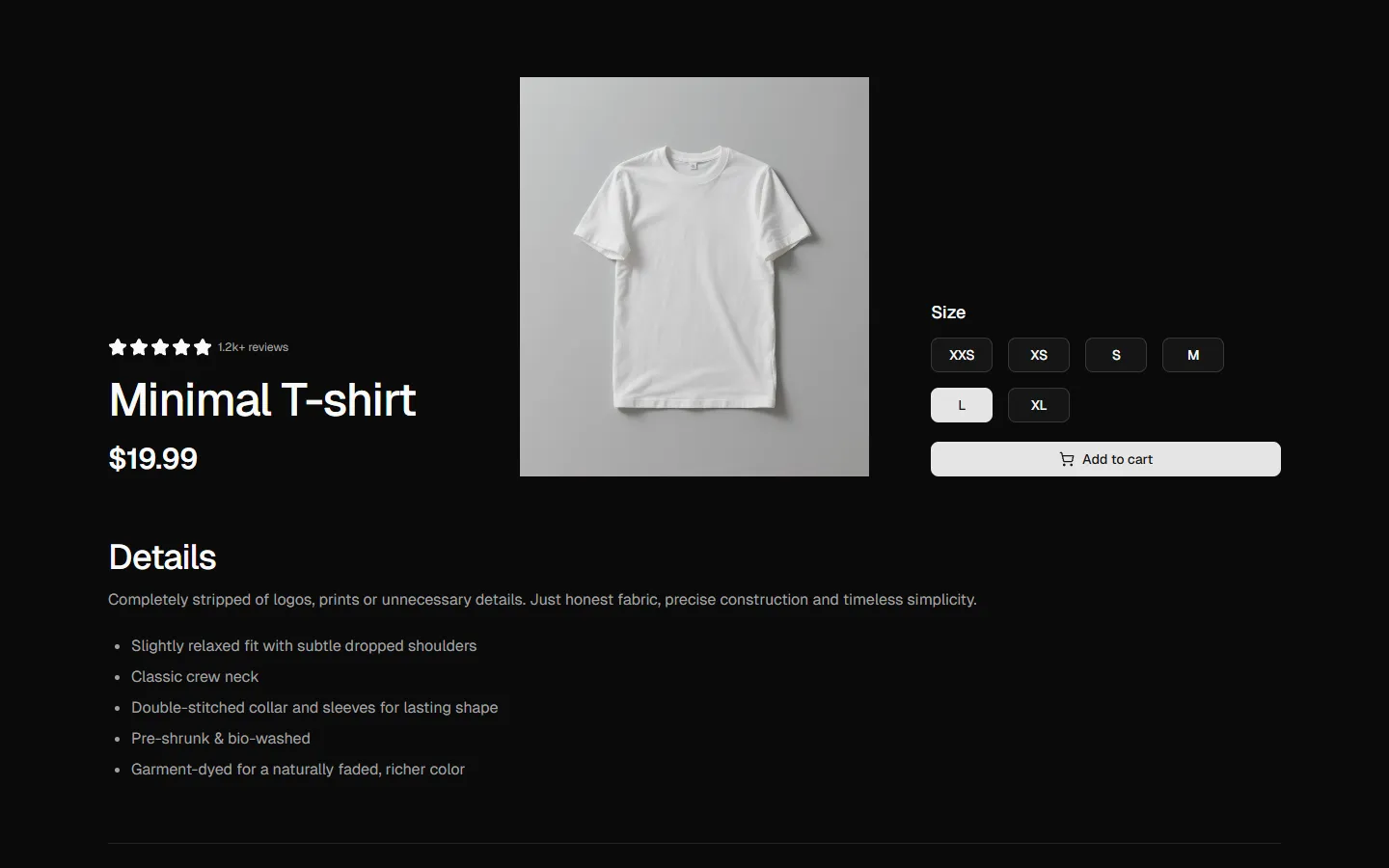
A clean and professional product detail section featuring a large primary image on the left and functional configuration tools on the right. The information hierarchy includes the product title, star ratings, price, and a brief description. Below, users can interact with size selection tiles, color swatches, and a quantity selector before adding the item to the cart. This layout is designed for maximum clarity, guiding the user through the customization process toward a final purchase.
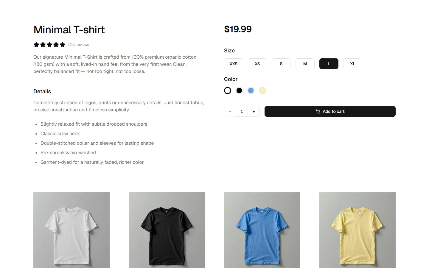
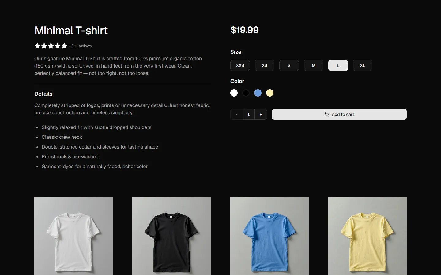
More Product Details
Production-ready by default
Built with shadcn/ui conventions and designed for real projects.
Clean React components using Tailwind and modern shadcn patterns.
Add the block directly using the shadcn CLI.
Compatible with shadcn themes and token-based color systems.
Use shadcn MCP server right from your favorite AI tools.
