Product Details 3
Detailed product view with specifications and gallery
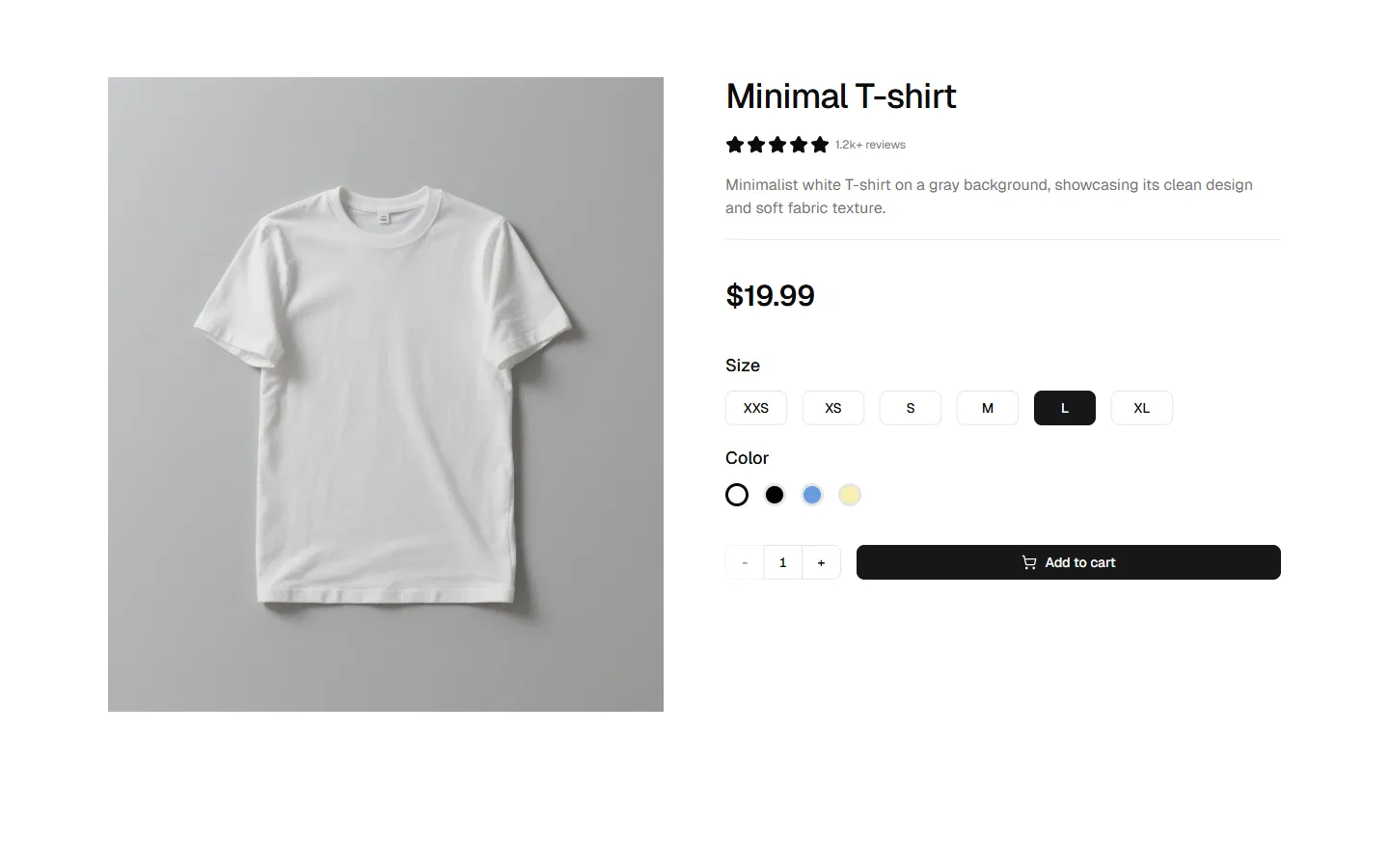
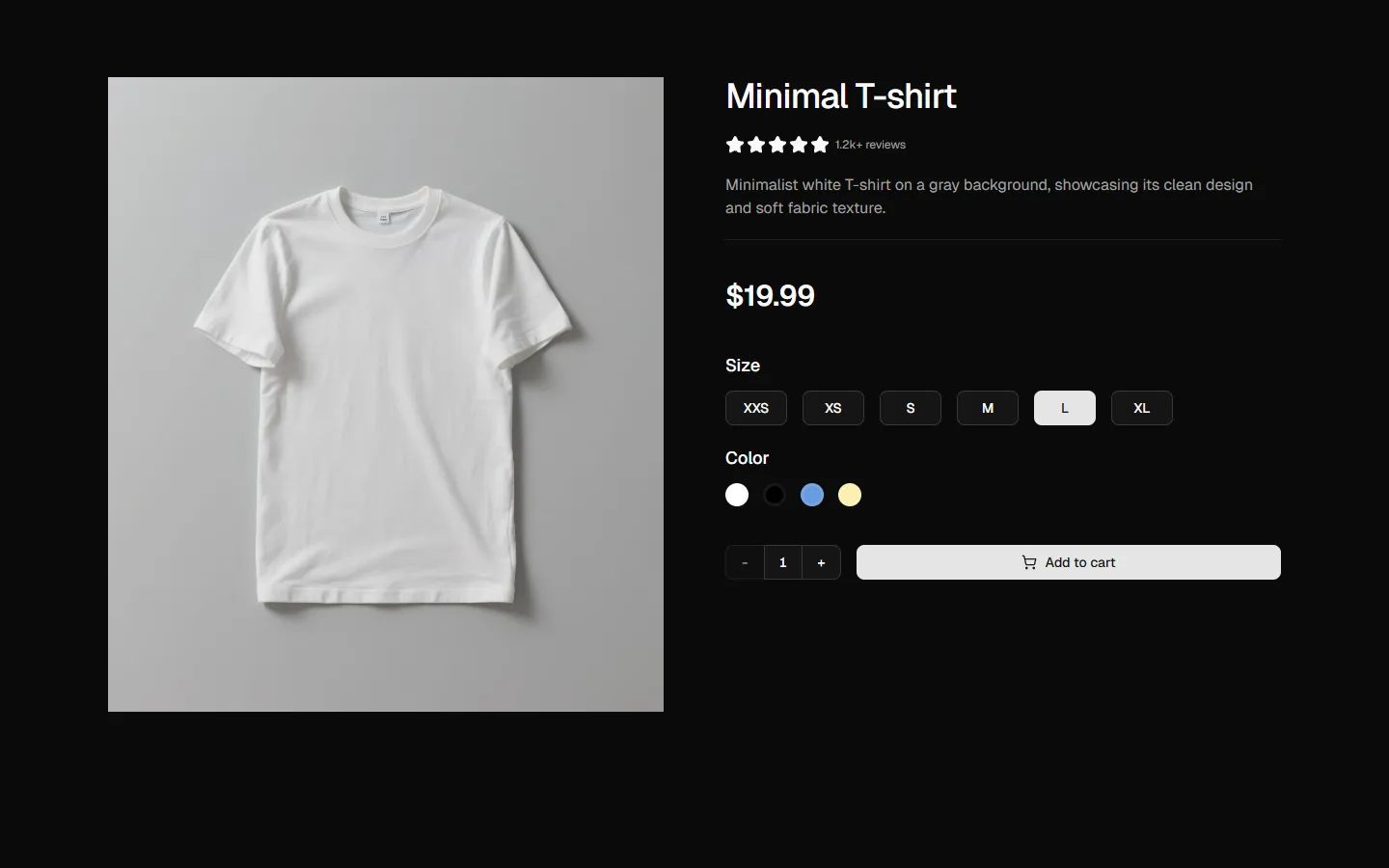
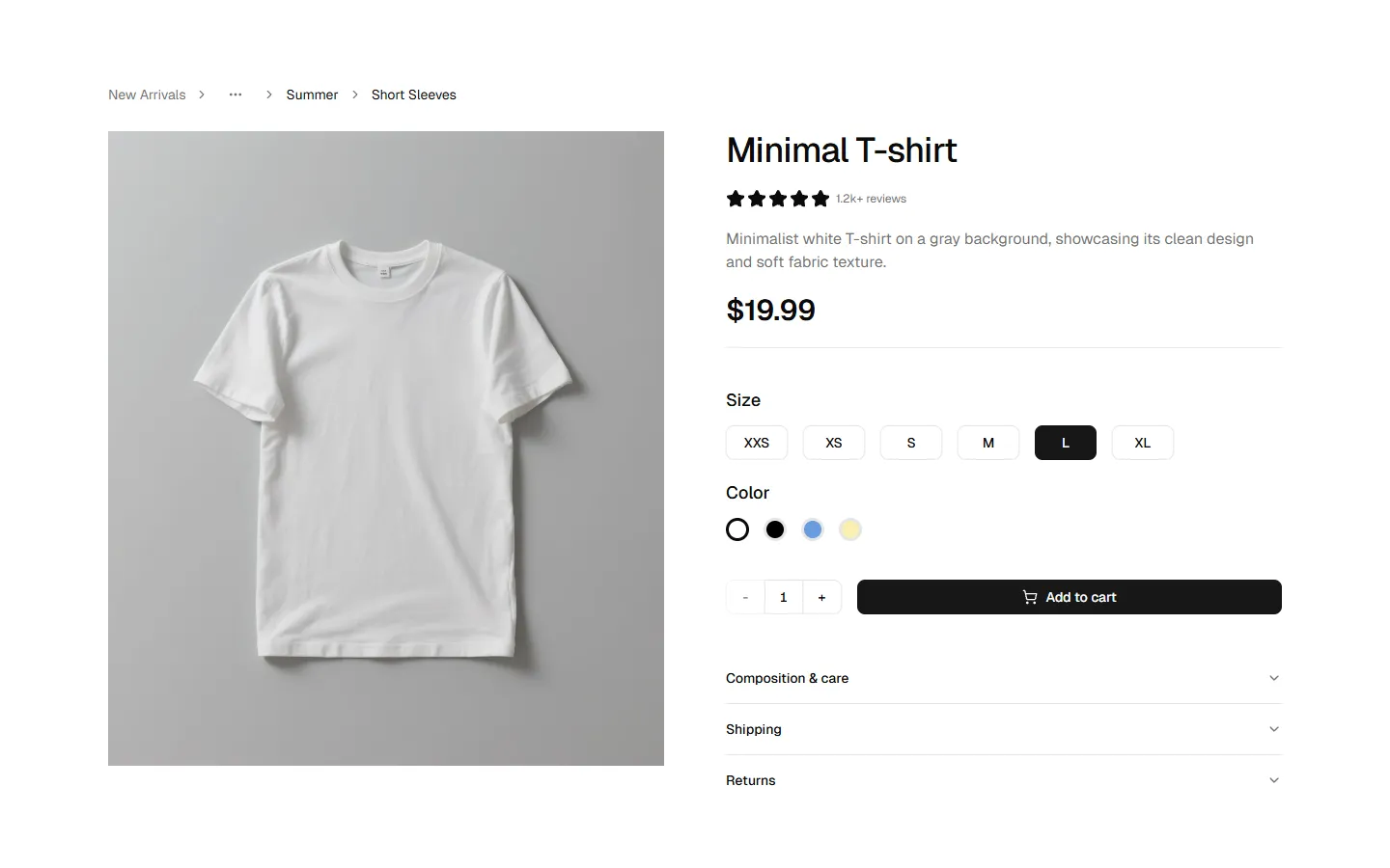
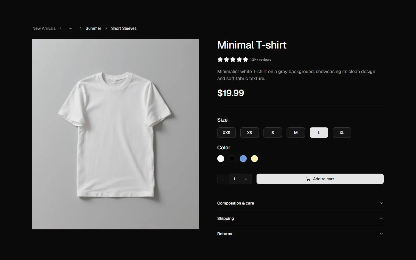
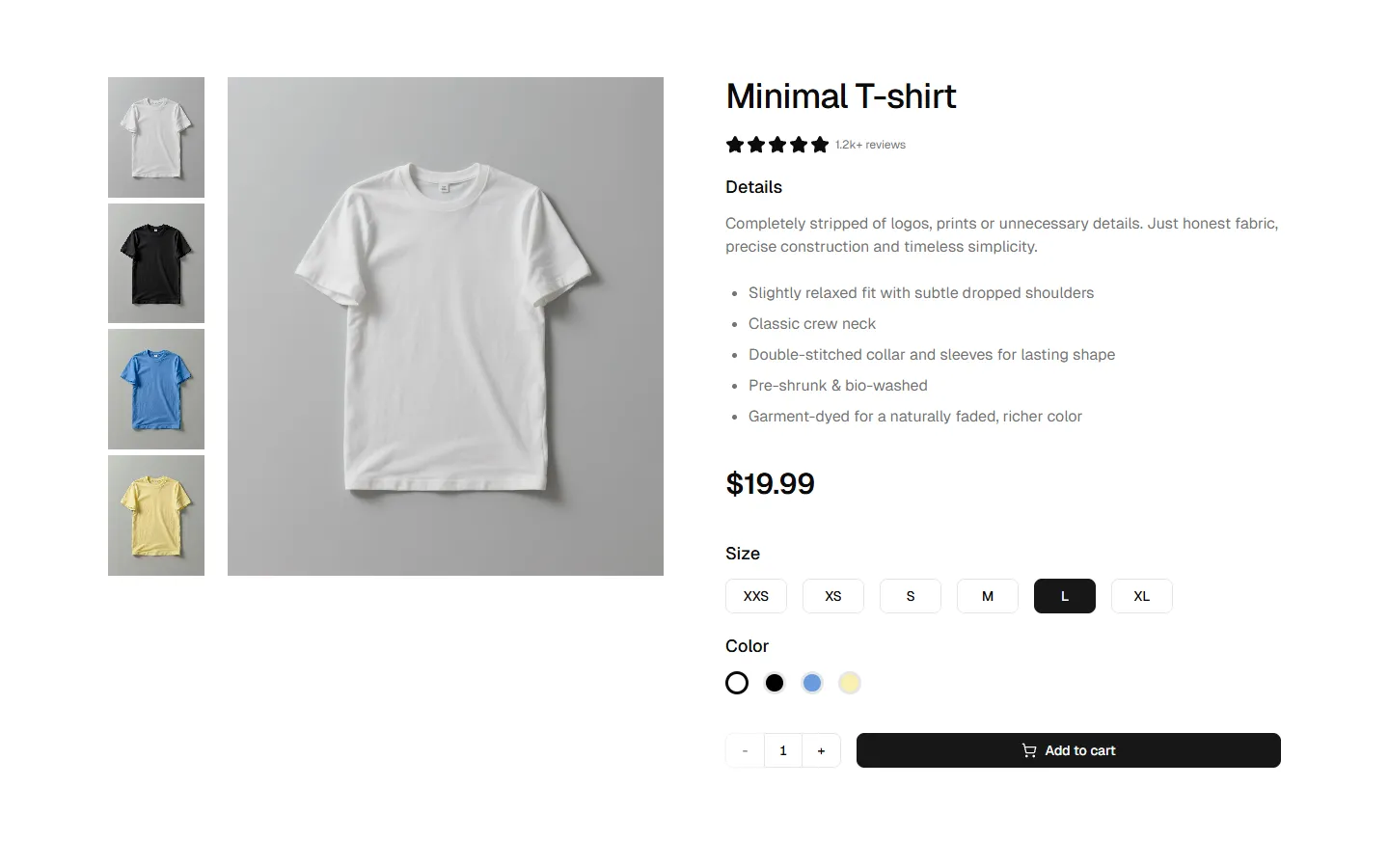
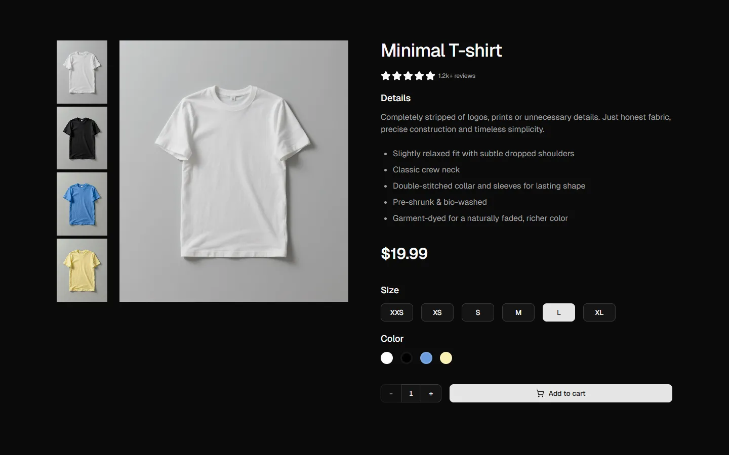
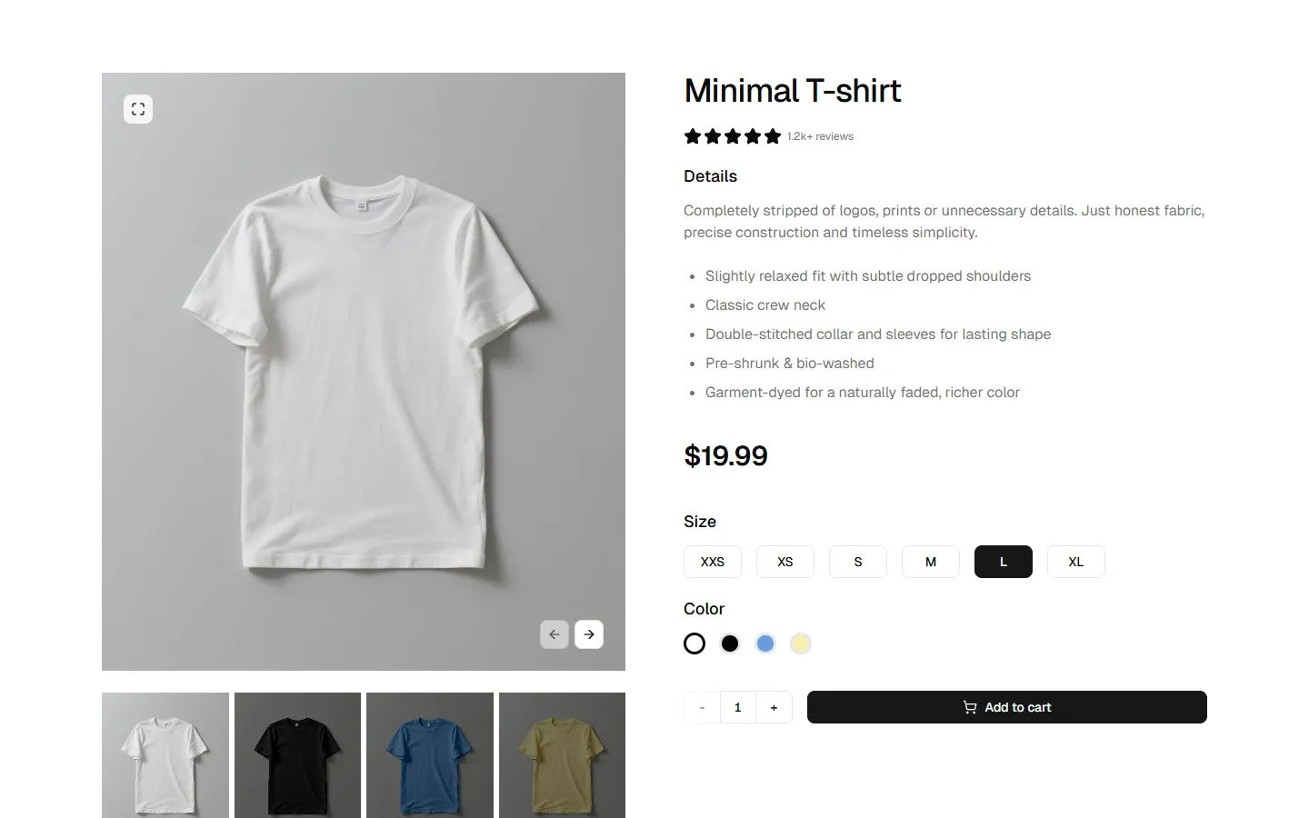
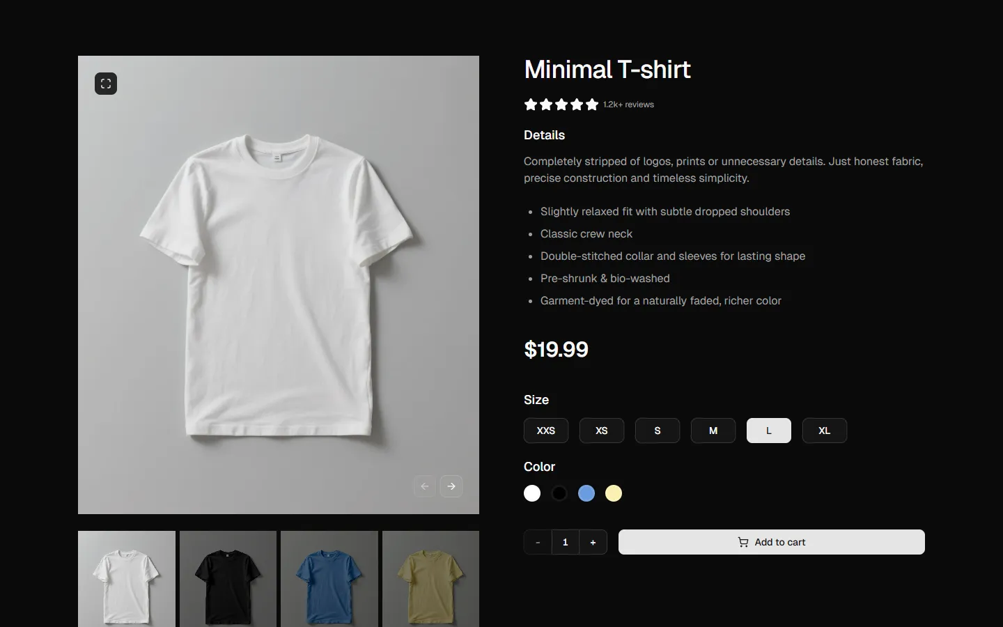
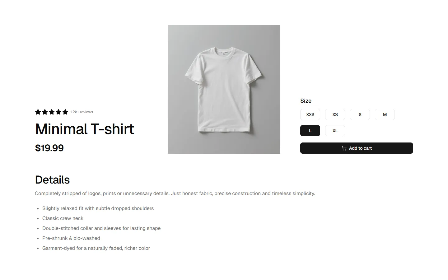
A content-rich product detail section that prioritizes technical information. The layout features a primary text area on the left detailing fabric composition and design features, balanced by a configuration sidebar on the right for size and color selection. Below, a four-column gallery showcases the product in every available color variant, providing a visual overview that aids the customer's final decision.
More Product Details
Production-ready by default
Built with shadcn/ui conventions and designed for real projects.
Clean React components using Tailwind and modern shadcn patterns.
Add the block directly using the shadcn CLI.
Compatible with shadcn themes and token-based color systems.
Use shadcn MCP server right from your favorite AI tools.
