Pro
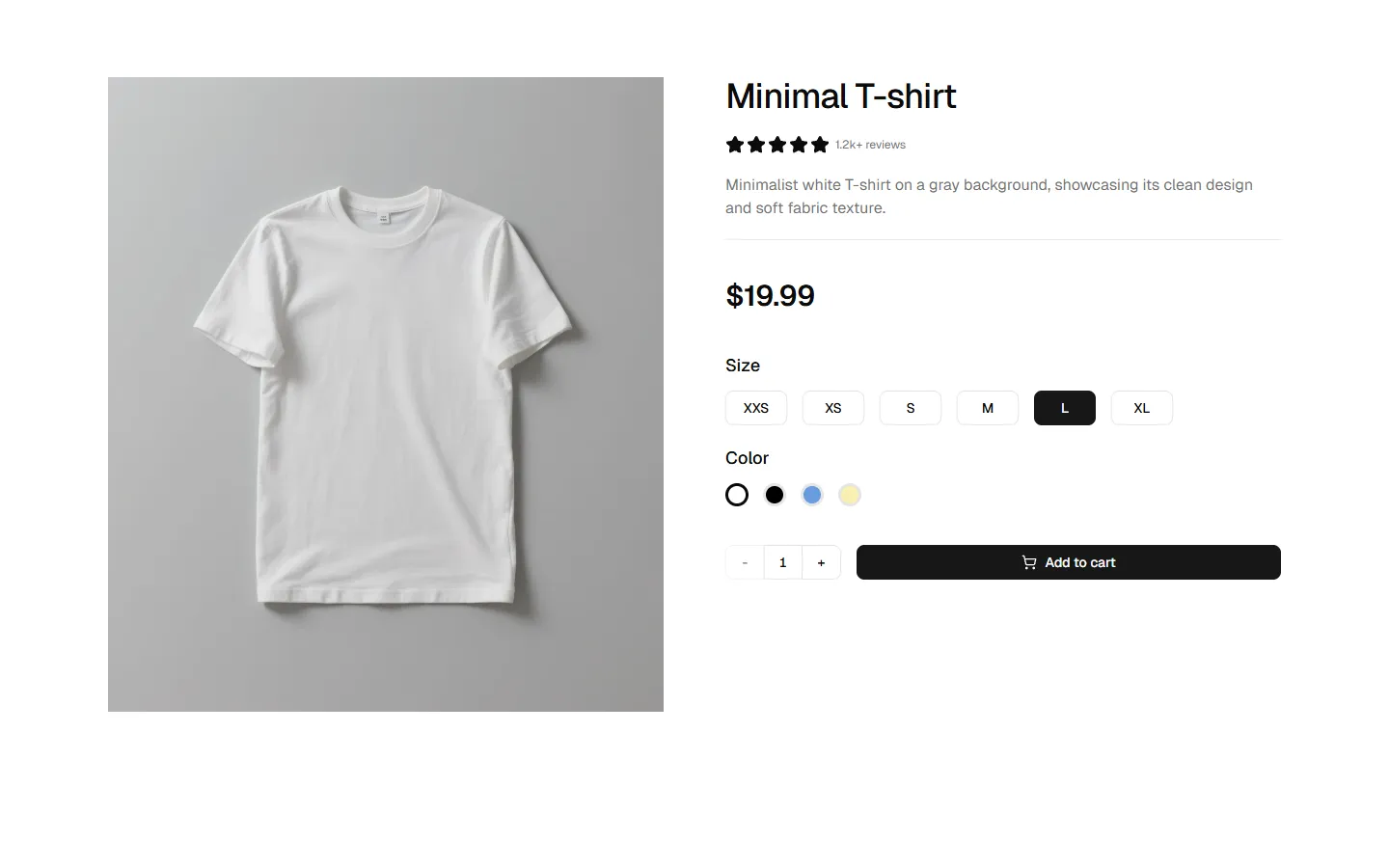
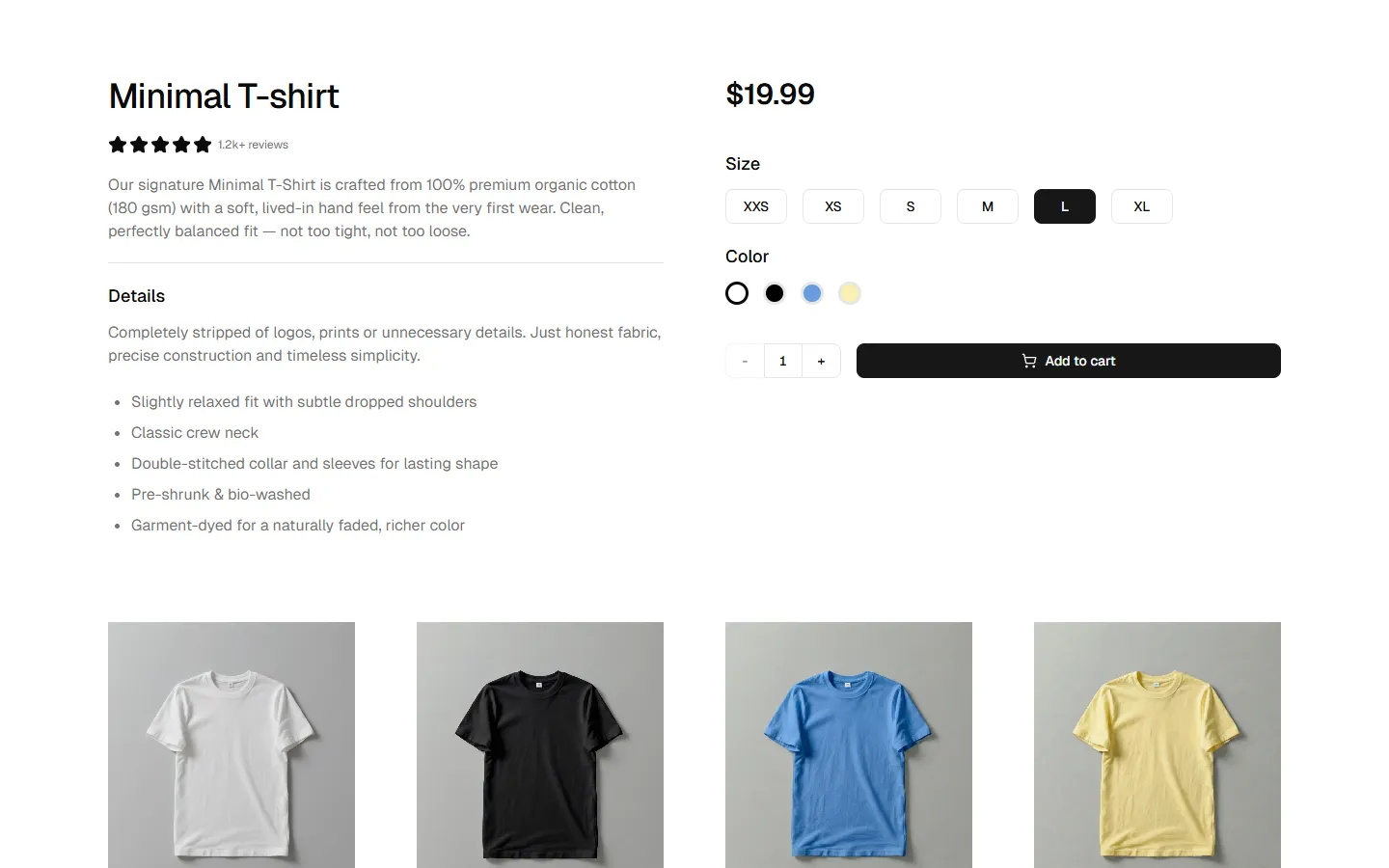
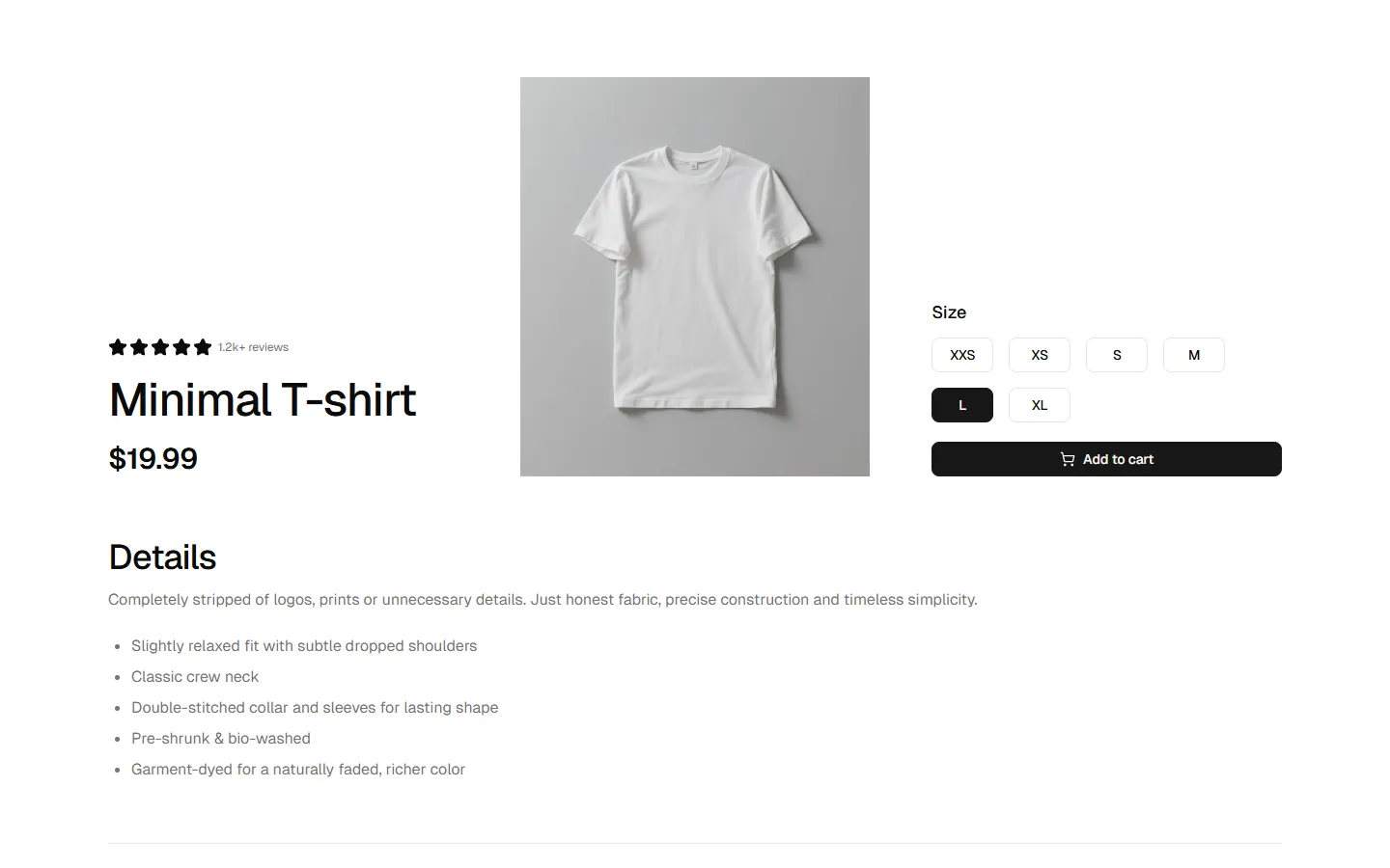
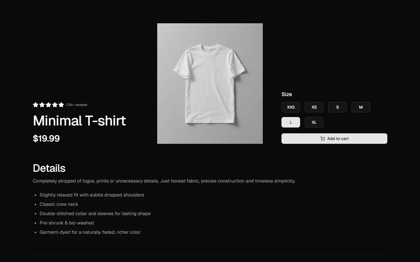
Product Details 1
Product overview with configuration
Pro
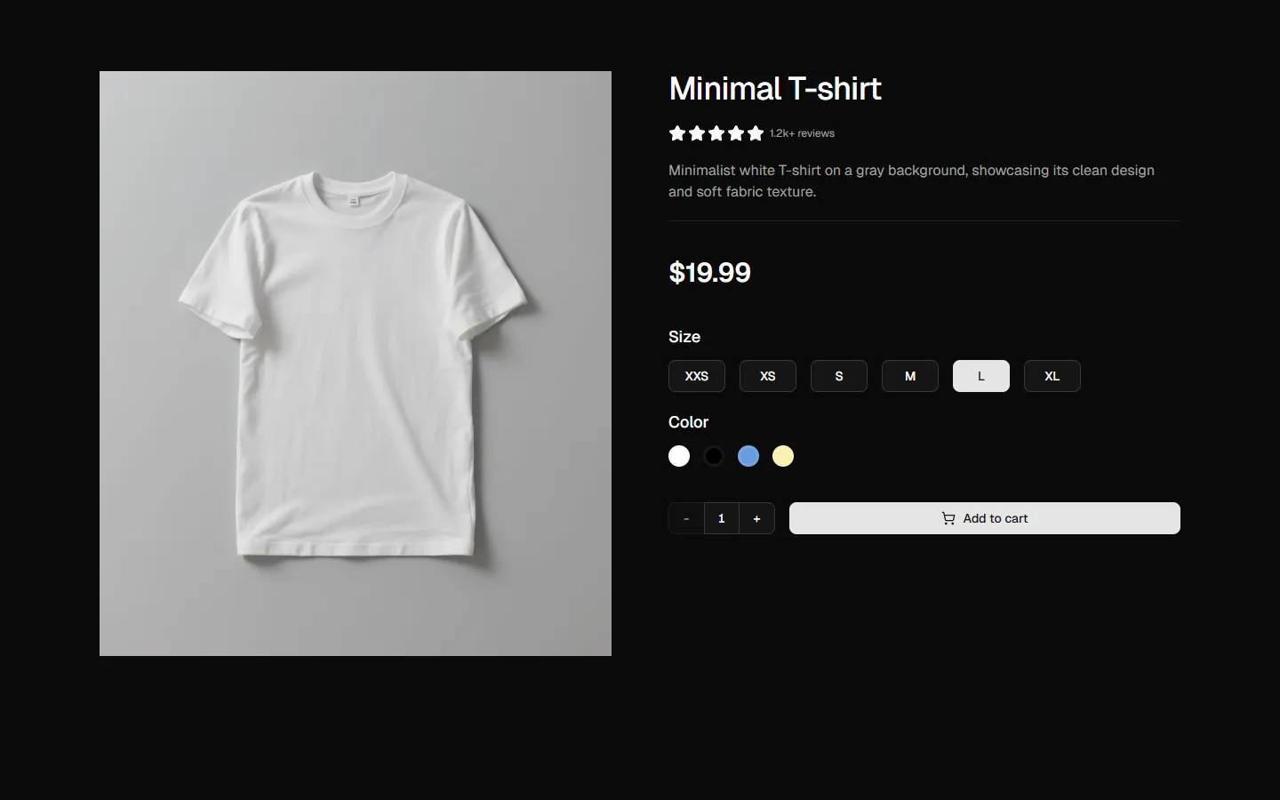
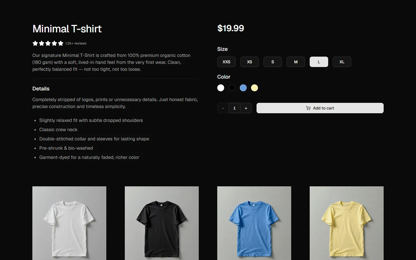
Product Details 2
Product page with breadcrumbs and accordion
Pro
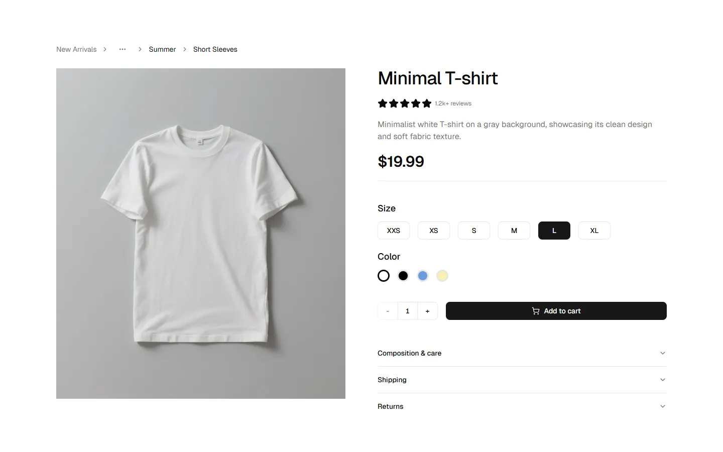
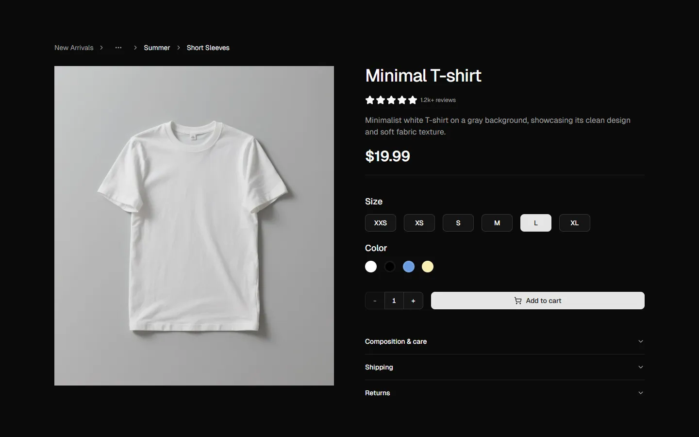
Product Details 3
Detailed product view with specifications and gallery
Pro
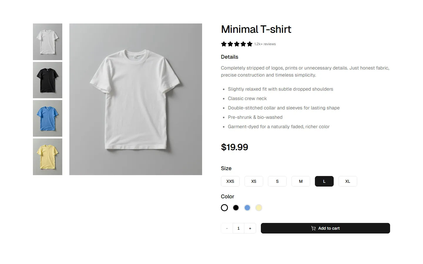
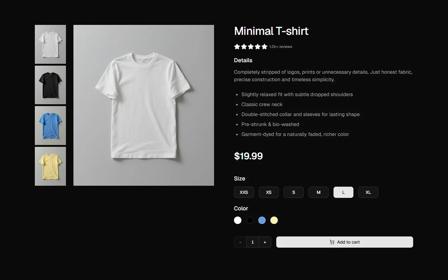
Product Details 4
Product detail page with vertical thumbnail gallery
Pro
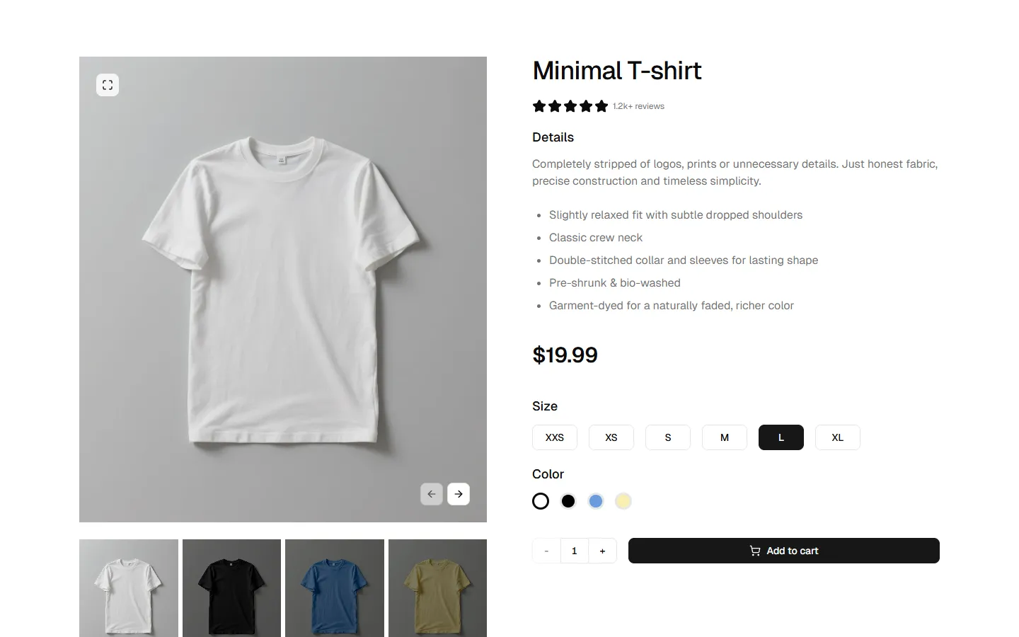
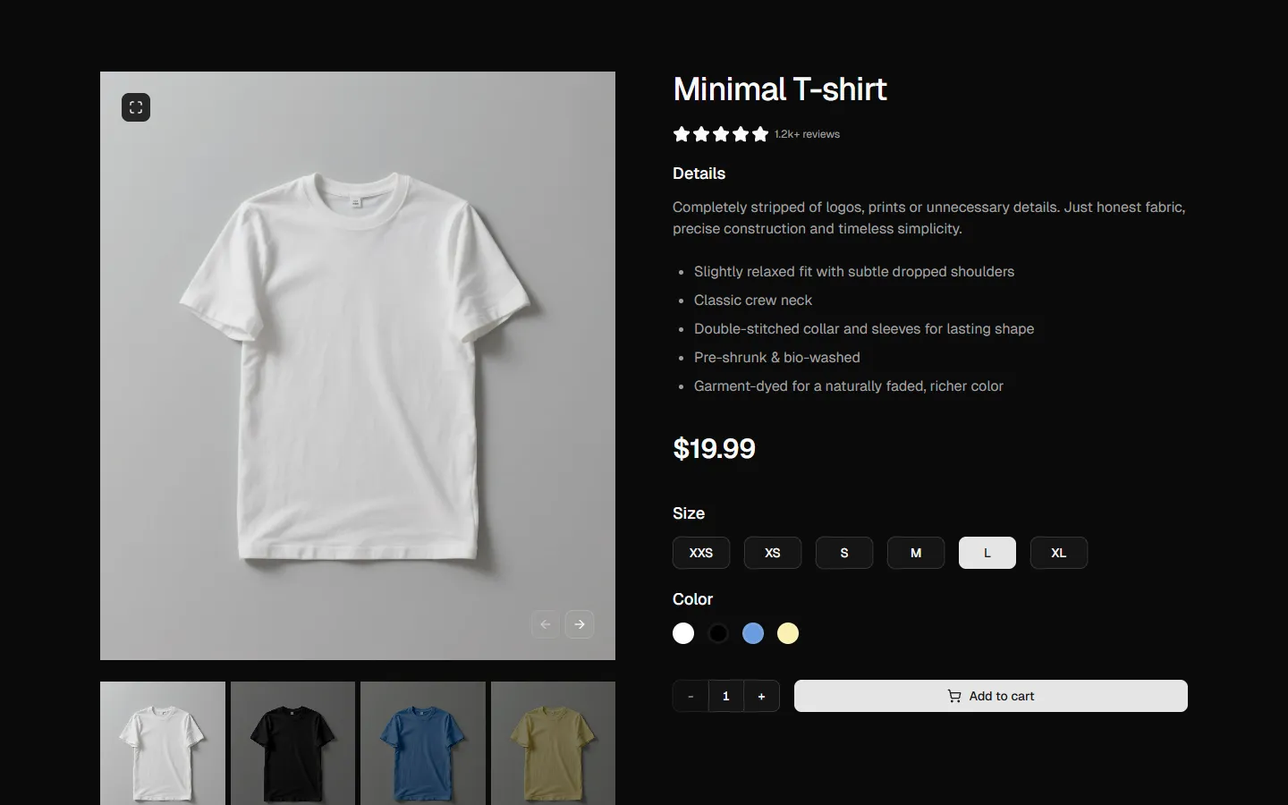
Product Details 5
Product page with bottom gallery and navigation arrows
Pro
Product Details 6
Product page with centered hero and multi-column FAQ grid
Explore all block categories
Built on official shadcn/ui components with real structure, spacing, and accessibility. No AI-generated layouts. Designed for real products in Figma and React.
Looking for something specific? Browse all shadcn/ui blocks.
Benefits
Designed for your shadcn/ui project
Blocks built to work together across marketing pages and product interfaces.
Consistent layout system
Shared spacing, grids, and typography across all blocks.
Composable layouts
Combine blocks to build complete pages without layout conflicts.
Theme compatible
Works with shadcn/ui themes and token-based color systems.
Production-ready structure
Layouts designed with real content patterns and responsive behavior.
