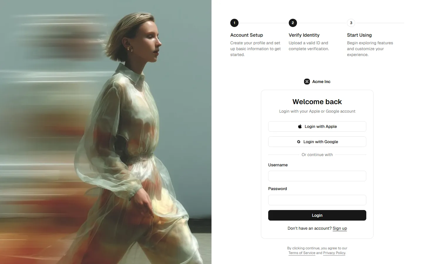
Multistep
A set of structured onboarding layouts designed to guide users through a sequence of steps with clear progress and orientation. Includes split layouts and media-assisted variants that balance form inputs with contextual guidance or visual reinforcement. Built to reduce cognitive load, set expectations early, and help users move confidently through longer or more complex setup flows.
Explore all block categories
Built on official shadcn/ui components with real structure, spacing, and accessibility. No AI-generated layouts. Designed for real products in Figma and React.
Looking for something specific? Browse all shadcn/ui blocks.
Designed for your shadcn/ui project
Blocks built to work together across marketing pages and product interfaces.
Shared spacing, grids, and typography across all blocks.
Combine blocks to build complete pages without layout conflicts.
Works with shadcn/ui themes and token-based color systems.
Layouts designed with real content patterns and responsive behavior.
