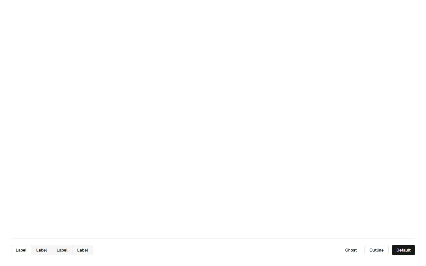
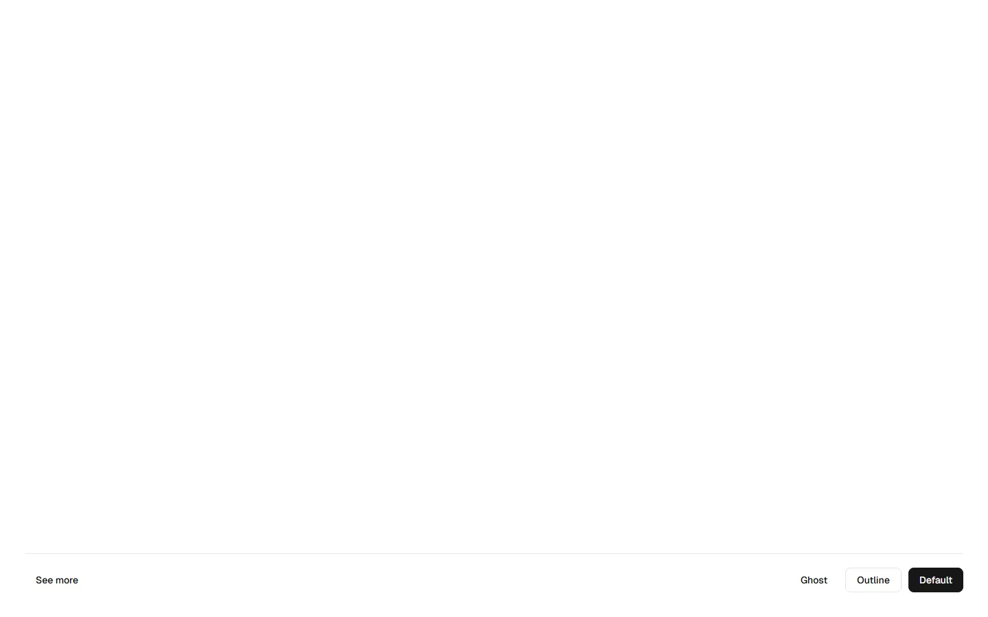
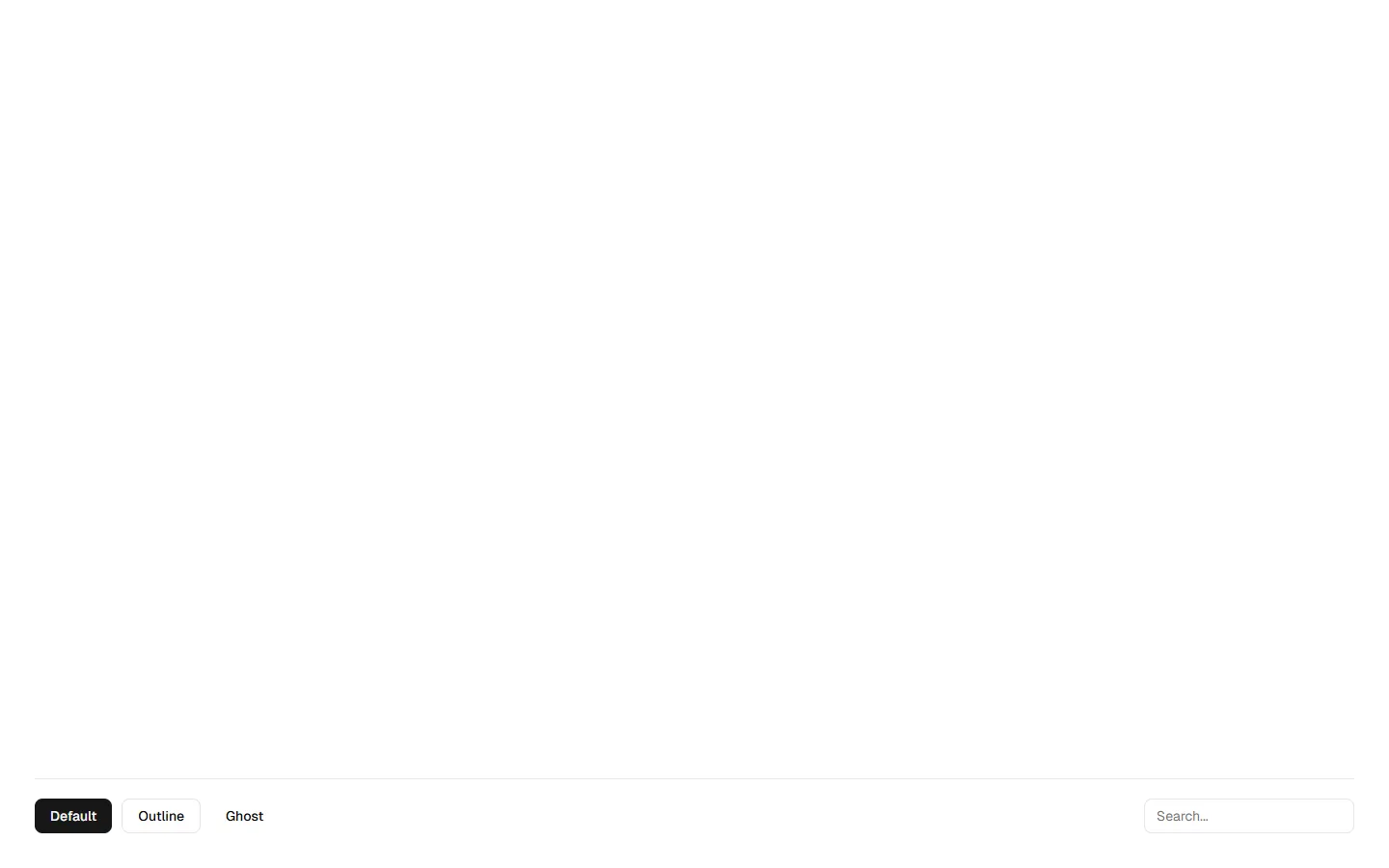
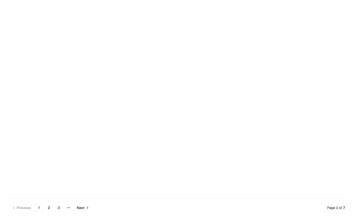
Section Footers
A set of footer patterns designed for task-focused and utility-driven layouts. Includes minimal action bars, single-action footers with progressive reveal, and utility footers with inline controls. Built to keep primary actions accessible without overwhelming the interface, while supporting contextual controls, secondary actions, and lightweight navigation. Suitable for forms, tables, dashboards, and workflow-driven pages.


Explore all block categories
Built on official shadcn/ui components with real structure, spacing, and accessibility. No AI-generated layouts. Designed for real products in Figma and React.
Looking for something specific? Browse all shadcn/ui blocks.
Designed for your shadcn/ui project
Blocks built to work together across marketing pages and product interfaces.
Shared spacing, grids, and typography across all blocks.
Combine blocks to build complete pages without layout conflicts.
Works with shadcn/ui themes and token-based color systems.
Layouts designed with real content patterns and responsive behavior.
