Heroes
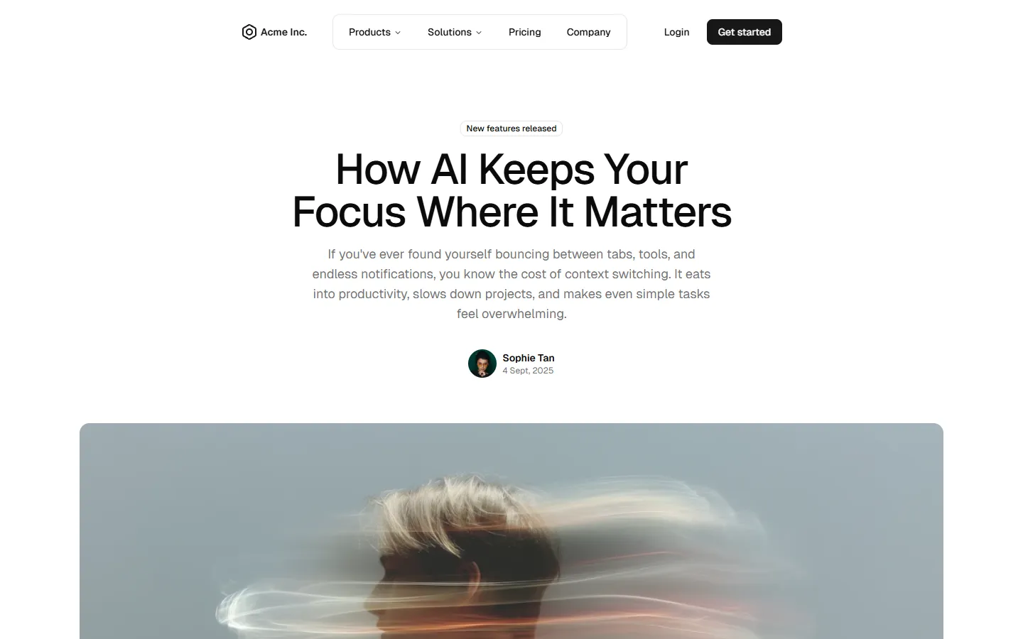
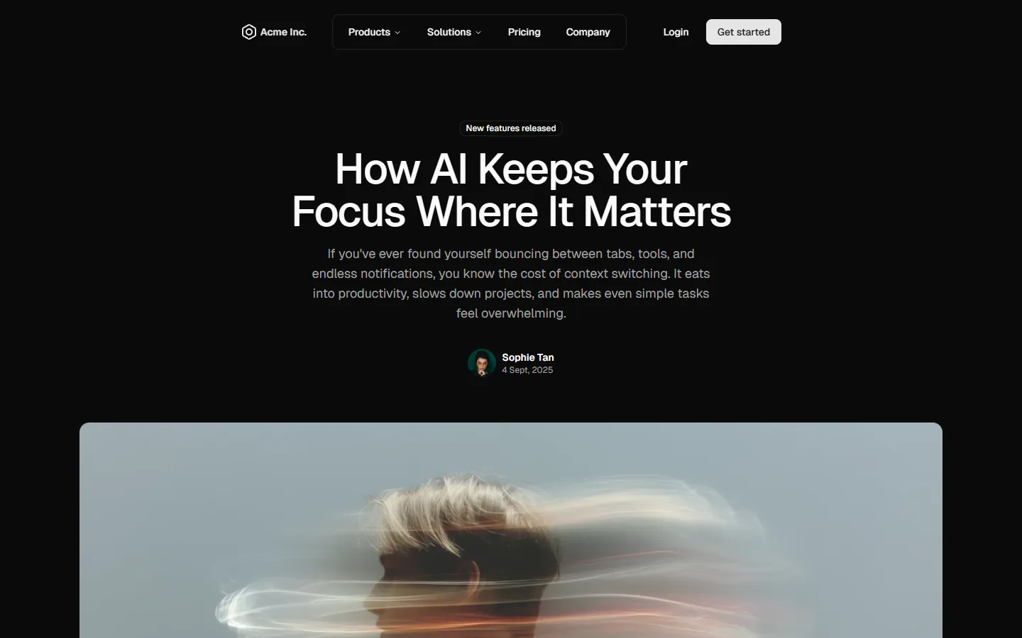
shadcn/ui Hero blocks that combine striking visuals with headings and navigation. Designed to make a strong first impression, with options for image backgrounds and guidance on maintaining text contrast for accessibility.


Explore all block categories
Built on official shadcn/ui components with real structure, spacing, and accessibility. No AI-generated layouts. Designed for real products in Figma and React.
Looking for something specific? Browse all shadcn/ui blocks.
Designed for your shadcn/ui project
Blocks built to work together across marketing pages and product interfaces.
Shared spacing, grids, and typography across all blocks.
Combine blocks to build complete pages without layout conflicts.
Works with shadcn/ui themes and token-based color systems.
Layouts designed with real content patterns and responsive behavior.
