Headers
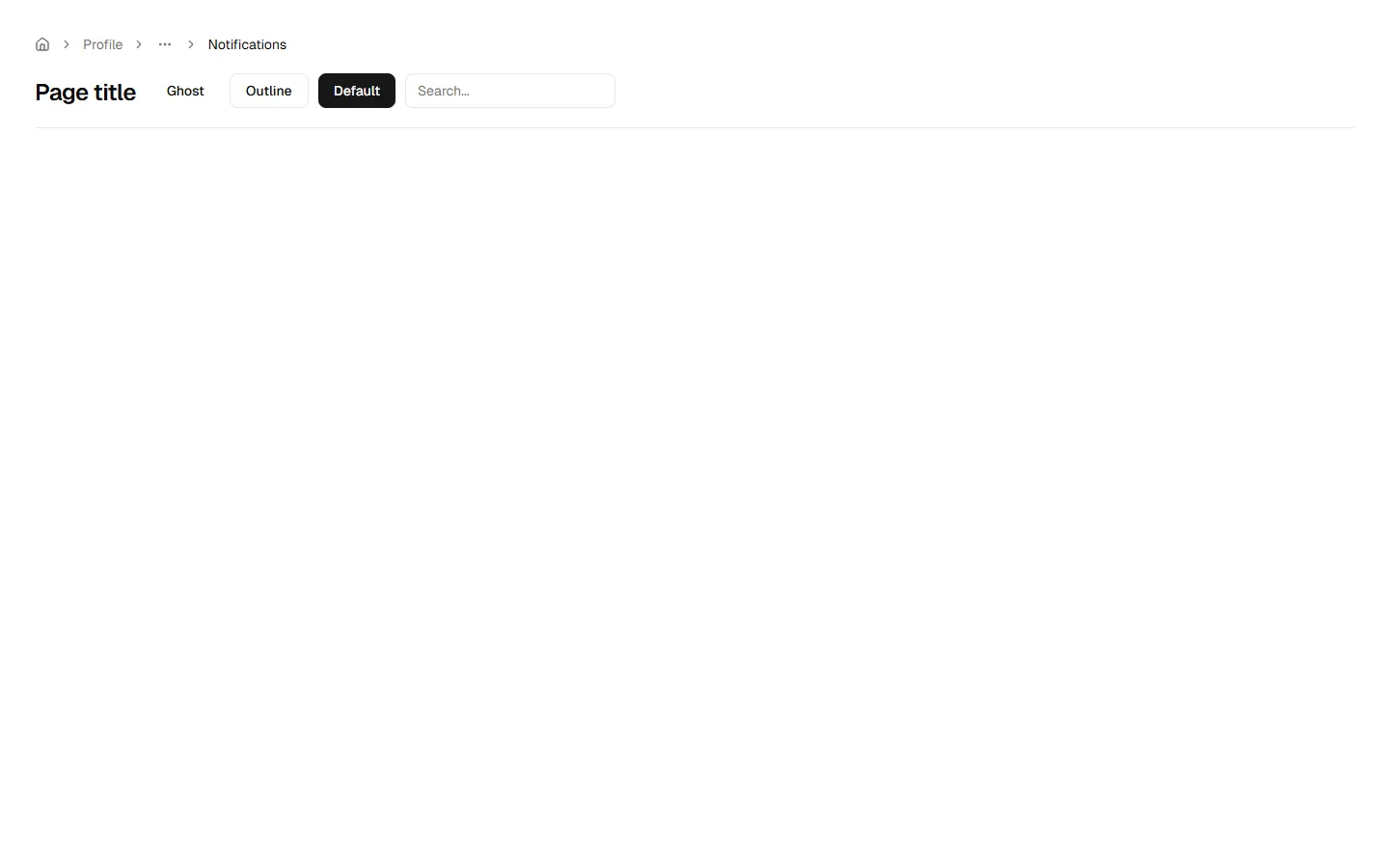
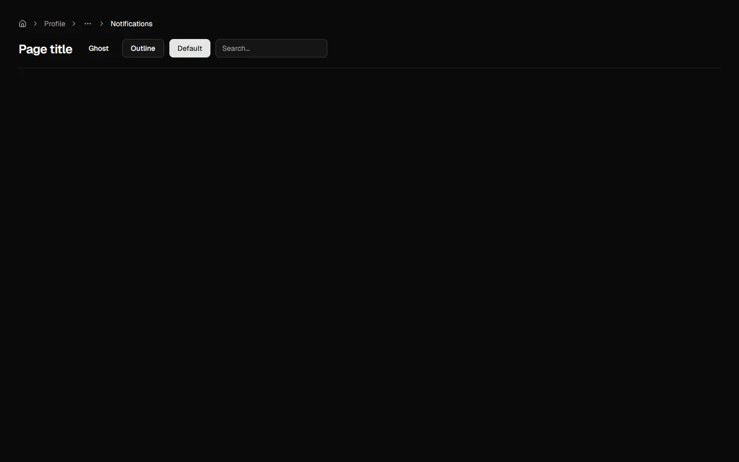
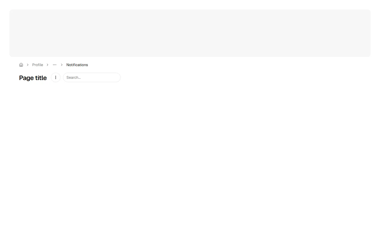
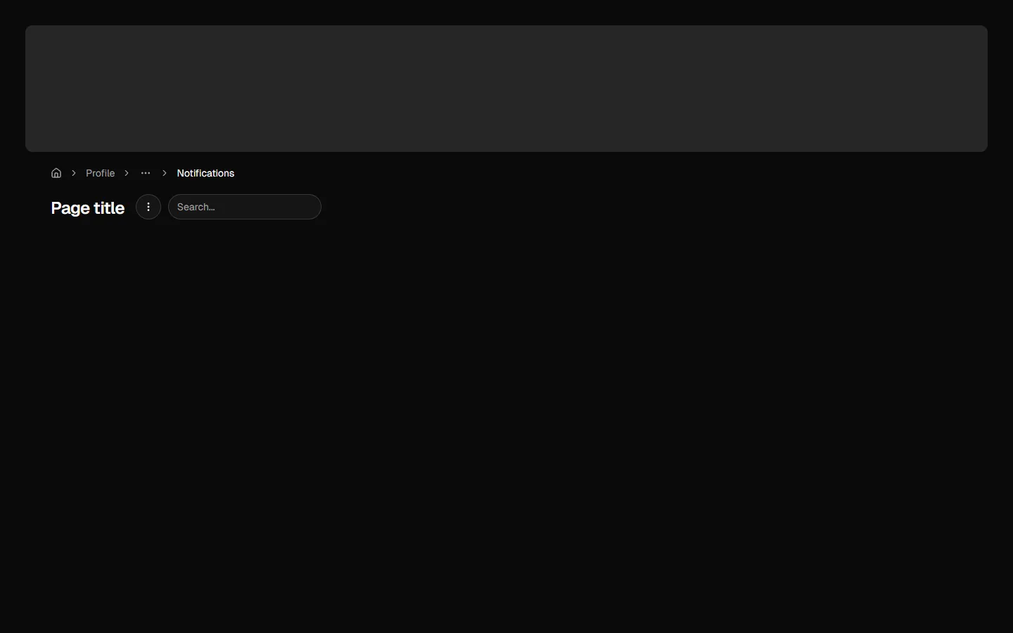
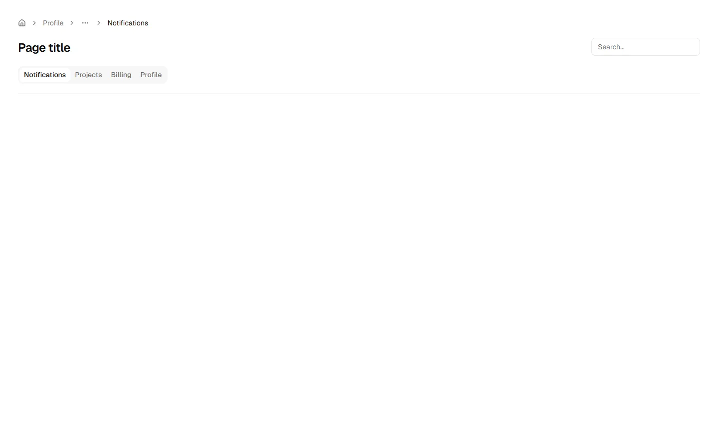
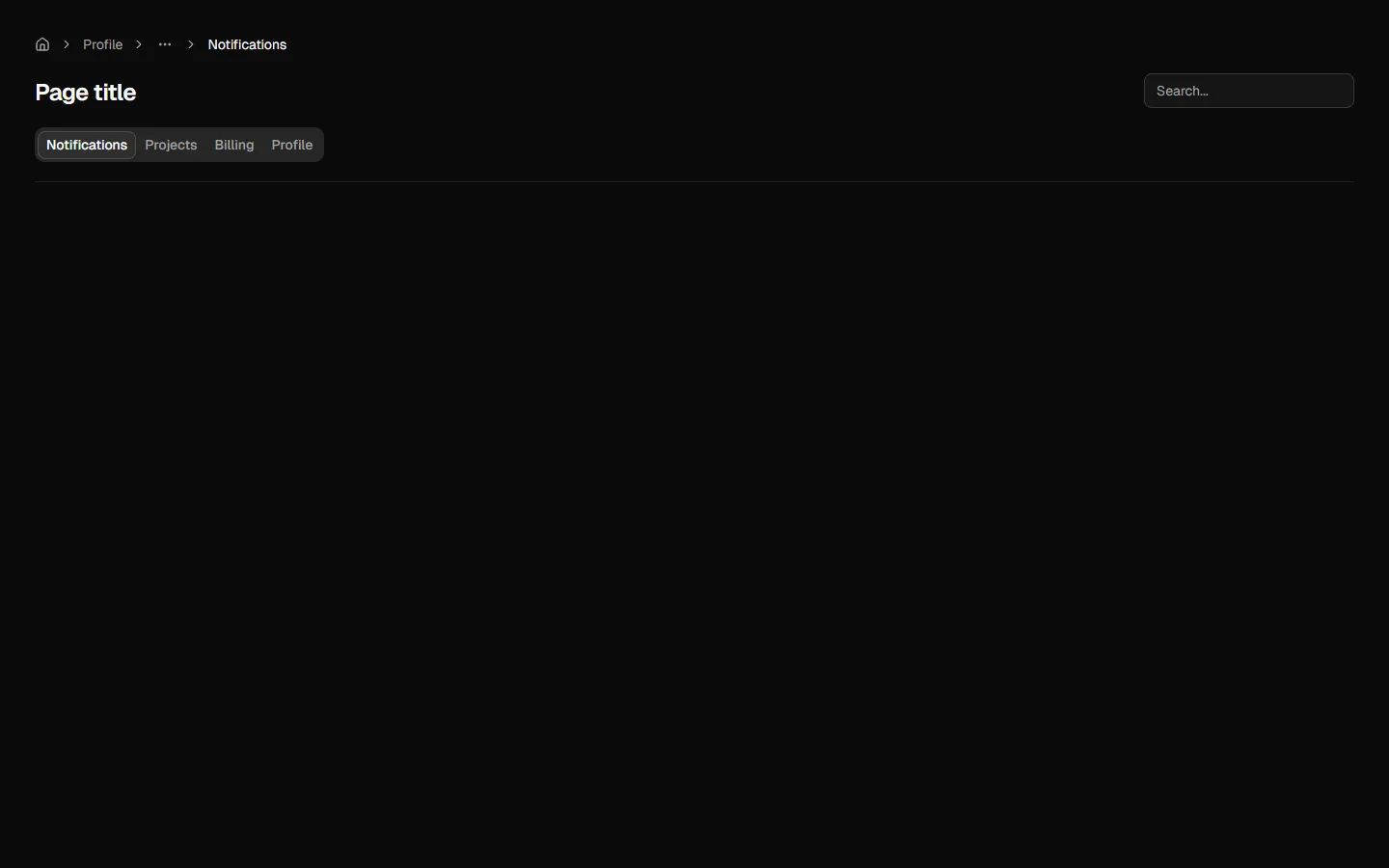
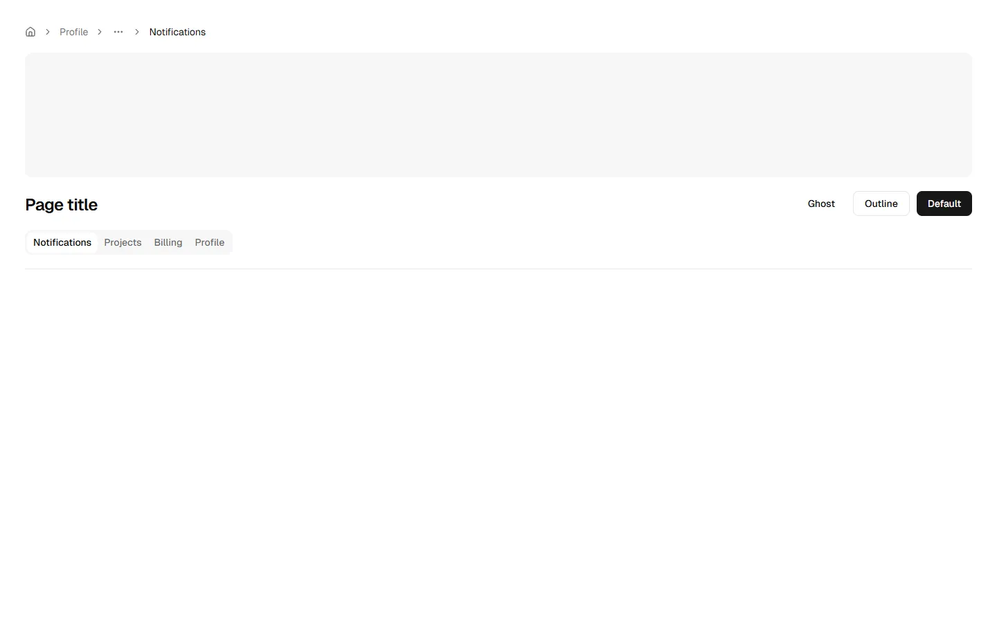
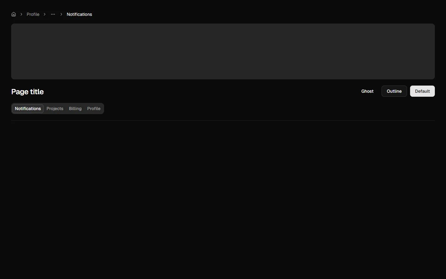
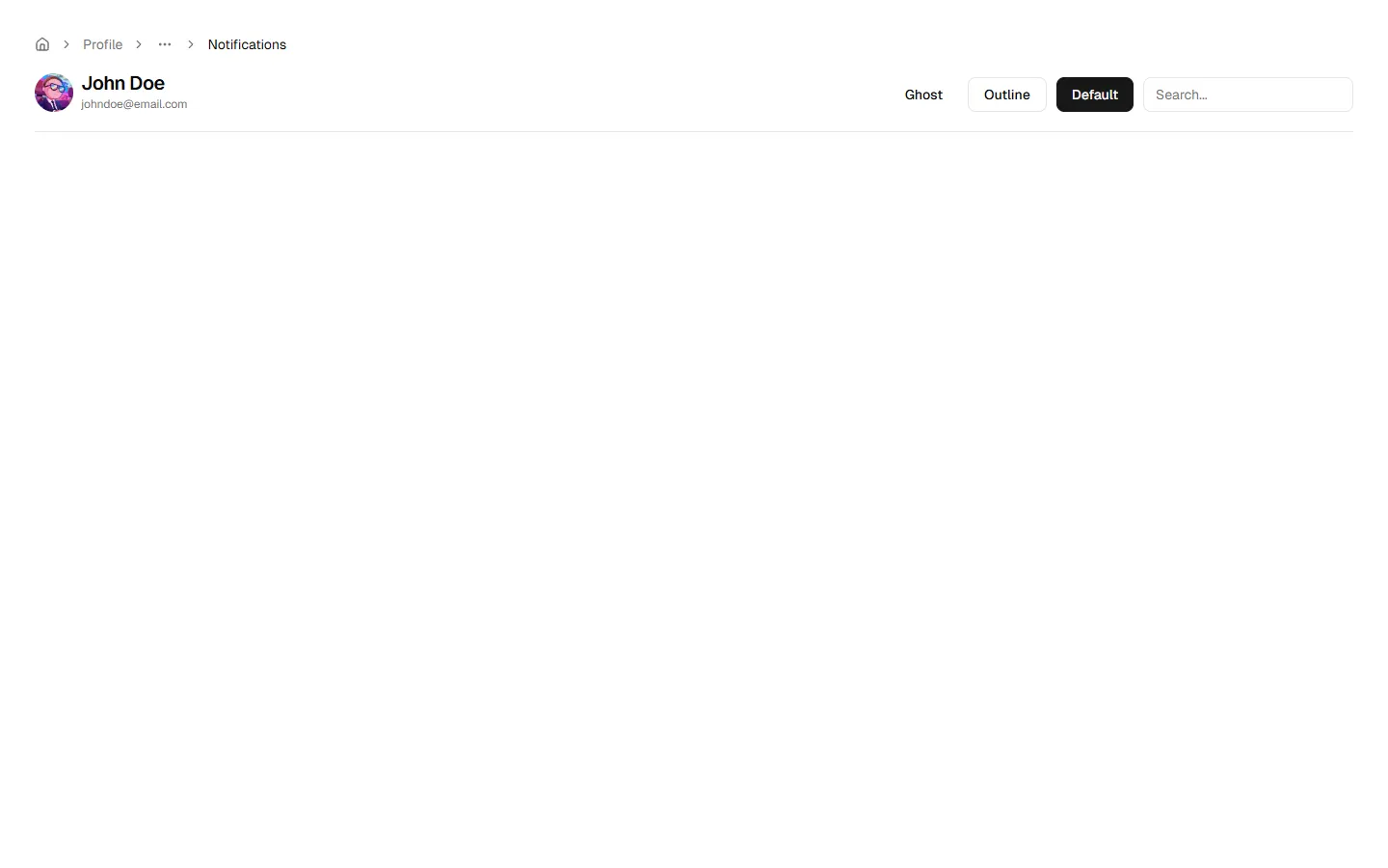
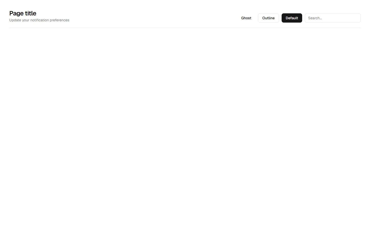
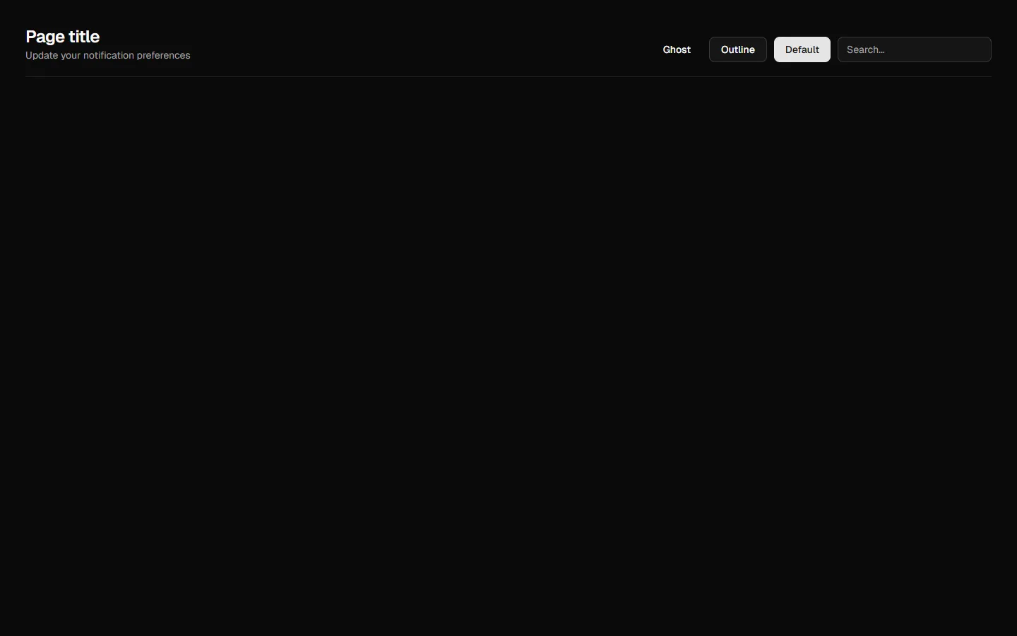
A collection of flexible page header patterns that anchor page context and key actions. Includes minimal headers with actions and search, headers with optional cover imagery, tab-based navigation for section switching, and combined layouts with both cover images and tabs. Designed to scale from simple utility pages to richer, content-led views while keeping titles, navigation, and primary actions clear and consistent.

Explore all block categories
Built on official shadcn/ui components with real structure, spacing, and accessibility. No AI-generated layouts. Designed for real products in Figma and React.
Looking for something specific? Browse all shadcn/ui blocks.
Designed for your shadcn/ui project
Blocks built to work together across marketing pages and product interfaces.
Shared spacing, grids, and typography across all blocks.
Combine blocks to build complete pages without layout conflicts.
Works with shadcn/ui themes and token-based color systems.
Layouts designed with real content patterns and responsive behavior.
